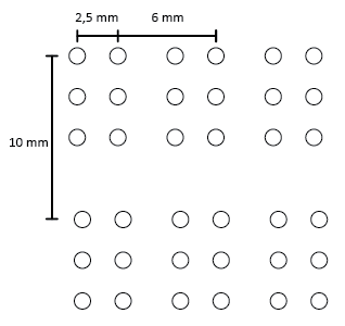
In braille, many different conventions and variations are used. Below, you will find an overview of the aspects of braille that are supported in TactileView. By using text labels in TactileView with the correct braille table selected, in-depth knowledge of braille to still produce correct braille texts is not required. However, below you will find a list of the most prominent inherent properties of braille script that determine the layout of braille text labels in your designs.
TactileView automatically ensures the braille is sized correctly (following the most commonly used distance of approx. 2,5 mm = 1/10 inch between braille dots) as well as using the correct distance between braille characters (approx. 6 mm) and lines of text (approx. 10 mm). A white space around the braille makes sure that there is enough space between adjacent objects or texts to ensure they can easily be distinguished with your fingertip. The braille grid can be used as a layout tool for alignment using these standard dimensions, see Braille grid (text alignment).
Other aspects that are specific to braille such as braille composition signs (capital letter sign, number sign, symbols, etc.) are also applied automatically. These composition signs are highlighted on screen with a light grey background. Remember that these composition signs differ significantly between different languages and braille tables.

Figure 1. Braille cell sizes.
![]()
Figure 2. Capital sings as an example of composition signs; the rules for these signs vary between different languages and braille tables.
With the introduction of refreshable braille displays, two extra dots were added to form 8-dot braille. This way, using 255 braille characters are available (not including the space character) instead of the regular 63, allows a larger range of characters to be denoted in braille, such as mathematical symbols. Other notable differences with 6-dot braille are found in the braille composition signs.
For more consistency, braille display users that are familiar with reading 8-dot braille can use an 8-dot braille table producing designs from TactileView as well. Text labels (including the white space behind the braille) will automatically be higher to accommodate the addition of the two extra dots.

Figure 3. Comparison between 6-dot and 8-dot braille (example: LibLouis tables en-us-g1.ctb and en-us-comp8.ctb).
To save space in an embossed braille document, frequently used syllables or entire words can be represented by a shorter combination of braille character or even a single character. This is called contracted braille or grade 2 braille.
As an example, the word ‘the’ would be denoted with three braille characters in uncontracted English braille. In contracted braille however, this is shortened to just a single character.
When using a contracted Liblouis table, these contractions and abbreviations are applied automatically. The reader must be familiar with these conventions to be able to read contracted braille. On screen and when the design is also printed in ink, the font size of the visible text is reduced to match the text position with the braille characters.

Figure 4. Length difference between contracted and uncontracted braille.

 Previous section
 Return to TactileView manual overview