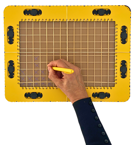
The columns of the GraphGrid frame can be considered as bars of a bar chart. The value in each bar is indicated by the number of marked cells, starting from the lower edge of the frame or from an additional rubber band. The lower edge or the rubber band is the x-axis. A cell can stand for one or multiple units or for a percentage.
Bar chart for birthday data
This bar chart example presents an overview of when people in a group have their birthday, spread over the year. Setup: Each column stands for a month. Each cell stands for one person.
Procedure: Ask who has thier birthday in January and mark the number of cells accordingly. Do the same for all respective months. Take the GraphGrid away. You can now interpret the data by counting the number of markings in the column.
More complex data
One bar can present multiple data sets by applying different tactile markings in the same cell. For a male count, you can apply a line in the cell from lower left to upper right, and for female, a line from upper left to lower right. Data that are presented with two colours could follow the same routine. Additional graphical markings can present even more complex data types.
Providing maximum value/top of the bar
To present numeric values, you can find the position in the column/bar by counting upwards from the x-axis. Assume the maximum value can go as high as 1000, then you might take five cells as the longest bar. A value of 700 can be indicated as a straight line horizontal in the middle of the fourth cell up. Only the top of the bar needs to be indicated in order to interpret the data.
 Previous section

 Table of content