Equations for sighted users are usually written in a spatial arrangement, in such a way that the components and their relations can be understood from their relative positioning. For example, a division is depicted by placing the dividend above the divisor, separated by a horizontal division line.
For printing in braille, this spatial arrangement has to be converted into a continuous line of braille characters. Mathematical symbols such as (large) brackets, square roots and many other non-day-to-day symbols have to be converted as well.
Mathematical notations and braille tables
Since computers began to play a role in math and science, it has become even more a necessity to find an unambiguous way of presenting the results (in braille as well). Many of the equation editors use MathML as their universal language to store and manipulate mathematical equations. This language is also used to add equations to your design in TactileView.
In order to get the correct equation printed in braille, a 2-step conversion is required: applying mathematical notation rules and applying a braille table to translate the characters into the corresponding braille dots.
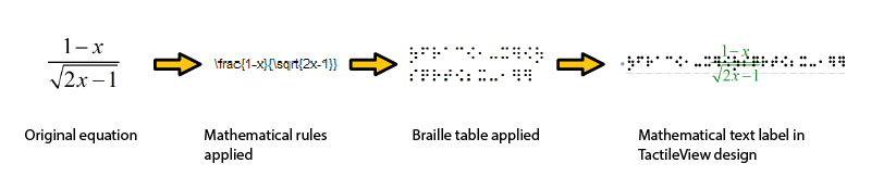
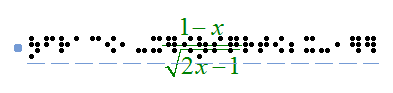
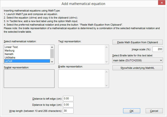
Figure 1. Conversion from an equation in MathType to a mathematical text label in TactileView, by applying the chosen mathematical notation (in this case LaTeX) and braille table (en-us-comp8.ctb).
A math notation applies a set of rules that convert the spatial elements from the graphical lay-out (MathML) into a continuous line of text. Extra characters need to be inserted to indicate the relationship of the parts, to depict special mathematical symbols or to signify the logical order of the elements. Amongst other, the Nemeth, Unified English Braille, LaTeX, Marburg and Dedicon are some of the better known math notations and are available in TactileView.
The result of the first conversion step is that the equation has become readable as text in a linear instead of a spatial arrangement. During the second step, a ‘braille translator’ (in TactileView, the open source project LibLouis is used) applies the desired braille table to convert the linear text of the equation into the corresponding braille characters.
Keyboard entry of mathematical formulas
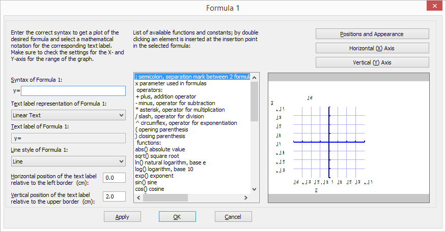
When entering a mathematical formula in TactileView, it is important to use the correct syntax for text-only mathematical notation on a computer. The spatial arrangement of the elements in a mathematical expression has to be entered using a combination of specific symbols and applying parenthesis where necessary. The list below gives an overview of which mathematical elements are supported for use in formulas in TactileView. The examples show how to apply and combine these elements.
| Mathematical element or function | Symbol | Example |
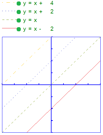
| Separation between multiple formulas | ; | y= |
| Formula parameter | x | y=x |
| Operators | ||
| Addition | + | y=x+1 |
| Subtraction | - | y=x-3 |
| Multiplication | * | y=2*x |
| Division | / | y=x/3 |
| Exponentiation | ^ | y=2^x |
| Parentheses | ( ) | y= (x+2)/(x-3) |
| Functions | ||
| Absolute value | abs( ) | y=abs(x+2) |
| Square root | sqrt( ) | y=sqrt(2*x) |
| Natural logarithm with base e | ln( ) | y=ln(x-1) |
| Logarithm with base 10 | log( ) | y=log(x+1) |
| Exponent with base e | exp( ) | y=exp(x^2-2*x) |
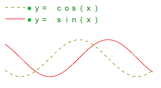
| Sine | sin( ) | sin(2*x) |
| Cosine | cos( ) | cos(2*x) |
| Tangent | tan( ) | tan(2*x) |
| Arcsine, arccosine or arctangent | asin( ), acos( ), atan( ) | y=asin(x-1) |
| Hyperbolic sine, cosine or tangent | sinh( ),cosh( ),tanh( ) | y=sinh(x-1) |
| Hyperbolic arcsine,arccosine or arctangent | asinh( ),acosh( ),atanh( ) | y=asinh(x-1) |
| Constants | ||
| Decimal sign | . | y=1.5*x |
| Natural logarithm base | e | y=e^(x^2-2*x) |
| Pi | pi | y=sin(2*pi*x) |
| Phi (golden ratio) | phi | y=2*phi*x |
| Derivatives | ||
| First derivative | ' | y=(x^2-3*x+4)' |
| Second derivative and higher | multiple ' | y=(sin(2*x+1))" |