 Previous section
 Return to TactileView manual overview
When it comes to tactile graphs, there are several properties that together determine the tactile usability. The three elements in a graph (the equation in braille, grid paper with coordinate system and the curve of the formula) can be configured individually to achieve the optimal tactile result. Personal preferences of the VIP reader as well as the properties of the printer that will be used both need to be taken into account. Therefore we advise you to test the settings described below first to find what works best for you.
Choosing the best graph properties
The mathematical formula(s) and range of the axes are generally the most important elements when you create a new graph. All other aspects of the grid are for tactile presentation purposes. Reading a tactile graph can be complex enough on its own, so choosing the optimal settings for your production method (swellpaper or the type of braille embosser) is important. This works best if you can imagine the result of each setting in advance. The list below gives an overview of all the settings that are related to a tactile graph.
Graph properties
- Coordinate system and grid paper
The coordinate system (the axes of the graph) and grid paper (the regular grid that indicates the values of the graph) form the frame in which the graph will be plotted.
Select ‘Positions and appearance’ from the properties toolbar or context menu of the graph to access the ‘Appearance’ settings for the coordinate system and grid paper.
Coordinate system – X and Y axis
– Line thickness of the axis; thicker axis lines can be used to distinguish the axes more easily from the thinner grid lines, but also take up more space and tear more easily on some embossers.
Grid paper
– Draw border to surround the axis; this places a rectangular frame around the entire grid.
– Style of auxiliary lines for grid boxes; you can choose from: line, cross, dot, dash and none.
– Thickness of the auxiliary lines for grid boxes; use thinner lines to make the grid boxes less prominent for better contrast with the formula lines.
– Relief height of auxiliary lines for grid boxes; you can make the grid lines less prominent and more easily distinguished from the axes and formulas by lowering the line height. This is only available for embossers that support variable dot height.
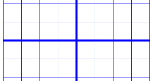
Figure 1. Differences in line thickness are used for easy tactile distinction between the grid boxes and axes.
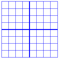
Figure 2. A border is used around the edges of the graph.
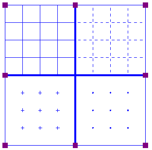
Figure 3. Four different grid box styles: line, dash, cross and dot.
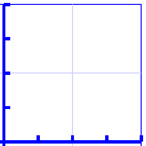
Figure 4. A lower line height, indicated with a lighter blue colour, can be used for easy distinction of the grid boxes.
- X and Y axes
These settings can be adjusted separately for the horizontal (X) and vertical (Y) axis.
– Extreme values for the axis; this determines the range in which the graph is shown.
– Subdivision of the axis: units per grid box and units per tick; you can choose the interval that is used for the grid boxes and ticks along the axis to easily read the values of the graph.
– Ticks per text label; you can choose whether a numeric value should be placed at each tick, more spaced out (e.g. 1 text label for every 2 ticks) or only at the origin/ends.
– Number of decimals of the values along the axis; some graphs might require more decimal numbers.
– Position of the labels relative to the graph’s border; this allows you to create enough space between the grid and value labels along the axis. In the design, you can also drag the purple marker below or left of the values to move them to the required position with the mouse.
– Name for the axis; by default, these are ‘x’ and ‘y’, but you can change this to suit the graph (e.g. ‘Number purchased’ and ‘Price’).
– Horizontal and vertical position of the axis name; these determine the position of the axis name label. In the design, you can drag this label to the required position with the mouse. Double click on a formula label to edit it.
– A thickness of the axes of 0 pixels allows you to produce a formula line without any coordinate system, when only the shape of the mathematical function is important without the corresponding values. For this application, it is best to disable the grid boxes and the border surrounding the graph.
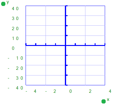
Figure 5. The range for the axes and positions of the ticks, grid boxes and value labels determines the layout of the axes of the graph
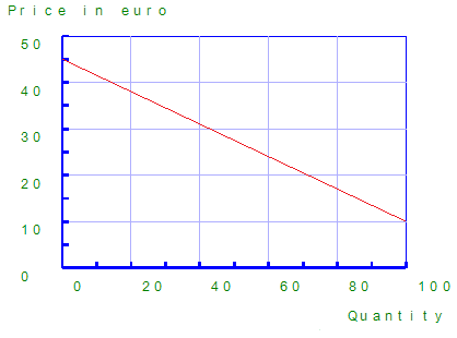
Figure 6. The axes can be labeled individually (X and Y are the default labels).
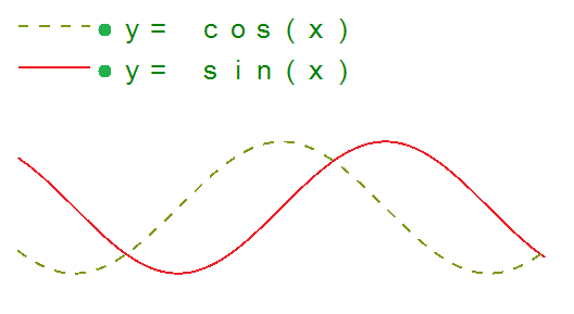
Figure 7. A graph using a thickness of 0 pixels for the axes shows only the formula lines.
- Formula lines
The settings for each formula line that is presented in the graph can be adjusted separately.
– Formula syntax; enter the mathematical equation that will be plotted.
– Text label representation of the formula; the legend above the graph shows which formulas are presented. You can choose from an number of mathematical representations; alternatively, you can choose to enter your own name (e.g. ‘Surface area’) or choose not to include a label.
– Line style for the formula; by default, each formula gets a different tactile line style to distinguish multiple formulas in a graph. This line style is also presented in the formula legend above the graph. Different colours are used on screen for easy visual recognition.
– Position of the text label; by default, the text labels for the formulas are placed above the graph. In the design, you can also move these with the mouse.
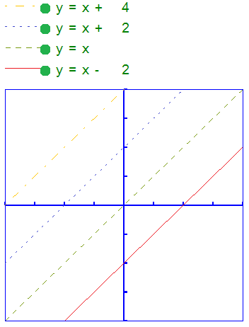
Figure 8. Different line styles are used for the formulas in the graph, as signified in the fomula legend. Different colours are used on screen to easyly distinguish the formulas visually.