Skip NavigationMenu

8.01 Introduction on mathematical notations

Equations for sighted users are usually written in a spatial arrangement, in such a way that the components and their relations can be understood from their relative positioning. For example, a division is depicted by placing the dividend above the divisor, separated by a horizontal division line.

For printing in braille, this spatial arrangement has to be converted into a continuous line of braille characters. Mathematical symbols such as (large) brackets, square roots and many other non-day-to-day symbols have to be converted as well.

Mathematical notations and braille tables

Since computers began to play a role in math and science, it has become even more a necessity to find an unambiguous way of presenting the results (in braille as well). Many of the equation editors use MathML as their universal language to store and manipulate mathematical equations. This language is also used to add equations to your design in TactileView.

In order to get the correct equation printed in braille, a 2-step conversion is required: applying mathematical notation rules and applying a braille table to translate the characters into the corresponding braille dots.

Conversion from equation in MathType

Figure 1. Conversion from an equation in MathType to a mathematical text label in TactileView, by applying the chosen mathematical notation (in this case LaTeX) and braille table (en-us-comp8.ctb).

A math notation applies a set of rules that convert the spatial elements from the graphical lay-out (MathML) into a continuous line of text. Extra characters need to be inserted to indicate the relationship of the parts, to depict special mathematical symbols or to signify the logical order of the elements. Amongst other, the Nemeth, Unified English Braille, LaTeX, Marburg and Dedicon are some of the better known math notations and are available in TactileView.

The result of the first conversion step is that the equation has become readable as text in a linear instead of a spatial arrangement. During the second step, a ‘braille translator’ (in TactileView, the open source project LibLouis is used) applies the desired braille table to convert the linear text of the equation into the corresponding braille characters.

Keyboard entry of mathematical formulas

When entering a mathematical formula in TactileView, it is important to use the correct syntax for text-only mathematical notation on a computer. The spatial arrangement of the elements in a mathematical expression has to be entered using a combination of specific symbols and applying parenthesis where necessary. The list below gives an overview of which mathematical elements are supported for use in formulas in TactileView. The examples show how to apply and combine these elements.

Mathematical element or function Symbol Example
Separation between multiple formulas ; y=
Formula parameter x y=x
Operators
Addition + y=x+1
Subtraction - y=x-3
Multiplication * y=2*x
Division / y=x/3
Exponentiation ^ y=2^x
Parentheses ( ) y= (x+2)/(x-3)
Functions
Absolute value abs( ) y=abs(x+2)
Square root sqrt( ) y=sqrt(2*x)
Natural logarithm with base e ln( ) y=ln(x-1)
Logarithm with base 10 log( ) y=log(x+1)
Exponent with base e exp( ) y=exp(x^2-2*x)
Sine sin( ) sin(2*x)
Cosine cos( ) cos(2*x)
Tangent tan( ) tan(2*x)
Arcsine, arccosine or arctangent asin( ), acos( ), atan( ) y=asin(x-1)
Hyperbolic sine, cosine or tangent sinh( ),cosh( ),tanh( ) y=sinh(x-1)
Hyperbolic arcsine,arccosine or arctangent asinh( ),acosh( ),atanh( ) y=asinh(x-1)
Constants
Decimal sign . y=1.5*x
Natural logarithm base e y=e^(x^2-2*x)
Pi pi y=sin(2*pi*x)
Phi (golden ratio) phi y=2*phi*x
Derivatives
First derivative ' y=(x^2-3*x+4)'
Second derivative and higher multiple ' y=(sin(2*x+1))"

8.02 Text label – Math input (equation in braille)

Currently, there are three options for entering a mathematical text label in your TactileView design:

  1. Enter the equation in a regular text label, using the corresponding braille table;
  2. Use six-key entry (braille keyboard) to directly enter the math in braille;
  3. Enter the mathematical expression using a math editor (MathType).

Options 1 and 2 require knowledge about the mathematical braille notation you are using in order to enter the equation correctly. Option 3 allows you to enter math and convert it automatically to the desired notation in braille, but this requires MathType as a math editor. In the upcoming service release, a fourth method will be included, which allows you to enter the equation in linear notation and have it converted automatically (i.e. this will not require knowledge of the braille notation or a mathematical editor).

1. Using a regular text label

When you know the rules of the mathematical braille notation you wish to use, you can use a regular text label to enter it in your design. Select ‘Add text label’ from the drawing tools icon bar, then select ‘Text and position: computer keyboard input’ from the properties toolbar. Click in the design where you want to place the equation. Make sure to include the correct spaces, parentheses and other specific aspects of the mathematical notation. MathType is required when you wish to use symbols that are not on your keyboard.

Next, make sure to select the correct braille table for the notation you are using. You can select the braille table by choosing ‘Select braille table’ from the properties toolbar or context menu. The following braille tables are recommended for the different mathematical notations:

  • nemeth.ctb for Nemeth;
  • ukmaths.ctb for UKmaths;
  • marburg.ctb for Marburg notation;
  • en-us-comp8.ctb or similar for LaTeX;
  • Dutch braille table for Dedicon notation.

‘Add text label’ icon: Icon for placing a text label
‘Computer keyboard input’ icon: Icon for computer keyboard input
‘Select braille table’ icon: Select braille table icon

2. Using six-key entry

If you know the mathematical braille code and wish to simply use braille keyboard (six-key) entry for direct input of the desired characters, please refer to the ‘Different types of text labels‘ section for instructions on adding text labels through six-key entry.


‘Braille keyboard input’ icon: Icon for braille keyboard input

3. Equation with math editor (MathType)

You can use MathType as a math editor to automatically convert the entered equation to the desired braille notation. The math editor is also required to enter math that is too complex to be entered in linear format or when symbols are required that are not available on the keyboard. For more information on using MathType to enter mathematical expressions, please visit their website.

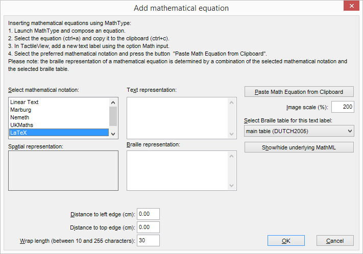
Once you have entered the equation in MathType, select it and copy it to the clipboard (Ctrl+C). Switch to TactileView, select ‘Add text label’ and choose ‘Text and position: math input’ from the properties toolbar. Click in the design where you wish to position your mathematical label.

In the dialog that appears, select the preferred mathematical notation and click on ‘Paste math equation from clipboard’. The equation will now be displayed in both visual (linear and spatial) and braille format.

The dialog also allows you to adjust the location in which you would like to insert the label (if different than where you originally clicked in the file) by filling in the distance fields. You can size the label by specifying the maximum number of characters you would like it to have before the text wraps to the next line. Choose ‘OK’ to confirm and close the dialog.

Mathematical text labels may be moved and edited the same as other text labels. For more information, please refer to the ‘Editing text labels‘ section.


‘Math input’ icon: Icon for math input

Mathematical text label in a TactileView design

Figure 1. A mathematical equation in TactileView; LaTeX and en-us-comp8.ctb were used as mathematical notation and braille table.

8.03 Graph properties for best tactile usability

When it comes to tactile graphs, there are several properties that together determine the tactile usability. The three elements in a graph (the equation in braille, grid paper with coordinate system and the curve of the formula) can be configured individually to achieve the optimal tactile result. Personal preferences of the VIP reader as well as the properties of the printer that will be used both need to be taken into account. Therefore we advise you to test the settings described below first to find what works best for you.

Choosing the best graph properties

The mathematical formula(s) and range of the axes are generally the most important elements when you create a new graph. All other aspects of the grid are for tactile presentation purposes. Reading a tactile graph can be complex enough on its own, so choosing the optimal settings for your production method (swellpaper or the type of braille embosser) is important. This works best if you can imagine the result of each setting in advance. The list below gives an overview of all the settings that are related to a tactile graph.

Graph properties

  1. Coordinate system and grid paper

The coordinate system (the axes of the graph) and grid paper (the regular grid that indicates the values of the graph) form the frame in which the graph will be plotted.
Select ‘Positions and appearance’ from the properties toolbar or context menu of the graph to access the ‘Appearance’ settings for the coordinate system and grid paper.

Coordinate system – X and Y axis

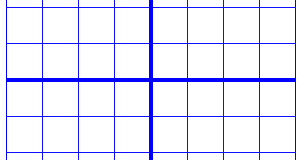
– Line thickness of the axis; thicker axis lines can be used to distinguish the axes more easily from the thinner grid lines, but also take up more space and tear more easily on some embossers.

Grid paper

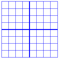
– Draw border to surround the axis; this places a rectangular frame around the entire grid.

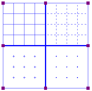
– Style of auxiliary lines for grid boxes; you can choose from: line, cross, dot, dash and none.

– Thickness of the auxiliary lines for grid boxes; use thinner lines to make the grid boxes less prominent for better contrast with the formula lines.

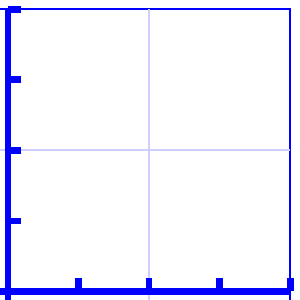
– Relief height of auxiliary lines for grid boxes; you can make the grid lines less prominent and more easily distinguished from the axes and formulas by lowering the line height. This is only available for embossers that support variable dot height.


The axes are thicker than the grid box lines for easy distinction.

Figure 1. Differences in line thickness are used for easy tactile distinction between the grid boxes and axes.

The ends of the graph are indicated by the bounding border

Figure 2. A border is used around the edges of the graph.

Four different grid box styles: lines, dashed lines, crosses and dots

Figure 3. Four different grid box styles: line, dash, cross and dot.

A lower relief height can be used for the grid boxes when supported by the embosser.

Figure 4. A lower line height, indicated with a lighter blue colour, can be used for easy distinction of the grid boxes.

  1. X and Y axes

These settings can be adjusted separately for the horizontal (X) and vertical (Y) axis.

– Extreme values for the axis; this determines the range in which the graph is shown.

– Subdivision of the axis: units per grid box and units per tick; you can choose the interval that is used for the grid boxes and ticks along the axis to easily read the values of the graph.

– Ticks per text label; you can choose whether a numeric value should be placed at each tick, more spaced out (e.g. 1 text label for every 2 ticks) or only at the origin/ends.

– Number of decimals of the values along the axis; some graphs might require more decimal numbers.

– Position of the labels relative to the graph’s border; this allows you to create enough space between the grid and value labels along the axis. In the design, you can also drag the purple marker below or left of the values to move them to the required position with the mouse.

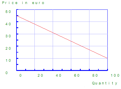
– Name for the axis; by default, these are ‘x’ and ‘y’, but you can change this to suit the graph (e.g. ‘Number purchased’ and ‘Price’).

– Horizontal and vertical position of the axis name; these determine the position of the axis name label. In the design, you can drag this label to the required position with the mouse. Double click on a formula label to edit it.

– A thickness of the axes of 0 pixels allows you to produce a formula line without any coordinate system, when only the shape of the mathematical function is important without the corresponding values. For this application, it is best to disable the grid boxes and the border surrounding the graph.


The range for the axes and positions of the ticks, grid boxes and value labels determines the layout of the axes of the graph

Figure 5. The range for the axes and positions of the ticks, grid boxes and value labels determines the layout of the axes of the graph

The axes can be labeled, such as 'Quantity' and 'Price in euro'

Figure 6. The axes can be labeled individually (X and Y are the default labels).

Graph without coordinate system, showing only the formula lines

Figure 7. A graph using a thickness of 0 pixels for the axes shows only the formula lines.

  1. Formula lines

The settings for each formula line that is presented in the graph can be adjusted separately.

– Formula syntax; enter the mathematical equation that will be plotted.

– Text label representation of the formula; the legend above the graph shows which formulas are presented. You can choose from an number of mathematical representations; alternatively, you can choose to enter your own name (e.g. ‘Surface area’) or choose not to include a label.

– Line style for the formula; by default, each formula gets a different tactile line style to distinguish multiple formulas in a graph. This line style is also presented in the formula legend above the graph. Different colours are used on screen for easy visual recognition.

– Position of the text label; by default, the text labels for the formulas are placed above the graph. In the design, you can also move these with the mouse.


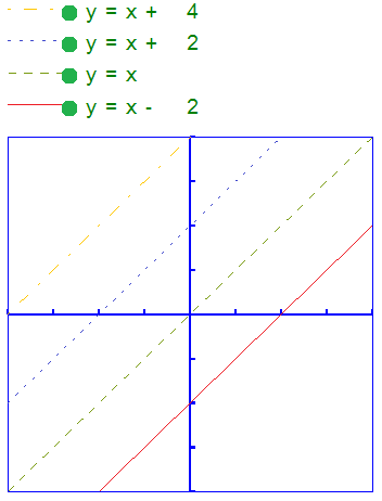
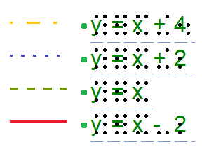
Different line styles are used for the formulas in the graph, as signified in the fomula legend.

Figure 8. Different line styles are used for the formulas in the graph, as signified in the fomula legend. Different colours are used on screen to easyly distinguish the formulas visually.

8.04 Creating a graph

TactileView offers a very powerful graphing feature, which allows you to enter formulas and have them graphed over a specified range. TactileView gives you precise control over the styles used in your graph for the functions, axes, gridlines, labels and more. You can also move and resize your graph like any other drawing object.

There are several possible approaches of creating a new graph. You can choose an empty grid as a basis (see paragraph 1), select one of the TactileView graph examples and adapt it to form your own (see paragraphs 2 and 3), or create a new graph based on the entered formula (see paragraphs 4 and 5). You can also save any graph as ‘MyGrid’ for reuse in later designs (see section ‘Save graph as MyGrid for later use’).

You can read an overview of all the tactile properties that determine the tactile usability of a graph in the ‘Graph properties’ section. For more information on the different mathematical notations in braille, read the ‘Introduction on mathematical notations‘ section.

1. Coordinate system (no functions)

To enter an empty coordinate system (empty grid paper without any graphed formulas), select ‘Draw graph’ from the drawing tools icon bar, then choose ‘Coordinate system (no functions)’ from the properties toolbar. This option can also be found in the Graphs menu.

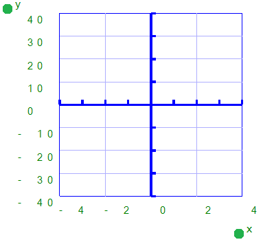
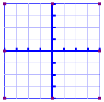
Once this option is selected, an empty grid will appear in the design. By default, this grid is square and ranges from -4 to 4 on both the x- and y-axis, with straight grid lines at an interval of 1 unit. You can use the options in the properties toolbar or context menu to adjust the properties of the grid or add a graphed formula.


Coordinate system (no functions) icon: Coordinate system (no functions) icon

Empty grid ranging from -4 to 4 along both axes.

Figure 1. Empty grid inserted in a TactileView design.

2. Functions and formulas (examples)

TactileView includes two sets of ready to use example grids. These have already been optimized to depict the selected formula. You can use these graphs as a basis for your own by simply changing the formula(s).

Select ‘Draw graph’ from the drawing tools icon bar, then choose ‘Functions and formulas (examples)’ from the properties toolbar. Alternatively, this option can also be found in the Graphs menu.

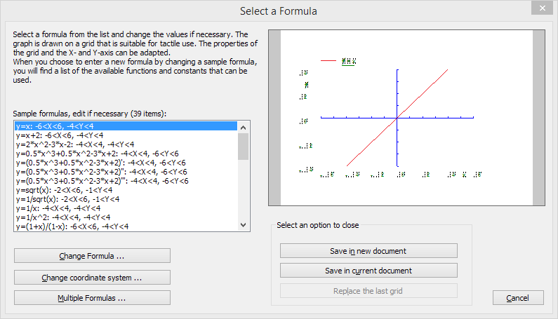
In the dialog that appears you will find a list of sample graphs which each include one formula, ranging from simple to more complex. By choosing ‘Change formula’, you can edit the formula to create your own graph based on the sample. ‘Change coordinate system’ allows you to adjust the settings for the grid style and properties of the axes (such as the range). Use ‘Multiple formulas’ to add extra formulas to the grid (for more information on including multiple formulas in one grid, read the ‘Graphing multiple lines’ section).

Once you have selected a sample graph or when you are satisfied with the adjustments, you can choose to insert the graph a blank new document (click ‘Save in new document’) or place it in the currently active document (click ‘Save in current document’). You can also choose to replace the most recent grid in the current document (click ‘Replace the last grid’).


‘Functions and formulas (examples)’ icon: Functions and formulas (examples) icon

Functions and formulas dialog

Figure 2. ‘Functions and formulas (examples)’ dialog; click on the image to enlarge.

3. Grids and graphs (advanced examples)

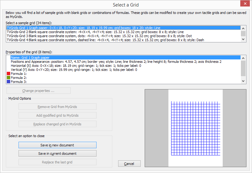
Similar to ‘Functions and formulas’, the ‘Grids and graphs’ dialog contains a list of sample grids that can be used as is, or adapted to create your own grids. The list contains a number of variations of empty grids, as well as a list of grids that contain one or more formulas (arranged from simple to more complex). These examples are labelled as numbered TVGrids. Below these TVGrids, you will find any grids that were saved for reuse as MyGrids.

You can access this list of sample grids by selecting ‘Draw graph’ from the drawing tools icon bar, then choosing ‘Grids and graphs (advanced examples)’ from the properties toolbar. Alternatively, this option can also be found in the Graphs menu.

The list of properties of the selected sample graph is shown in the second list box. If you wish to adjust any of the settings, select it from this list and click ‘Change properties’.

If you have selected one of the MyGrids from the list, you have the option to remove it from the list of saved grids. When you have adjusted the selected MyGrid, you have the option to either save it as a new MyGrid or replace the edited MyGrid.

Once you have selected a sample graph, MyGrid or when you are satisfied with the adjustments, you can choose to insert the graph a blank new document (click ‘Save in new document’) or place it in the currently active document (click ‘Save in current document’). You can also choose to replace the most recent grid in the current document (click ‘Replace the last grid’).


‘Grids and graphs (advanced examples)’ icon: Grids and graphs (advanced examples) icon

Grids and graphs dialog

Figure 3. ‘Grids and graphs (advanced examples)’ dialog; click on the image to enlarge.

4. Add custom graph: equation editor

This option allows you to create a graph based on a formula that is entered using MathType as an equation editor. The math editor is also required to enter math that is too complex to be entered in linear format or when symbols are required that are not available on the keyboard. For more information on using MathType to enter mathematical expressions, please visit their website.

Once you have entered the equation in MathType, select it and copy it to the clipboard (Ctrl+C). Make sure that the entered formula is suitable for conversion to a graph. Next, switch to TactileView and select ‘Draw graph’ from the drawing tools icon bar, then choose ‘Add custom graph: equation editor’ from the properties toolbar. Alternatively, this option can also be found in the Graphs menu.

In the dialog that appears, select the preferred mathematical notation and click on ‘Paste math equation from clipboard’. The equation will now be displayed in both visual (linear and spatial) and braille format. Choose ‘OK’ to confirm.

In the formula dialog that appears, the options below the formula as well as the buttons ‘Positions and appearance’, ‘Horizontal (x) axis’ and ‘Vertical (y) axis’ allow you to adjust all the grid properties, formula labels, line style and axis properties; you can read an overview in the ‘Graph properties’ section. Use the ‘Apply’ button to refresh the graph preview after you have made any changes to the graph.

Once you are satisfied with the composed graph, select ‘OK’ to close the dialog and insert the graph in the design.


‘Add custom graph: equation editor’ icon: Add custom graph: equation editor icon

Add custom graph: equation editor dialog

Figure 4. ‘Add custom graph: keyboard input’ dialog; click on the image to enlarge.

5. Add custom graph: keyboard input

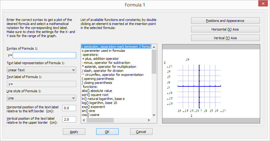
When you activate ‘Add custom graph: keyboard input’ from the Graphs menu or from the properties toolbar of ‘Draw graph’, a formula dialog will open. Enter the formula in the first entry field, making sure to use the correct syntax (e.g. 2*x instead of 2x, x^2 for x squared, etc.) similar to entering an equation in software such as Microsoft Excel. You can also select elements from the list of available functions and constants and insert them into the formula by double clicking on it or pressing the Enter key.

Once again, the options below the formula as well as the buttons ‘Positions and appearance’, ‘Horizontal (x) axis’ and ‘Vertical (y) axis’ allow you to adjust all the grid properties, formula labels, line style and axis properties; you can read an overview in the ‘Graph properties’ section. Use the ‘Apply’ button to refresh the graph preview after you have made any changes to the graph.

Once you are satisfied with the composed graph, select ‘OK’ to close the dialog and insert the graph in the design.


‘Add custom graph: keyboard input’ icon: Add custom graph: keyboard input icon

Add custom graph: keyboard input dialog

Figure 5. ‘Add custom graph: keyboard input’ dialog; click on the image to enlarge.

8.05 Graphing multiple lines

TactileView provides the ability to graph four or more formulas at the same time. In the ‘Creating a graph‘ section you can read how to prepare a graph with a single formula, to which you can add additional formulas as described below.

Adding a formula

Select the graph in your design to which you wish to add a formula. Similar to creating a new graph, when adding a formula you need to choose which input method you want to use: you can either enter the formula with MathType as an equation editor, or use the keyboard to enter the formula. From the properties toolbar or context menu of the selected graph, choose ‘Add function: keyboard input’ or ‘Add function: equation editor’. In the dialog that appears, you can enter your new formula in the same way as when you created the graph.

Notice that by default a dashed line style is selected to distinguish the different formulas from each other, but you can change this to Line, Dot or Long/Short Broken if you wish. It is recommended to choose a different line style for each formula you enter. The legend above the graph shows which formula corresponds with which line style. On screen, four different colours are used to easily distinguish between the formulas.

You can apply any changes in the graph preview on the right side of the dialog at any time by choosing the ‘Apply’ button. When you are satisfied with the selected options for the new formula dialog, choose the ‘OK’ button to save your changes, close the dialog and update your graph. In the properties toolbar you will see that the icon for ‘Formula 2’ is no longer greyed out, indicating that a second formula is present in the graph.

You can add a third or fourth formula by following this same process after selecting the graph and choosing ‘Add function: keyboard input’ or ‘Add function: equation editor’ from the properties toolbar or context menu. If you wish to include more than four formulas, you will need to add the remaining formulas to one of the first four, seperated by a semicolon: e.g. sin(x^2);cos(x^2). These will be plotted as seperate lines, but with the same line style and other properties.


‘Add function: keyboard input’ icon: Add function: keyboard input icon
‘Add function: equation editor’ icon: Add function: equation editor icon
‘Formula 1-4’ icons: Formula 1 to 4 icons

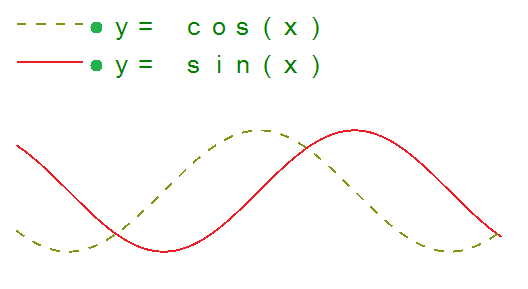
Different line styles such as dashed or dotted lines are used to distinguish different formulas in a graph.

Figure 1. Different line styles, such as dashed or dotted lines, are used to distinguish different formulas in a graph; on screen, colours are used to signify these differences.

8.06 Saving grids as MyGrids

The example grids (empty grid paper as well as graphs) are called TVGrids. These examples can be modified to use them as the basis for your own graphs. Any grid can be added to this list by saving them as MyGrids. This allows you to easily store them for later use. You can find your saved MyGrids below the list of TVGrids in ‘Grids and graphs (advanced examples)’.

You can save a selected grid as MyGrid by selecting ‘Add to MyGrids’ from the properties toolbar or context menu. Enter agrid name as a reference, then click ‘Yes’ to save the grid.

‘Add to MyGrids’ icon: Add to MyGirds icon

Menu Graphs – Update MyGrids

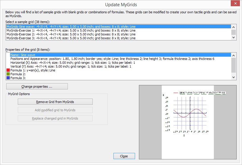
If you wish to modify or remove any of the saved MyGrids, select ‘Update MyGrids’ from the Graphs menu and select one from the list.

To modify a MyGrid, select ‘Change properties’ to make the desired changes. After you have applied the changes, you can choose to save the modified grid as a new MyGrid by selecting ‘Add modified grid to MyGrids’ or overwrite the existing one by choosing ‘Replace changed grid in MyGrids’. You can also choose to delete one of the MyGrids from the list by selecting ‘Remove grid from MyGrids’.


Update MyGrids dialog

Figure 1. The ‘Update MyGrids’ dialog allows you to edit the list of saved graphs; click on the image to enlarge.