Skip NavigationMenu

2.05 Free demonstration mode

For a free trial version of the software, you can simply download TactileView for free and install it on your computer (requires administrator rights). This allows you to use the software in demonstration mode without registration and to explore the great features in the software for creating tactile graphics. In demonstration mode, all software features are available. The only restrictions will be that printed designs will contain watermarks and files cannot be saved.
Download icon

To download the free trial version of TactileView, click here.

Configuration for demonstration mode
After launching the software for the first time, the configuration wizard will automatically guide you through the most important settings. To start using TactileView in demonstration mode, you can skip step 1 of 4 in the wizard. We strongly advise you to take the time to go through the remaining three steps, which present you with the settings that will give you the optimal user experience. You can revisit these and other setting via the Settings menu.

Read more about the Configuration wizard >

Upgrading to a full software version
After having played with the software, we hope you like it so much so you will contact one of our dealers or buy your licence in the Thinkable webshop.

9.01 Inserting graphics in Duxbury Braille Translator (DBT)

When you have both TactileView 2.200 or higher, and Duxbury Braille Translator (DBT) 11.3 or higher installed, you will be able to insert a TactileView design into a text in DBT. This produces a document containing both text and graphics. You can choose to add a completely new design or use an existing file. The available space for the image will automatically be taken into account.

For TactileView version 2.250 or higher, an update is required for DBT to support high resolution graphics for Index V4 and V5 embossers. Select ‘Check for Updates’ from the Help menu in DBT to download and install this update.

If you do not have DBT installed yet, please visit their website.

1. Preparing DBT document
Launch DBT, create a new document and add the text in which you wish to insert tactile graphics. You can find more information on working in DBT, creating files and producing the correct braille translation on their website.

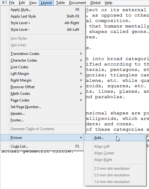
2. Inserting existing images
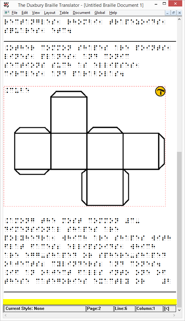
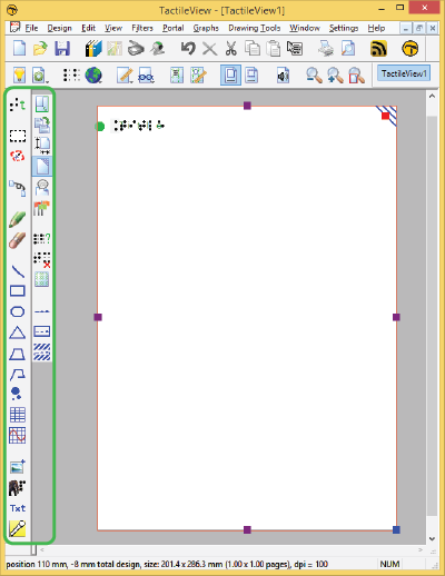
In order to insert a design, move the caret to the position in the DBT text where you want to insert an image. Select Layout > Picture > Add.., then select the desired TactileView design (.bpx file) and click Open. The tactile image is now inserted in the DBT text file. The small yellow logo in the upper right corner of the image indicates that the graphic was created in TactileView.

Adding a TactileView design in DBT: choose Layout > Picture > Add...

3. Image positioning
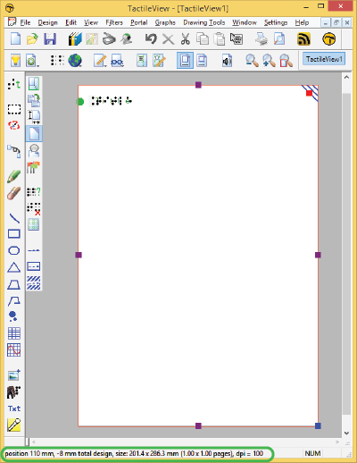
You can choose to insert an image either before or after translation of the braille document (ctrl+T). Either way, the amount of space needed on the page for the image is automatically taken into account. If the image is too large to fit on the current page, it will be placed at the top of the following page. Any empty white space around the edges of the TactileView design will be removed automatically for optimal use of space. For the best results, make sure that the same embosser and paper size are selected in TactileView and DBT. In TactileView, the red border indicates the available printable area for the selected combination of embosser and paper size.

Image inserted in DBT

4. Editing inserted images
If you wish to edit the inserted tactile graphics, simply double click on the image in DBT. This will launch the TactileView software, in which you can make any desired adjustments. Once you are satisfied, you can save the changes by clicking on the ‘Insert design in external text file’ icon in the top right corner of the canvas area, or select File > Insert design in external text file.

Icon for Insert design in external text file: Icon for returning to DBT

5. Removing images
You can remove inserted images by moving the caret position right after the image and pressing backspace, or delete with the caret just before the image.

6. Printing combined text and graphics files
An embosser that supports printing tactile graphics is required for printing the DBT file containing the images. In TactileView, you can see a preview of the graphic output of the selected embosser by selecting menu View > Design mode: dot view, or by viewing the print preview.

3.01 Software window elements

After launching TactileView, the software window will contain the following sections that provide all available functionality and allow you to operate all the functions in the software.

Drawing area

In the centre of the TactileView window you can find the drawing area of the design. The drawing area is surrounded with a red border, indicating the size of the printable area on the selected paper size for the selected printer. Some printers have larger margins along the edges of the paper that cannot be printed, resulting in a smaller area within the red border compared to other printers.
The white area shows the actual size of the contents of your design. The size of the contents can be increased in size both horizontally and vertically to span multiple pages. If the white area does not fit within the red border of the printable area, you can reduce the size to make it fit within the page(s) using the purple markers on the four sides. The blue marker in the lower right corner is used to scale the entire design.
All software functions are situated around this drawing area.

Design area

Figure 1. Drawing area highlighted in green.

Top section: menus and horizontal icon bars

Above the drawing area, you can find three elements: the software menus, two horizontal icon bars and the names of the opened documents. The top row of icons are general functions for the software, whereas the second row contains functions related to the design that you are working on in the drawing area. In some icons, a small arrow indicates that there is a dropdown toolbar with additional options. Most icons will depict the function that they represent. To get more information, your can hover over the icon with the mouse. Tooltips in your selected language will be displayed, explaining which function will be activated when you click on the icon.

Menus, horizontal toolbars and files names

Figure 2. Menus, horizontal icon bars and file names.

Left section: vertical icon bars

On the left hand side you can find two vertical icon bars. The leftmost vertical icon bar contains all the drawing tools to create graphics or modify the content of your design. By selecting one of these tools and clicking in the drawing area, different objects can be placed.
The right vertical icon bar will show the range of properties for the current selection. This can either be the drawing tool selected from the left toolbar, or the object in the design that has the focus. You can (re)select an object by clicking on it in the design area.
Once again, tooltips will explain which functions are represented by the icons in the vertical toolbars.

Vertical toolbars

Figure 3. Vertical icon bars give access to the drawing tools and the options for the selected tool or element in the design.

Bottom section: status line

Below the drawing area you will find the status line, showing mouse position, dimensions, etc. for the selected drawing tool or object in the design.

Status bar

Figure 4. Status bar near the bottom of the software window gives information about the selected element or drawing tool.

6.13 Editing object properties

The drawing tools for placing objects described in the previous manual sections, allow you to place objects by clicking and dragging in the drawing area. The blue colour will indicate that an element in the design is an object. Below, you can find the common properties that are shared by these objects in TactileView.

Properties in right vertical icon bar

As soon as the drawing tool is activated in the left icon bar, or when the object is placed or is selected in the design, the properties icon bar for that selection will appear. For most objects, the first icon in this bar allows you to determine the size and position by entering the values via edit fields.

‘Size and position’ icon: Size and position icon


Resizing objects (all object types)

Purple markers can be found on the corners and along the sides of the object. By dragging the markers on one of the four sides, you can adjust the width or height. For example, a square will become a rectangle. The markers in all four corners will scale the entire shape (both the width and height) maintaining the same aspect ratio.

For polygons and freehand lines, a red dashed box will appear around the object. The markers on the corners and sides of this box can be used to resize the entire object. The purple markers on the corners of the polygon or anchor points of the line are used to adjust the shape of the object.

Alternatively, all objects can be resized by selecting ‘Size and position’ (or similar) from the context menu or properties toolbar. In the ‘Size’ section of the dialog, choose the ‘Enlarge/Reduce’ radio button if you want to scale the entire object, or ‘Stretch’ to independently adjust the width and size without retaining their ratio. Next, specify the desired width or height and choose ‘OK’ to resize the object.

Resizing a square with the mouse

Figure 1. Resizing a square using the purple markers.

Moving objects (all object types)

You can move objects by holding the left mouse button and dragging it to another position, as indicated by the four-way arrow cursor. A green line will indicate the distance over which the object has moved. For more precise placement, you can use the arrow keys to move the object by 1 pixel or Shift+arrow keys for steps of 10 pixels.
Alternatively, select ‘Size and position’ (or similar) from the properties toolbar or context menu of an object to enter the position values via the ‘Size and position’ dialog. Enter the position relative to the top left corner of the design and click ‘OK’ to reposition the object.

Two additional functions in the properties toolbar help you to position an object in a specific way: you can either choose to horizontally centre it in the design, or only move it horizontally, vertically or diagonally (alternative: hold shift while moving the object).

Moving an object with the mouse

Figure 2. The green line indicates the moved distance when moving an object with the mouse.

‘Centre’ icon: Centre icon
‘Restrict to horizontal, vertical or diagonal movement’ icon: Move horizontally vertically diagonally icon

Rotation

The object can rotate over 360 degrees. Scrolling with the mouse while holding down the Shift key will rotate per 5 degrees, or use Shift+Ctrl+mouse wheel for more accurate rotation per degree. You can also set the rotation to a certain value by choosing the ‘Rotation’ icon and entering the angle in the dialog that appears.

‘Rotation’ icon: Rotation icon


Line style part 1: Solid and dashed lines

The outer border of the object will be a solid line of a certain (narrow) thickness. The line style will allow for a variation in pattern, thickness and texture for the border. Choose ‘Line style’ from the properties toolbar, then select your style elements from the dialog.

To change the line style, select the object and choose ‘Line style’ from the properties tool bar or context menu. In the dialog that opens, you can set the line properties for the object, including the line pattern (solid or dashed) and thickness in pixels. The dialog includes a preview of how your line will look as you make changes. Choose ‘OK’ to apply your changes to the object and close the dialog.

Keep in mind that thicker lines do not always benefit the tactile usability of your design; it is best to experiment which line styles work best for your embosser or printer.

Two squares with different line styles. The left one has a solid line, whereas the right square has a dashed line style.

Figure 3. Squares with different line styles: continuous lines (default) or dashed line style.

‘Line style’ icon: Line style icon


Line style part 2: Line textures

Besides solid and dashed line styles, you can also apply different line textures to the object outline. These incluse a series of waves, zigzag lines, double lines and various other patterns. To apply a line texture to the object, first choose ‘Line style’ from the properties toolbar or context menu. In the dialog, set the radio button under ‘Line texture’ to ‘Apply line texture’. Next, click the button ‘Choose texture’ to select the specific line texture you wish to use.

Most line textures require a sufficiently large line thickness to feel the characteristics of the pattern. The tactile result may vary for each embosser model or type of swellpaper, so it is advisable to experiment with different textures and sizes to get a feel for which settings work best for your embosser or printer.

Squares, triangles and polygons have straight lines that meet at the corners. Depending on the length of the line segment, the line pattern repeats a certain number of times and starts again on the next line segment. This means that the line pattern of the two line segments may not always join exactly in the corners. This effect is more prominent with some patterns but less noticeable in others.

Squares with varying line styles: zigzag, block wave, triple line and wave

Figure 4. Wave line texture applied as the line style for a square.

Surface properties part 1: Fill style – Texture

The Fill style will give you a wide variety of textures that add a tactile pattern in to the surface of the object. The pattern can be selected based on the preview. The patterns are made of repeated tiles. The tile size can be set to determine the fineness of the texture. The pattern can have its own rotation within the object, independent from the position and rotation of the object. This enables even more variation in textures, as the same texture can be used in various rotations, giving a different tactile experience.

In the dialog that opens you can set the fill properties, including selecting the fill texture style as well as its size and rotation angle.

If you wish to add a fill texture to the selected object, select the object and choose ‘Fill style: texture’ from the properties toolbar or context menu. In the dialog that opens, select the ‘Use texture fill’ radio button. Next, click on the ‘Choose texture’ button to open the list of available textures. Choose a texture from the list and click ‘OK’ to confirm. A preview of the chosen texture appears in the ‘Fill style’ dialog.

Use the ‘Tile size’ and ‘Texture rotation angle’ edit boxes to scale and rotate the texture. The relief height of the texture as well as the surface area in between can be adjusted when supported for the selected embosser. When you are finished making changes, choose ‘OK’ to apply the fill style.

Two squares with different fill styles. The left square has no fill style (default), whereas the right square has diagonal lines as a fill style.

Figure 5. Squares with different fill styles: no fill style (default) and diagonal lines.

‘Fill style: texture’ icon: Icon for Fill style: texture

Surface properties part 2: Transparency

The transparency of an object determines whether or not it will cover underlying object. In case the object is transparent, only the border is visible. All parts of the design that are overlapped by the object are still visible.

In case the object is non-transparent, all that is inside the object is covered by the white inner surface of the non-transparent object. Keep in mind that non-transparent objects might (completely) cover other elements in the design. You can change the order in which they are presented to determine which one is on top of the other.

See also: ‘Transparency and object stacking

‘Make object transparent’ icon: Make transparent icon
‘Make object non-transparent’ icon: Make non-transparent icon

Surface properties part 3: Fill style – colour

For production of the design on swellpaper, objects can have a colour as well. Select the desired colour from the dialog ‘Fill style: Colour’. Keep in mind that most embossers do not support printing in (coloured) ink, so this function does not apply to production with braille only.

‘Fill style: colour’ icon: Fill style colour icon


Audio information

The ‘Audio style’ function is used to add audible information to an object, giving the object an extra ‘layer’ of information. This layer consists of a text that is pronounced by a speech synthesizer (TTS). This functionality is used to create an audio-tactile diagram and can be explored using the TactileView ClickPad or TactiPad combined with the TactileView digital pen.

See also: ‘Using audio styles

‘Audio style’ icon: Audio style icon

Relief height

The relief height for the outline, surface and texture of objects can be selected separately. Keep in mind that this functionality is only available in the properties toolbar when using an embosser that supports variable dot height.

See also: Using variable relief height

‘Relief height: line, surface and texture’ icons: Relief height line icon Relief height surface icon Relief height texture icon


Deleting objects

You can delete the entire object by selecting ‘Delete’ in the properties toolbar or context menu, or by using the Delete key. When you only want to remove parts of an object, you first have to fuse it with the bitmap (Ctrl+B or ‘Fuse with bitmap’ from the properties toolbar or context menu). After this you can use the eraser tool to remove parts from the object.

‘Delete’ icon: Delete icon