Skip NavigationMenu

3.01 Software window elements

After launching TactileView, the software window will contain the following sections that provide all available functionality and allow you to operate all the functions in the software.

Drawing area

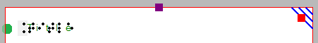
In the centre of the TactileView window you can find the drawing area of the design. The drawing area is surrounded with a red border, indicating the size of the printable area on the selected paper size for the selected printer. Some printers have larger margins along the edges of the paper that cannot be printed, resulting in a smaller area within the red border compared to other printers.
The white area shows the actual size of the contents of your design. The size of the contents can be increased in size both horizontally and vertically to span multiple pages. If the white area does not fit within the red border of the printable area, you can reduce the size to make it fit within the page(s) using the purple markers on the four sides. The blue marker in the lower right corner is used to scale the entire design.
All software functions are situated around this drawing area.

Design area

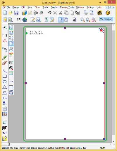
Figure 1. Drawing area highlighted in green.

Top section: menus and horizontal icon bars

Above the drawing area, you can find three elements: the software menus, two horizontal icon bars and the names of the opened documents. The top row of icons are general functions for the software, whereas the second row contains functions related to the design that you are working on in the drawing area. In some icons, a small arrow indicates that there is a dropdown toolbar with additional options. Most icons will depict the function that they represent. To get more information, your can hover over the icon with the mouse. Tooltips in your selected language will be displayed, explaining which function will be activated when you click on the icon.

Menus, horizontal toolbars and files names

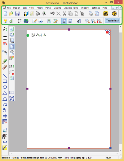
Figure 2. Menus, horizontal icon bars and file names.

Left section: vertical icon bars

On the left hand side you can find two vertical icon bars. The leftmost vertical icon bar contains all the drawing tools to create graphics or modify the content of your design. By selecting one of these tools and clicking in the drawing area, different objects can be placed.
The right vertical icon bar will show the range of properties for the current selection. This can either be the drawing tool selected from the left toolbar, or the object in the design that has the focus. You can (re)select an object by clicking on it in the design area.
Once again, tooltips will explain which functions are represented by the icons in the vertical toolbars.

Vertical toolbars

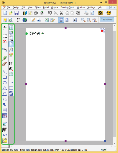
Figure 3. Vertical icon bars give access to the drawing tools and the options for the selected tool or element in the design.

Bottom section: status line

Below the drawing area you will find the status line, showing mouse position, dimensions, etc. for the selected drawing tool or object in the design.

Status bar

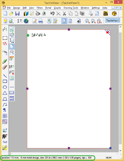
Figure 4. Status bar near the bottom of the software window gives information about the selected element or drawing tool.

3.02 After launching the software

In this section you can find a first introduction to some of the first software functions you will come across when you create a tactile design.

First impression

After launching the software, the red border is showing the current paper size and orientation.

The word ‘Title’ can be found in the top left corner. This is to make you aware of the importance of a title in your design, which will help the reader to understand the content of the diagram at hand.

When you open a new design, you will see a tactile marker in the upper right corner. This so-called right-up marker helps a blind reader to easily find out the paper orientation without having to explore its contents first. This the position of the right-up marker is always in the top right corner, independent of landscape or portrait orientation. On screen, the marker is shown as three blue lines at an angle of 45 degrees.

For most designs we advise you to include the right-up marker for ease of use. However, by clicking on the marker it can be turned off, which for example can be used if you want to print multiple designs in a bundle and bind them. A red marker will remain which can be activated to switch the marker on again.

Red paper border, title and right-up marker

Figure 1. The top of the design shows the title text label, right-up marker and red border for paper size and orientation.

Design orientation: landscape or portrait designs

Choosing the right paper orientation for your design allows you to make optimal use of the available space on the paper. This way the image can be presented as large as possible in order to retain smaller details. You can change the paper orientation by clicking on the ‘Change the orientation to landscape/portrait’ icon in the design toolbar (second vertical toolbar when nothing is selected). You can also find this option in the Design menu.

It is important to know that changing the paper orientation will not adjust the size of the image! This ensures that the tactile quality of the image is maintained. However, you might need to adjust the width and/or height manually to fit the new paper orientation by dragging the markers around the design.

‘Change the orientation to landscape’ icon: Change the orientation to landscape

‘Change the orientation to portrait’ icon: Change the orientation to portrait

Portrait to landscape orientation

When you start with a design with a tree in portrait mode and you decide you want to have it in landscape, you can change the paper orientation. The size of the white design area that contains the tree will stay the same.

It is likely that the lower part of your design will now be outside the red border and that you have two sheets of paper instead of one. Even though you could have a design spread over multiple sheets, chances are you would want to reduce the design size to fit a single sheet of paper. You can use the blue marker in the lower right corner to make the height of the tree fit. Please note that your tree has become smaller, so make sure any smaller details are still adequate for tactile use. Next, use the purple marker in the middle of the right side of your design to add paper to span the width of the paper.

Landscape to portrait orientation

The other way around, you might start with a tree that spans the height of a design in landscape orientation, but decide you want it to be in portrait to make better use of the length of the paper. In that case, you could increase the size of the image by using the blue marker in the lower right corner. You can use the purple markers in the middle of the two sides of the white area to trim any empty space left and right of the tree.

For more information, see section ‘Paper size vs. design size‘.

Line view and Dot view

To get you familiar as soon as possible with the effect of creating designs for braille embossers, you can view the design on screen as it will be embossed in dots.

For good visibility you can use the line view mode for the drawing. When you switch to dot view, all lines will be converted to individual dots, just as your braille embosser will do.

You can read more in the section ‘Design mode: dot view/line view‘.

Difference between dot view and line view
Figure 2. A circle shown in line view (left) or dot view (right) shows the graphic capabilities of the selected embosser.

3.03 Colours on screen

General colour use in TactileView

Green Green

The colour green is used as a colour for information. Everything you see in this colour is NOT printed on the design. Examples are: the font ‘beneath’ the braille dots of the textlabels, the alignment lines for the text labels, the grid for aligning object in the drawing area, the letters at the angles for the triangle.

Blue Blue

Objects created with one of the drawing tools (square, line, circle, dot, etc.) are presented in blue. Variations of blue are used to indicated the selected dot height (for embossers that support varying dot heights). A lighter blue colour indicates a lower dot height.

Black Black

Lines that are created with the drawing tool ‘Retouching: Adding lines’, are drawn in black. This indicates that the line is part of the underlying bitmap in the design. The bitmap consists of individual pixels that can be erased by choosing ‘Retouching: Erase’.

Any colours present in images inserted from file or from the internet will be converted to braille dots. These images should be processed using the filters and be converted to black/white in order to print them in braille lines.

Purple Purple

Markers are placed on or around a selected object. These markers can be used to reposition or resize the object, or change its proportions. Markers with a different function will have a different colour instead of purple.

Red Red

A red border is surrounding the drawing area, reflecting the printable area of a sheet of paper in the selected paper size. When the designs exceeds this initial area, the red borders will signify that multiple sheets of paper will be printed that together will contain the design.

Special cases

Text labels

A rounded marker precedes each text label to signify the type of input used for the specific label.

  • Green text label bullet Green is used for text labels entered with the regular computer keyboard;
  • Orange text label bullet Orange for those that were created with Perkins style input;
  • Blue-grey text label bullet Grey/blue for mathematical textlabels, created with the MathType equation editor.

Formulas in graphs

When multiple formulas are used in a graph, each formula in a graph will have its own colour (red, green, blue and yellow) to easily distinguish between them. These different colours are only used for display on the screen and will not lead to differences on a print.


Different colours distinguish the formulas of a graph

Figure 1. Colours are used on screen to distinguish between different formulas.

Braille tables
In a single document, multiple braille tables can be used to accommodate for language variations. In the design toolbar (right vertical toolbar when nothing is selected), click ‘Show used braille tables’ to see an overview of the different braille tables in the design. Colours are used in the legend and design to distinguish the different braille tables.

Colours give an overview of the braille tables in the design

Figure 2. The colours in the legend and text labels signify the used braille tables.

Audio styles

Objects with audiostyles are presented with a light red/pink fill.


Circle with an audio style

Figure 3. The light red colour signifies that the circle contains an audio style.

3.04 Keyboard shortcuts

The following list of keyboard shortcuts are supported in TactileView. These shortcuts can be used to easily activate specific software functions, general operations, drawing tools and text editing functions. The list of shortcut keys for the drawing tools can be personalised to make them easier to remember (see below).

See Scroll wheel and key combinations for keyboard combinations with the scroll wheel.

TactileView shortcuts
Ctrl+B Fuse selected object with the bitmap
Ctrl+E Open current file in Explore mode: Speech and sound
Ctrl+I Play audio style
Ctrl+J Show properties of selected object
Ctrl+K Open context menu
Ctrl+L Start Menu driven design
Ctrl+R Explore colour composition
Ctrl+W Take webcam snapshot when activated

Drawing tools (default set, see below for personalisation)
T Text label
S Select area
H Detect shape
F Filters
U Retouching – adding lines
E Retouching – eraser
L Draw straight line
Q Draw Square-Rectangle
C Draw Circle-Ellipse
N Draw Triangle
P Draw Polygon
D Draw free hand line or closed shape
O Draw Dots
A Draw Table
G Draw Graph
I Import
M Mammoth braille
R Draw letters and digits
V Add voice memo

General shortcuts
Ctrl+N New document
Ctrl+O Open document
Ctrl+S Save
Ctrl+Shift+S Save as
Arrow keys Move object or anchor point by 1 pixel
Shift+Arrow keys Move object or anchor point by 10 pixels
Ctrl+X Cut
Ctrl+C Copy
Ctrl+P Print
Ctrl+Z Undo
Page Up Jump to previous page
Page Down Jump to next page
Esc Deactivate currently active drawing tool/deselect currently selected object
Ctrl+Tab Switch between open designs

Text editing
Home Jump to front of text line
End Jump to end of text line
Ctrl+Home Jump to start of text label
Ctrl+End Jump to end of text label
Shift+Arrow keys Select text
Shift+Left mouse click Select text between caret position and click position
Del or Backspace Delete selected text

Personalised drawing tools shortcuts

Via menu Settings > Keyboard shortcuts, the list of shortcuts that activate the drawing tools in the left vertical toolbar can be edited. The left column in the dialog contains the list of drawing tools; by clicking on the right column, you can assign a keyboard key that will act as the shortcut for the corresponding drawing tool. You can always return to the default list of shortcut keys by clicking on the ‘Reset default shortcut keys’ button.

Remember that each shortcut key can be used only once in the list, giving each drawing tool a unique key.

3.05 Scroll wheel and key combinations

A number of software features are easily accessible by using the scroll wheel when operating the software with your mouse. The description below gives an overview of the different operations using the scroll wheel for better efficiency when drawing.

Operation Shortcut
Pan vertically through design Scroll up/down
Zoom in Ctrl + scroll up
Zoom out Ctrl + scroll down
Rotate selected object 5 degrees Shift + scroll up/down
Rotate selected object 1 degree Shift + alt + scroll up/down
Increase/decrease line thickness Shift + scroll up/down
Increase dot size Shift + scroll up/down

Pan vertically through the design (Scroll up/down)

When the mouse is in the design area, scrolling up or down with the mouse wheel (no keys pressed) will allow you to move vertically through the design.

Zooming in/out (Ctrl + scroll up/down)

To view a particular part of the design in more detail, you can zoom in by using Ctrl + scroll up. Ctrl + scroll down will zoom out in order to view a larger section of the design.

Rotation of objects (Shift + scroll, Shift + Ctrl + scroll)

Almost all objects (including textlabels) can be rotated any number of degrees. The angle for the rotation can be set in an edit field by clicking ‘Rotation’ in the object’s toolbar. For easy access, a selected object can be rotated in steps of 5 degrees by using Shift + scroll wheel up/down. For more accuracy, Ctrl + shift + scroll up/down will rotate the object in steps of 1 degree.

Increase/decrease of line thickness or dot size (Shift + scroll up/down)

The value for the line thickness, the eraser width or the size of the blue dots can be set by entering a value in the respective dialogs. While drawing, the size can be easily adjusted Shift + scroll wheel.

3.06 Transparency and object stacking

All blue objects with the exception of lines have two components: the outline (e.g. the tree sides of a triangle) and the object’s surface (the area in between those three lines). The object’s surface can be given a combination of different properties, such as textures and transparency.

The transparency comes into play when two or more objects are (partly) overlapping. When the object is transparent, all blue parts of the objects ‘below’ it will be visible and included on the print. When the object is not transparent, (parts of) the object below will be covered.

Select ‘Change to cover underlying image (is now transparent)’ from the properties toolbar or context menu to make the object non-transparent. Vice versa, select ‘Change to make the underlying image visible (is now not transparent)’ to make the object transparent.

The influence of transparency of objects

Figure 1. The circle on the left is transparent, revealing the square below; the circle on the right is non-transparent and covers the square.
 
‘Make object transparent’ icon: Make transparent
‘Make object non-transparent’ icon: Make non-transparent icon

Control overlap with Object Stacking
By default, the order in which the objects are placed in the design determines the stacking order, i.e. which object is ‘on top’ and will overlap ‘lower’ object(s). Objects that were placed later will be on top of earlier placed objects.

You can easily get an overview of the stacking order of the objects in your design by selecting ‘Screen elements’ from the second horizontal toolbar, then choosing ‘Show object stacking’. When this is activated, the object order is indicated with green numbers for transparent objects and orange numbers for non-transparent objects. The lowest numbers will be on top, e.g. object 1 will cover object 3 when it is not transparent.

If you want to reverse the object order, select the object that you wish to move below or on top of another object, then select ‘To back’ or ‘To front’ to move it below or on top of the other object(s) respectively.

Orange and green numbers show the stacking order of the objects

Figure 2. The green and orange numbers show the stacking order of the circles and squares.
 
‘Screen elements’ icon: Screen elements icon
‘Show object stacking’ icon: Object stacking icon
‘To front’ icon: To front icon
‘To back’ icon: To back icon

3.07 Bitmap and object drawing

Any design in TactileView contains two layers: one is the underlying bitmap layer, the second contains the editable objects, figures and text labels that are placed ‘on top’ of the bitmap. Both layers will be visible on your prints, i.e. objects do not have to be fused in order to be printed.

Retouching

You can use the retouching tools (pen and eraser) to draw freehand lines or erase elements in the bitmap. Objects and figures are not affected by the retouching tools and need to be fused with the bitmap first to (partially) erase them. You can find out more by reading the ‘Retouching tools (pen and eraser)‘ section.

Fusing objects with the bitmap

Editable objects can be fused to a bitmap at any time. To fuse an object to the bitmap, select it and then choose the ‘Fuse with bitmap’ icon from the second vertical toolbar at the left side of the screen, or right-click it and choose ‘Fuse with bitmap’ from the context menu. You can also use Ctrl+B as a shortcut for fusing an object.

The editing markers (purple and/or red squares around the object) will disappear and the object will turn black and no longer be editable. The object is now part of the bitmap layer in your design and can be edited with the retouching tools.

If you accidentally fuse an editable object to the bitmap, you can choose ‘Undo’ from the Edit menu, press Ctrl+Z or click the ‘Undo’ icon from the tool bar across the top of the screen to undo this action and retrieve the editable object.

Please note that when you apply one of the filters to the entire design, all objects will be fused with the bitmap. If you want to avoid any objects from no longer being editable, you can also apply a filter locally on a selected area.

See also: ‘Filters; editing an imported image‘ and ‘Selecting area and editing parts of the design

Converting a selected area to an object

Objects that are part of a fused bitmap appear in black, and it is not possible to select them. To convert a selected area to an editable object, choose the ‘Select area’ icon from the left vertical toolbar, or choose ‘Select area’ from the Drawing Tools menu. Then click and drag the mouse to select a rectangular area around the part of the bitmap you wish to turn into an object.

Once the area is selected, it will be surrounded by a black dashed rectangle. Right-click anywhere inside the selected area and choose ‘Convert to figure’, or click on the large red marker on one of the sides of the selection. The selected area is now converted to a figure, which may be edited in the same way as any other figure object (image).

See also: ‘Selecting area and editing parts of the design