 Previous section
 Return to TactileView manual overview
TactileView offers a number of different ways to begin making great tactile materials. You can create a file from scratch or start from a picture on your computer. Or you could get a head start by beginning from a pre-installed example file or one of the thousands of designs available in the online catalog.
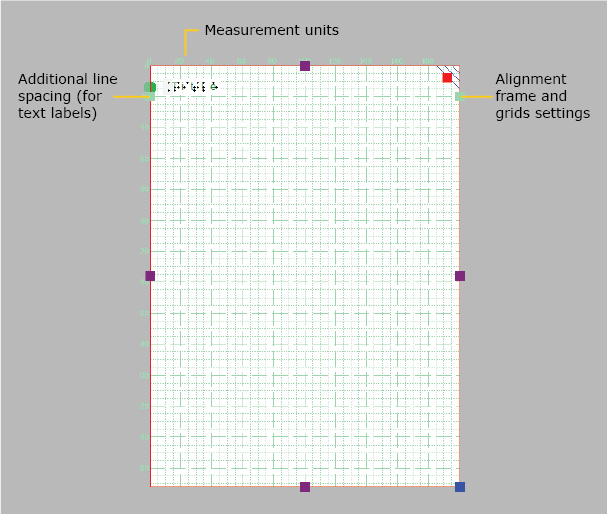
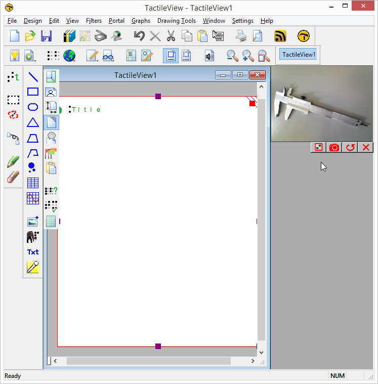
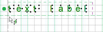
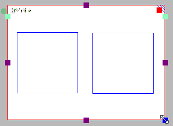
When you open the TactileView software, a new, blank document is created automatically. You can begin working in this document immediately. To open another new file, select ‘New’ from the File menu or press Ctrl+N. You can also click on the ‘Create a new document’ icon in the top horizontal toolbar.
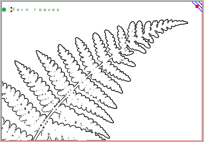
You can create a new document from a picture saved to your computer. To import a picture into TactileView, select ‘Open’ from the File menu or press Ctrl+O. In the Open dialog, browse to the location where your picture is stored and select it, then choose ‘Open’. A new TactileView document containing the picture is created.
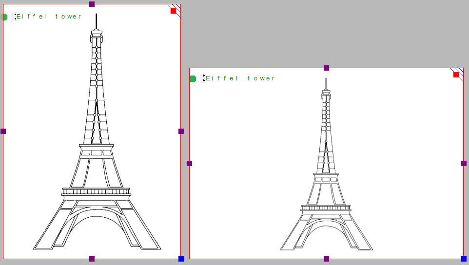
A number of example files are installed with the TactileView software. To open one of these files, select the ‘Open TactileView Examples’ option from the File menu. A dialog box will appear with a list of available sample files. Select a file from the list, then choose the ‘Open’ button to open it in TactileView.
To download an existing file from the online catalog, open the Portal menu and choose ‘Download and Edit Design from Catalog’. This will launch a new window that will allow you to browse available files by category or search for something specific using the search field. Browsing by category is recommended for best results because of the variety of languages used for file titles and keywords.
Once you’ve chosen a category, select a design and choose the ‘Closer Look’ link (green arrow button) beneath it. This will launch a web browser window with a larger preview of the image in the file. Select the ‘Download & Edit’ link.
A dialog will pop up asking if you want to open or save the file. Select ‘Open’.
NOTE:
If this is the first time you are downloading a file from the TactileView catalog, Windows may open a dialog box asking what application to use to open the .bpx file. Choose the option that allows you to browse your computer for the desired application, and browse to C:\Program Files\TactileView\TactileV.exe on a 32-bit operating system or C:\Program Files (x86)\TactileView\TactileV.exe on a 64-bit operating system. If there is a checkbox available to always use this program to open this type of file, make sure it is checked, then select the ‘OK’ button.
The file will now open in TactileView.


