 Previous section
 Return to TactileView manual overview
A number of software features are easily accessible by using the scroll wheel when operating the software with your mouse. The description below gives an overview of the different operations using the scroll wheel for better efficiency when drawing.
| Operation | Shortcut |
|---|---|
| Pan vertically through design | Scroll up/down |
| Zoom in | Ctrl + scroll up |
| Zoom out | Ctrl + scroll down |
| Rotate selected object 5 degrees | Shift + scroll up/down |
| Rotate selected object 1 degree | Shift + alt + scroll up/down |
| Increase/decrease line thickness | Shift + scroll up/down |
| Increase dot size | Shift + scroll up/down |
Pan vertically through the design (Scroll up/down)
When the mouse is in the design area, scrolling up or down with the mouse wheel (no keys pressed) will allow you to move vertically through the design.
Zooming in/out (Ctrl + scroll up/down)
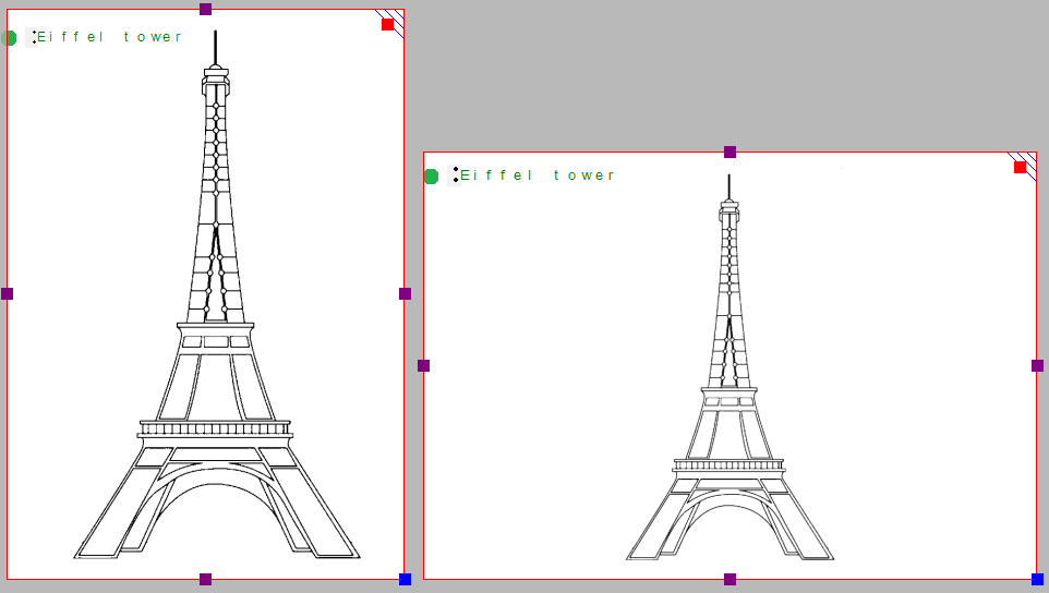
To view a particular part of the design in more detail, you can zoom in by using Ctrl + scroll up. Ctrl + scroll down will zoom out in order to view a larger section of the design.
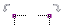
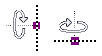
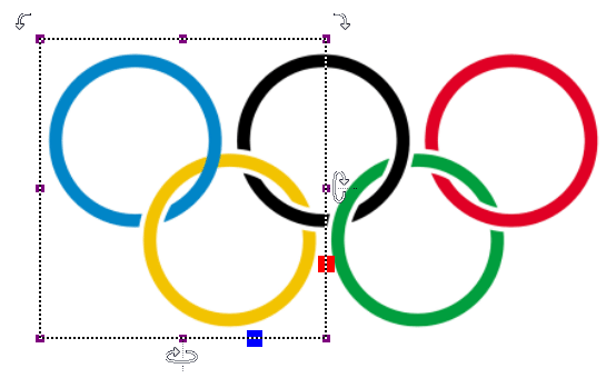
Rotation of objects (Shift + scroll, Shift + Ctrl + scroll)
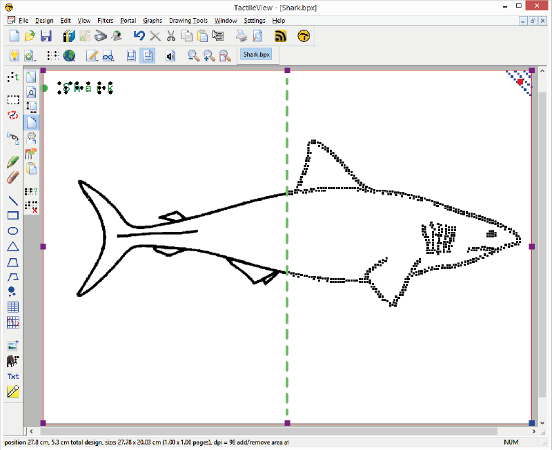
Almost all objects (including textlabels) can be rotated any number of degrees. The angle for the rotation can be set in an edit field by clicking ‘Rotation’ in the object’s toolbar. For easy access, a selected object can be rotated in steps of 5 degrees by using Shift + scroll wheel up/down. For more accuracy, Ctrl + shift + scroll up/down will rotate the object in steps of 1 degree.
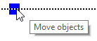
Increase/decrease of line thickness or dot size (Shift + scroll up/down)
The value for the line thickness, the eraser width or the size of the blue dots can be set by entering a value in the respective dialogs. While drawing, the size can be easily adjusted Shift + scroll wheel.

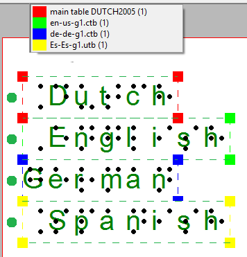
 Green
Green Blue
Blue Black
Black Purple
 Red
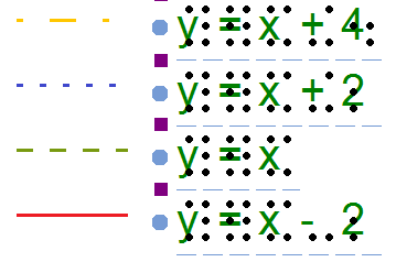
Red Green is used for text labels entered with the regular computer keyboard;
 Orange for those that were created with Perkins style input;
 Grey/blue for mathematical textlabels, created with the MathType equation editor.