However, in order to use a software version of this generation in full mode, your software license needs to be eligible. You can check here if you already have such a license. (You need your software product code (SPC) for this. You can find it in the menu ‘Help’ > ‘About TactileView’.)
If your license is already eligible:
First, check the TactileView version you have installed already. Go to the menu ‘Help’ > ‘About TactileView’ and check if the version number starts with 2.5 . In this case, there is nothing you need to do.
If you have a lower version, go to the menu ‘Help’ > ‘Check for New Updates and Release Notes’.
Alternatively, you can download the latest software installation file and start the installation process by opening it.
If your license is not yet eligible:
Option 1: Use our webshop
Purchase an SPC upgrade in our webshop. You will receive and email with instructions and a key (code) which can make your SPC eligible to use TactileView generation 2.5 .
After making your SPC eligible, you can either go to the TactileView menu and select ‘Settings’ > ‘Update TactileView Components’ and choose ‘Check for new software updates’.
Alternatively, you can download the latest software installation file and start the installation process by opening it.
Option 2: Ask your distributor
Contact your distributor and request a license upgrade for your SPC. When your request has been processed, you will receive an email to inform you that your SPC is now valid for the upgrade to TactileView generation 2.5 . In this email you will find a download link to the latest version.
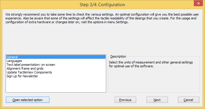
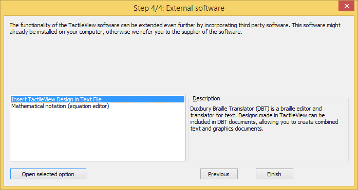
Once TactileView has been installed, you will be prompted with the Configuration wizard, which will guide you through registration and the most important settings for optimal use of the software. Each of the 4 steps in the configuration wizard are ‘Computer registration’, ‘Printer setup’, ‘Configuration’ and ‘External software’. In each step, there is a list with the essential settings. By selecting one from this list, you can read the description on the right. Click on ‘Open selected option’ to go to the selected settings dialog.
You can launch the Configuration wizard at any time later on by selecting it from the Help menu.
In the manual section Settings menu, you can find a more detailed list of all the settings menu option.
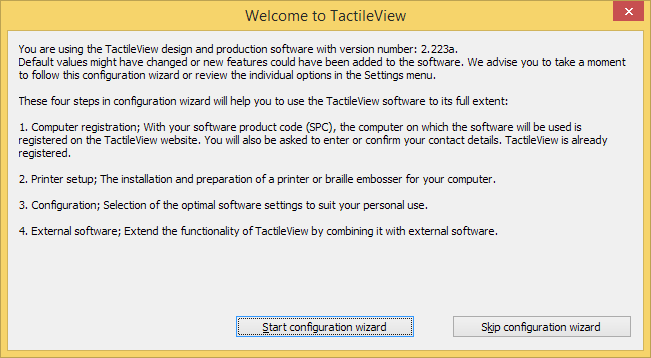
Configuration wizard: Introduction. This window gives an overview of the different steps in the configuration wizard. Click on ‘Start configuration wizard’ to proceed.
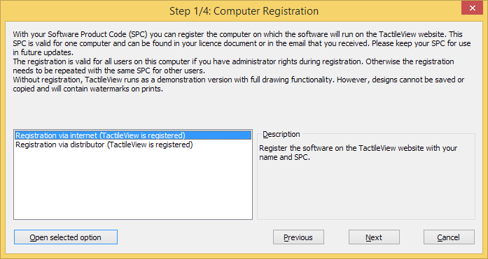
Configuration wizard step 1/4: Computer registration. In this step, you can register your software licence.
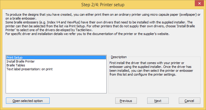
Configuration wizard step 2/4: Printer setup. This second step will help you to configure the steps required for printing your tactile designs.
Configuration wizard step 3/4: Configuration. All basic settings for operating the software are included in this third step.
Configuration wizard step 4/4: External software. This final step will help you to extend the functionality of TactileView with external software.
Once you have downloaded and installed the TactileView software, it will operate in demonstration mode at first. To run the software in full version, a software product code (SPC) is required. This SPC is provided by your dealer or has been sent by email after you purchased a software licence in the Thinkable shop.
The easiest and fastest method to register the software with your SPC is registration via the internet. However, TactileView also provides a registration option that does not require an internet connection; see Software registration via distributor (no internet access).
Each SPC is valid for one computer only. If you wish to use TactileView on multiple systems, you will need to purchase additional SPCs. For registration on multiple user accounts on the same computer, see Registration for multiple user accounts on single computer.
Software Product Code (SPC)
You will need to register the software using a Software product code (SPC) in order to get access to the complete set of software features. After purchasing a TactileView software licence, you will receive an SPC, either by email from the TactileView website, in a licence document from your dealer, etc. Make sure to store this code carefully, as you might need it later on for software updates or customer support.
Registration steps
Select ‘Registration via internet’ in step 1 of the Configuration wizard. Alternatively, choose ‘Computer registration’ from the Settings menu and make sure ‘Registration via internet’ is selected in the dialog that opens.
Enter your SPC, choose a User/company name and click on ‘Register now’.
Choose whether you wish to register the software for all users on the computer (requires administrator rights) or the current user only.
Enter and confirm the required contact details for customer support and optimal use of the software. You are now ready to start using the fully registered TactileView software.
When you are unable to connect to the internet with the computer on which you wish to register TactileView, you can register your software licence via your distributor. For regular registration via internet, see Software registration with SPC via internet.
Select ‘Registration via distributor’ from step 1 of the Configuration wizard. Alternatively, choose ‘Computer registration’ from the Settings menu and make sure that ‘Registration via distributor’ is selected in the dialog that opens.
Supply your distributor with the following information:
– Your SPC
– A user or company name
– Version number and Computer identification code (both can be copied from the registration dialog)
– Contact details: full name*, company, address, country* and email address* (information with an asterisk* is required)
Your supplier will contact the TactileView development team and provide you with a Registration code that can be used to register without an internet connection. Enter your SPC, a user or company name, and the received Registration code in the Settings > Computer registration dialog. Once you have filled this all in, select ‘Register now’.
You are now ready to start using the fully registered TactileView software. The registration is valid for all users on this computer if you have administrator rights during registration. Otherwise the registration needs to be repeated with the same SPC for other users.
Images from the internet often form a great source for a tactile image. The amount of different subjects that can be portrayed is virtually endless. However, selecting the right material from this vast resource can both improve the tactile quality and minimize the effort needed to convert the image into a tactile diagram.
Understanding which image works best
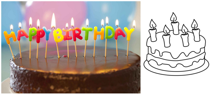
Virtually any image can be used as a basis for a tactile diagram, but some are more suitable than others. For example, some images are harder to understand when they converted to a tactile image. In general, a higher level of detail will result in a more difficult tactile diagram. Concepts such as shadows or three-dimensional perspective can be very hard to understand for a blind reader.
The second consideration is the amount of effort it takes to convert the image to a tactually usable design. Of course it depends greatly on the type of contents you wish to include in the image, but generally ‘less is more’: a simpler image takes less time to convert than a more detailed one.
An image needs to have enough features that can be understood by touch. This means that images often need to be simplified by isolating individual lines from the In most cases, line images are preferred as a basis for a design.
Figure 1. The image on the right has less fine detail and is less complex, making a tactile version easier to read and taking less effort to edit than the image on the left.
Make clever use Google image search
Using Google, you can search for images that match any keywords that you enter. In most cases this will give thousands of results, so in many cases you will need to refine your search criteria. You could try searching for a synonym or closely related word (e.g. ‘trees’ or ‘woods’ instead of ‘forest’). If you speak multiple languages it can be helpful to search for the same concept in another language.
Google also provides some tools to refine the type of image you are looking for. You can find these by clicking on the ‘Search tools’ button. These allow you to make some useful selections for finding the right material for tactile use. The most important selections for tactile use are:
– Size: larger images are generally better than smaller images, since they provide a better image quality in which more detail is retained when enlarged. You can also select ‘Show sizes’ under ‘More tools’ to get a quick overview of the image sizes.
– Type: refine the type of images that are presented. ‘Line drawing’ or ‘Clip art’ both are highly suitable as a basis for a tactile image, as they are often already simplified into individual lines and will be closer to what is required for a tactile image. We always advise to check first if these types of images are available to minimize the amount of effort it takes to create a tactile image.
The other search tools, such as colour and time can be used to further refine your search results. Appropriate usage rights can be selected if it concerns reproduction.
Figure 2. By making use of the Search Tools, you can select line drawings (right) instead of more complicated images, such as the photo on the left; the line drawing is much easier to read and edit.
Placing the image in your TactileView design
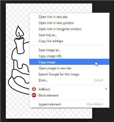
Once you have found a suitable image, right click on it to open the context menu, then select ‘Copy image’. This will copy the image onto your clipboard. In TactileView, press Ctrl+V to paste the image in your design. This will place the image in the design area at the position of you mouse. You can also right click in an empty area of the design, then select ‘Paste’ to place the image on the position of the click. Or you can select ‘Paste’ from the Edit menu or click the ‘Paste’ icon in the top horizontal toolbar, which will place the image in the top left corner of the design.
If you have saved an image on your computer, you can choose ‘Import’ from the drawing tools icon bar, then select ‘Import SVG’ for svg images or ‘Import image from file’ for bitmap image (.jpg, .png, …), or select ‘Import image from file’ from the File menu. Next, click in the design where you wish to insert the image.
You can always resize or move the image to the required position in the design. Use the retouching tools (pen and eraser), a combination of the filters from the drawing tools toolbar or the Filters menu, or any of the other drawing tools to make the required adjustments to make the inserted image suitable for tactile use.
In TactileView, several tools are available to facilitate a precise design process and cope with regulations and conventions that specify the layout of a tactile diagram.
Right-up marker Once the design is printed and in the hands of the reader, the right-up marker is tactile marker in the top right corner. This right-up marker helps to find the correct orientation of the diagram without having to explore the tactile diagram itself. This way you can easily find out if the design should be read in a portrait or landscape orientation.
When the marker is presented in blue on screen, it will be printed. By clicking on the red marker in the top right corner of the screen, the right-up marker can be selected or unselected. Alternatively, you can select ‘Draw right-up marker’ from the design toolbar (right vertical toolbar when nothing is selected) or the design context menu.
Figure 1. The right-up marker as shown on screen.
‘Draw right-up marker’ icon:
Alignment grids
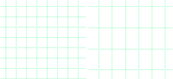
TactileView provides two alignment grids that make it easier to get the right layout in your document. The braille grid allows you to align text labels in a fixed grid throughout the design, whereas the measurements grid is used to visualise the dimensions in your document to align objects. The grids are shown in green on screen and will not be printed. You can enable or disable these grids in the second vertical toolbar. This option can also be found in the View menu.
Figure 2. A section of the measurements grid (left) and measurements grid.
‘Screen elements’ icon: ‘Show grid’ icon:
Dot view / line view mode The graphic capabilities for tactile images differ for each individual production medium. Use the ‘Design mode: dot view/line view’ to control the layout for the different print outputs.
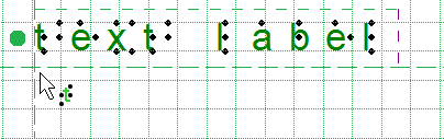
Text label alignment For accurate placement of texts in your tactile graphics, text labels can be aligned horizontally or vertically with other labels in the design. You can select ‘Switch text label alignment on/off’ from the properties toolbar of a selected text label, or when placing a new label in the design.
As long as the alignment function is on, green ‘magnetic’ dotted lines will appear when moving a text label close to the horizontal or vertical position of another label in the design. The text label on which the moved label will be aligned will be highlighted. When you let go at this position, the moved label will automatically ‘snap’ to this alignment. The same applies to placing a new text label in your design. Please note that aligned text labels are not ‘connected’ but can still be moved and edited separately.
Figure 3. Text label alignment with green dotted lines.
Centre object or text label All objects in the toolbar tool have a ‘Centre’ option in their properties toolbar. With this option the object will move to the centre position of the paper. When the paper width is changed, the object will no longer be centred.
Only move horizontally, vertically or diagonally
By holding the Shift key and dragging a selected object or textlabel, the movement will only be in a perfectly horizontal, vertical or diagonal direction. This can also be switched on or off permanently by selecting ‘Restrict to horizontal, vertical and diagonal movement’ from the properties toolbar or context menu of the object or label.
Text labels are used to add texts in braille to your tactile diagrams, ranging from small texts labelling elements in the image to complete texts in braille. When using text labels, it is important to select the right braille table in order to get the correct braille output.
There are three different types of text labels, which are described in the following manual sections:
Braille keyboard input; direct input of braille characters using Perkins style braille keyboard
Math input; use an equation editor or the keyboard as input for mathematical braille notation
To place a text label in the design, select ‘Add text label’ from the drawing tools toolbar. The type of text label can be chosen from the right vertical properties toolbar. Click in the design to position the text label.
TactileView includes a number of tools for drawing and working with tables. Most editing commands for tables are the same as for other drawing objects, including the methods with which to move, center or delete a table, change its line or fill style, add audio labels or fuse it to the bitmap. For more information on these topics, please refer to Editing object properties, Adding audio styles and Working with fused bitmaps. The features and commands described in this tutorial are specific to tables.
Drawing a table
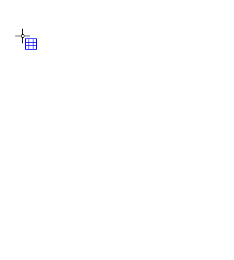
To add a table to your file, choose the ‘Draw table’ icon from the toolbar on the left side of the screen, then click and drag the mouse in the design to insert a table into your document. Your table will be created with the default number of rows and columns, but you can add and/or remove rows and columns as desired after the table has been inserted.
Another way to add a table to your file is to select ‘Draw table’ from the Drawing Tools menu. This launches a dialog, allowing you finer control over how the table is initially created.
To insert a table using this method, enter the desired location of the upper left corner of the table, then specify the size parameters, the number of rows desired and the number of columns desired. When setting the size, choose the ‘Enlarge/reduce’ radio button if you would like the cells in your table to be square, or choose the ‘Stretch’ radio button to allow adjustment of the height and width independently. Enter the desired cell width (and the height, if using the ‘Stretch’ option), the desired number of rows and the desired number of columns, then choose ‘OK’ to close the dialog and insert the table into your drawing.
Figure 1. Drawing a table in the design with the mouse.
‘Draw table’ icon:
Adjusting the table size
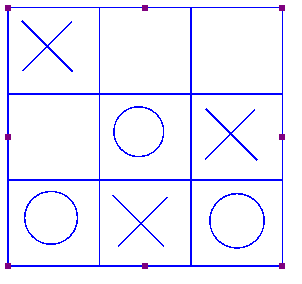
Once you have inserted the table into your drawing, you can adjust the overall table size. The objects and text labels that are placed within the table will be repositioned automatically so they remain positioned in the same cell (see below).
To adjust the size of the table, select the table so that purple squares appear along the outside edges of the table. To scale the table and preserve the height to width ratio, click a purple square in one of the corners of the table and drag it until the table is the desired size. The cells in the table will be scaled up or down automatically with the table and will maintain their height to width ratios.
To adjust the overall table width, click the center purple square on the right or left edge of the table and drag it until the table is the desired width. The cells in the table will be scaled automatically to maintain equal widths. Similarly, you can adjust the overall table height by clicking the center purple square on the top or bottom edge of the table and dragging it until the table is the desired height. The cells in the table will be scaled automatically to maintain equal heights.
Adding and removing rows and columns
By default, a new table has three columns and three rows; however, you can always adjust the number of rows and columns by inserting or deleting them. To do so, select ‘Insert or delete rows and columns’ from the properties toolbar or context menu.
In the dialog that appears, first make a selection whether you wish to add or remove rows or columns. Next, you need to specify which row(s)/column(s) should be deleted or at what position the row(s)/column(s) should be inserted.
– In the case of inserting, you can choose to place them ‘In front’ (i.e. on the left side of the table in the case of columns, on top for rows), ‘At the end’ (i.e. on the right or bottom) or after the specified column/row number (i.e. inside the table). You can choose to add a single or multiple rows or columns.
– In the case of deleting, you have the choice between ‘First’ (again, the leftmost column or top row), ‘Last’ (rightmost column or bottom row) or after the specified row/column number. Again, you can choose to remove multiple rows at a time.
Finally, you have to select if either:
– the table dimensions need to remain constant, i.e. the outer dimensions of the table remain the same but the cell size is adjusted to accomodate the new number of rows/columns; or
– the cell dimensions remain constant, i.e. the table size is adjusted to add or remove space for the new number of rows/columns.
Once you have made all selections, choose ‘OK’ to confirm.
‘Insert or delete rows and columns’ icon:
Entering table contents
At any point after creating your table, you can enter contents into the cells. You can use the drawing tools from the left vertical toolbar or Drawing tool menu to place text labels or objects in the table. Objects inserted into a table may be edited just like objects that are not part of table contents (for more information, please refer to the ‘Drawing tools’ section of the manual). Inserting an object into the table contents will anchor it to the table, so that if you later move, stretch or scale the table, the object stays linked to the correct cell in the table.
As an alternative to drawing the object with the mouse, select the table and choose the ‘Table contents’ icon from the properties toolbar, or right-click the table and choose ‘Table contents’ from the context menu. This launches a dialog from which you can control the table content.
When you select an object type from this menu, a dialog will come up allowing you to give further information about the object you want to create. What is on the dialog will vary depending on which type of object you select. A size and position dialog will appear for straight lines, squares/rectangles, circles/ellipses, triangles, polygons, freehand lines/closed shapes, dots and tables. For the other objects, a dialog will appear in which the contents can be entered (e.g. text labels) or selected (e.g. figures).
The dialogs are very similar to the ones that appear when you access the drawing tools from the Drawing Tools menu, except that they also have edit boxes that allow you to select which cell to place the object in by specifying the desired row and column for the object.
This is the size and position dialog for inserting a square, but since it is being inserted into a table it has ‘Row in table’ and ‘Column in table’ edit boxes at the bottom. Make the desired selections to create your object and place it in the appropriate cell, then choose ‘OK’ to close the dialog and insert the object into the table. It will also appear as a listing in the table contents menu.
Figure 2. Scaling or moving a table will automatically reposition the contents in the table.
The drawing tools for placing objects described in the previous manual sections, allow you to place objects by clicking and dragging in the drawing area. The blue colour will indicate that an element in the design is an object. Below, you can find the common properties that are shared by these objects in TactileView.
Properties in right vertical icon bar
As soon as the drawing tool is activated in the left icon bar, or when the object is placed or is selected in the design, the properties icon bar for that selection will appear. For most objects, the first icon in this bar allows you to determine the size and position by entering the values via edit fields.
‘Size and position’ icon:
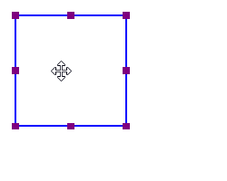
Resizing objects (all object types)
Purple markers can be found on the corners and along the sides of the object. By dragging the markers on one of the four sides, you can adjust the width or height. For example, a square will become a rectangle. The markers in all four corners will scale the entire shape (both the width and height) maintaining the same aspect ratio.
For polygons and freehand lines, a red dashed box will appear around the object. The markers on the corners and sides of this box can be used to resize the entire object. The purple markers on the corners of the polygon or anchor points of the line are used to adjust the shape of the object.
Alternatively, all objects can be resized by selecting ‘Size and position’ (or similar) from the context menu or properties toolbar. In the ‘Size’ section of the dialog, choose the ‘Enlarge/Reduce’ radio button if you want to scale the entire object, or ‘Stretch’ to independently adjust the width and size without retaining their ratio. Next, specify the desired width or height and choose ‘OK’ to resize the object.
Figure 1. Resizing a square using the purple markers.
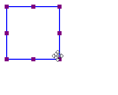
Moving objects (all object types)
You can move objects by holding the left mouse button and dragging it to another position, as indicated by the four-way arrow cursor. A green line will indicate the distance over which the object has moved. For more precise placement, you can use the arrow keys to move the object by 1 pixel or Shift+arrow keys for steps of 10 pixels.
Alternatively, select ‘Size and position’ (or similar) from the properties toolbar or context menu of an object to enter the position values via the ‘Size and position’ dialog. Enter the position relative to the top left corner of the design and click ‘OK’ to reposition the object.
Two additional functions in the properties toolbar help you to position an object in a specific way: you can either choose to horizontally centre it in the design, or only move it horizontally, vertically or diagonally (alternative: hold shift while moving the object).
Figure 2. The green line indicates the moved distance when moving an object with the mouse.
‘Centre’ icon: ‘Restrict to horizontal, vertical or diagonal movement’ icon:
Rotation
The object can rotate over 360 degrees. Scrolling with the mouse while holding down the Shift key will rotate per 5 degrees, or use Shift+Ctrl+mouse wheel for more accurate rotation per degree. You can also set the rotation to a certain value by choosing the ‘Rotation’ icon and entering the angle in the dialog that appears.
‘Rotation’ icon:
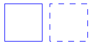
Line style part 1: Solid and dashed lines
The outer border of the object will be a solid line of a certain (narrow) thickness. The line style will allow for a variation in pattern, thickness and texture for the border. Choose ‘Line style’ from the properties toolbar, then select your style elements from the dialog.
To change the line style, select the object and choose ‘Line style’ from the properties tool bar or context menu. In the dialog that opens, you can set the line properties for the object, including the line pattern (solid or dashed) and thickness in pixels. The dialog includes a preview of how your line will look as you make changes. Choose ‘OK’ to apply your changes to the object and close the dialog.
Keep in mind that thicker lines do not always benefit the tactile usability of your design; it is best to experiment which line styles work best for your embosser or printer.
Figure 3. Squares with different line styles: continuous lines (default) or dashed line style.
‘Line style’ icon:
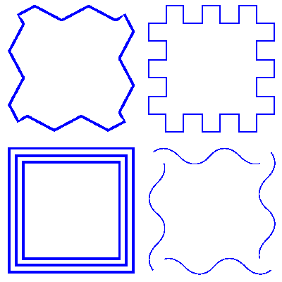
Line style part 2: Line textures
Besides solid and dashed line styles, you can also apply different line textures to the object outline. These incluse a series of waves, zigzag lines, double lines and various other patterns. To apply a line texture to the object, first choose ‘Line style’ from the properties toolbar or context menu. In the dialog, set the radio button under ‘Line texture’ to ‘Apply line texture’. Next, click the button ‘Choose texture’ to select the specific line texture you wish to use.
Most line textures require a sufficiently large line thickness to feel the characteristics of the pattern. The tactile result may vary for each embosser model or type of swellpaper, so it is advisable to experiment with different textures and sizes to get a feel for which settings work best for your embosser or printer.
Squares, triangles and polygons have straight lines that meet at the corners. Depending on the length of the line segment, the line pattern repeats a certain number of times and starts again on the next line segment. This means that the line pattern of the two line segments may not always join exactly in the corners. This effect is more prominent with some patterns but less noticeable in others.
Figure 4. Wave line texture applied as the line style for a square.
Surface properties part 1: Fill style – Texture
The Fill style will give you a wide variety of textures that add a tactile pattern in to the surface of the object. The pattern can be selected based on the preview. The patterns are made of repeated tiles. The tile size can be set to determine the fineness of the texture. The pattern can have its own rotation within the object, independent from the position and rotation of the object. This enables even more variation in textures, as the same texture can be used in various rotations, giving a different tactile experience.
In the dialog that opens you can set the fill properties, including selecting the fill texture style as well as its size and rotation angle.
If you wish to add a fill texture to the selected object, select the object and choose ‘Fill style: texture’ from the properties toolbar or context menu. In the dialog that opens, select the ‘Use texture fill’ radio button. Next, click on the ‘Choose texture’ button to open the list of available textures. Choose a texture from the list and click ‘OK’ to confirm. A preview of the chosen texture appears in the ‘Fill style’ dialog.
Use the ‘Tile size’ and ‘Texture rotation angle’ edit boxes to scale and rotate the texture. The relief height of the texture as well as the surface area in between can be adjusted when supported for the selected embosser. When you are finished making changes, choose ‘OK’ to apply the fill style.
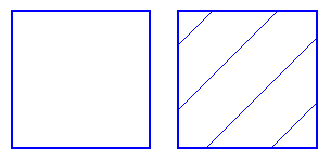
Figure 5. Squares with different fill styles: no fill style (default) and diagonal lines.
‘Fill style: texture’ icon:
Surface properties part 2: Transparency
The transparency of an object determines whether or not it will cover underlying object. In case the object is transparent, only the border is visible. All parts of the design that are overlapped by the object are still visible.
In case the object is non-transparent, all that is inside the object is covered by the white inner surface of the non-transparent object. Keep in mind that non-transparent objects might (completely) cover other elements in the design. You can change the order in which they are presented to determine which one is on top of the other.
For production of the design on swellpaper, objects can have a colour as well. Select the desired colour from the dialog ‘Fill style: Colour’. Keep in mind that most embossers do not support printing in (coloured) ink, so this function does not apply to production with braille only.
‘Fill style: colour’ icon:
Audio information
The ‘Audio style’ function is used to add audible information to an object, giving the object an extra ‘layer’ of information. This layer consists of a text that is pronounced by a speech synthesizer (TTS). This functionality is used to create an audio-tactile diagram and can be explored using the TactileView ClickPad or TactiPad combined with the TactileView digital pen.
The relief height for the outline, surface and texture of objects can be selected separately. Keep in mind that this functionality is only available in the properties toolbar when using an embosser that supports variable dot height.
You can delete the entire object by selecting ‘Delete’ in the properties toolbar or context menu, or by using the Delete key. When you only want to remove parts of an object, you first have to fuse it with the bitmap (Ctrl+B or ‘Fuse with bitmap’ from the properties toolbar or context menu). After this you can use the eraser tool to remove parts from the object.
The computer keyboard input method is used to enter texts similar to using a Perkins style braille keyboard. This works by simultaneously pressing the keys that represent the 6 or 8 dots of a braille character (see Braille tables – Inherent braille properties).
To place a text label with braille keyboard input, first select ‘Add text label’ from the drawing tools toolbar and choose ‘Text and position: braille keyboard input’ from the properties toolbar or context menu. Next, click on the position in the design where you wish to place the text in braille. You can now type your text directly in your design.
‘Text label: braille keyboard input’ icon:
Entering braille text
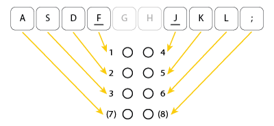
When entering the braille text, the letter keys f, d and s correspond to braille dots 1, 2 and 3 respectively; keys j, k and l with dots 4, 5 and 6. Keys a and ; can be used to type dots 7 and 8 when using 8-dot braille. The space bar is used for spaces in braille text as well.
Figure 1. Overview of which letter keys correspond with the dots in a braille character.
To enter a character, press all letter keys simultaneously, then release them at the same time. For example, to enter the letter n in braille containing dots 1345, press f, s, j and k.
The typed text will appear as black braille characters on screen, but without the visual text characters that are shown for text labels with computer keyboard input. The orange dot in front of the text label signifies that the braille keyboard was used as input.
Once the text label is placed in the design, it cannot be converted to another input method.
 Previous section
 Return to TactileView manual overview


