Skip NavigationMenu

5.01 Layout tools

In TactileView, several tools are available to facilitate a precise design process and cope with regulations and conventions that specify the layout of a tactile diagram.

Right-up marker
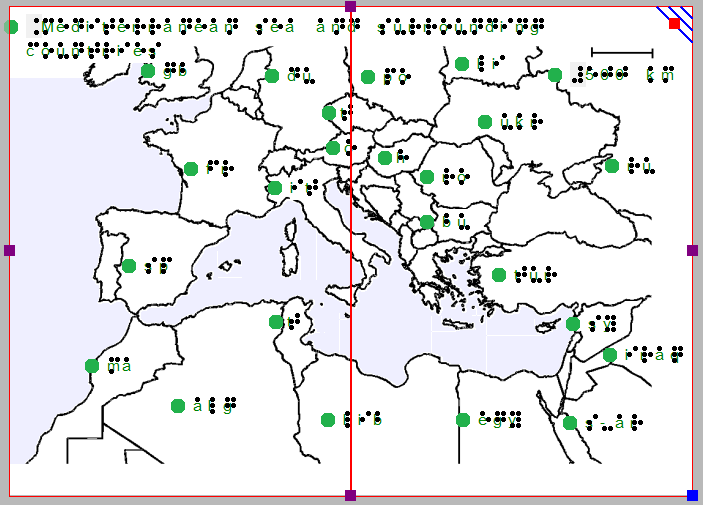
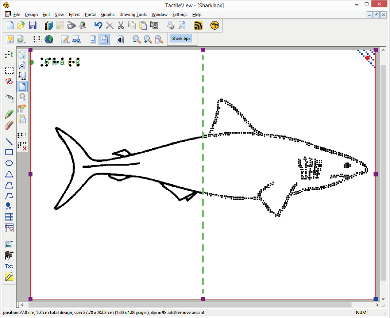
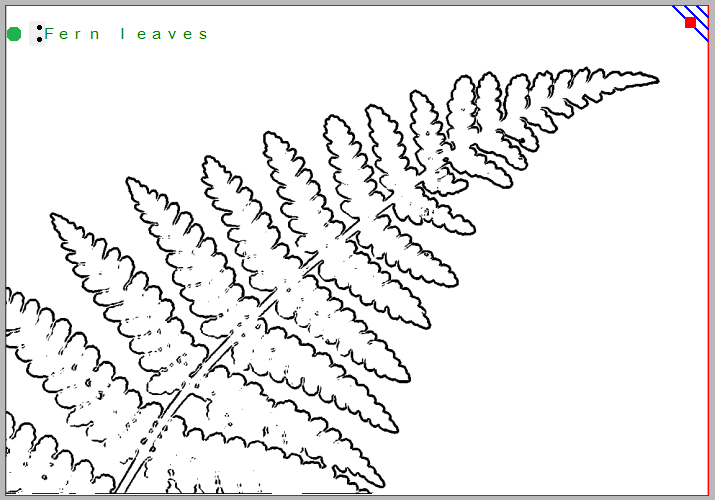
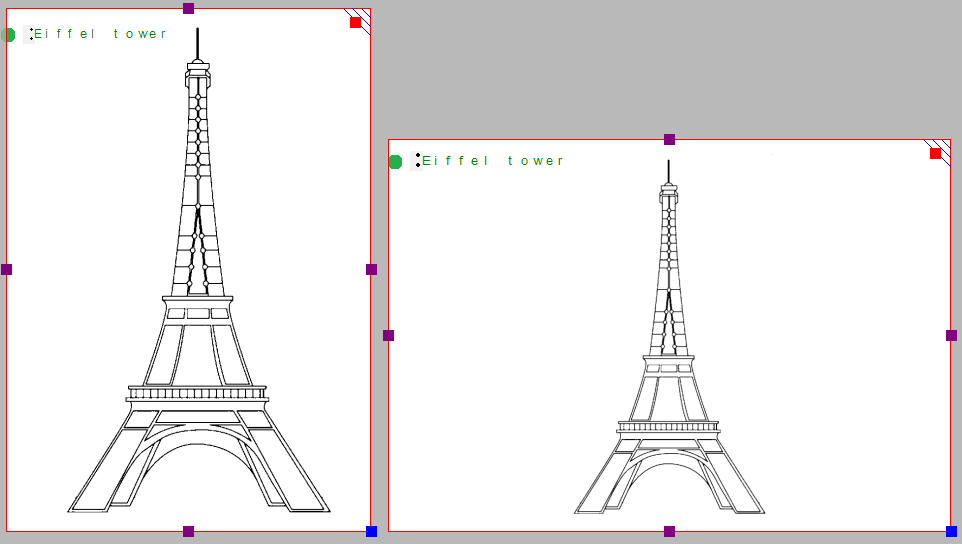
Once the design is printed and in the hands of the reader, the right-up marker is tactile marker in the top right corner. This right-up marker helps to find the correct orientation of the diagram without having to explore the tactile diagram itself. This way you can easily find out if the design should be read in a portrait or landscape orientation.

When the marker is presented in blue on screen, it will be printed. By clicking on the red marker in the top right corner of the screen, the right-up marker can be selected or unselected. Alternatively, you can select ‘Draw right-up marker’ from the design toolbar (right vertical toolbar when nothing is selected) or the design context menu.

Right-up marker

Figure 1. The right-up marker as shown on screen.

‘Draw right-up marker’ icon: Icon for switching the right-up marker on or off

Alignment grids

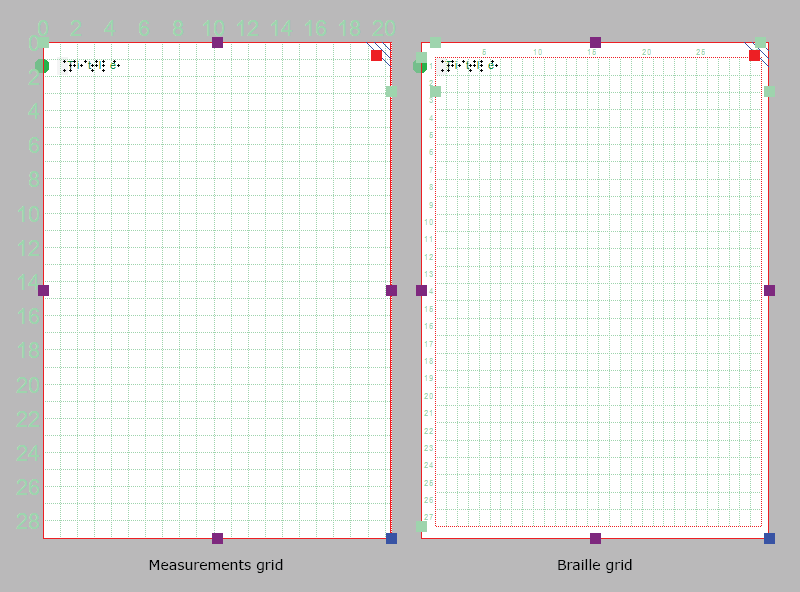
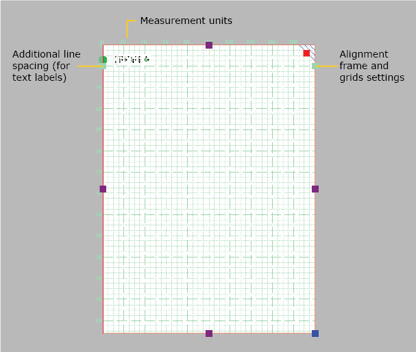
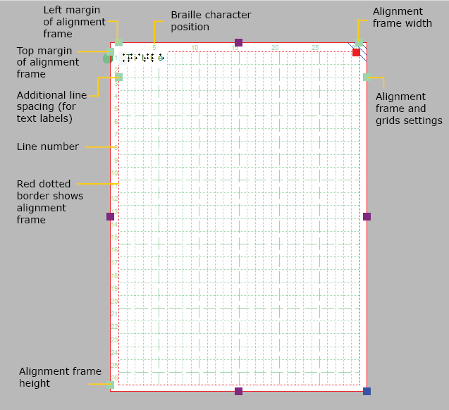
TactileView provides two alignment grids that make it easier to get the right layout in your document. The braille grid allows you to align text labels in a fixed grid throughout the design, whereas the measurements grid is used to visualise the dimensions in your document to align objects. The grids are shown in green on screen and will not be printed. You can enable or disable these grids in the second vertical toolbar. This option can also be found in the View menu.

See: Alignment grids – braille grid and measurements grid.

Section of the measurements grid (left) and braille grid

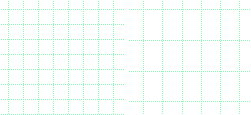
Figure 2. A section of the measurements grid (left) and measurements grid.

‘Screen elements’ icon: Screen elements icon
‘Show grid’ icon: Show grid icon

Dot view / line view mode
The graphic capabilities for tactile images differ for each individual production medium. Use the ‘Design mode: dot view/line view’ to control the layout for the different print outputs.

See: Design mode: dot view/line view.


Text label alignment
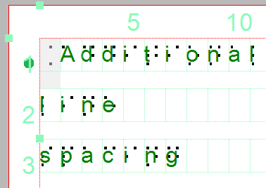
For accurate placement of texts in your tactile graphics, text labels can be aligned horizontally or vertically with other labels in the design. You can select ‘Switch text label alignment on/off’ from the properties toolbar of a selected text label, or when placing a new label in the design.

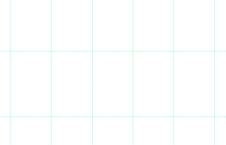
As long as the alignment function is on, green ‘magnetic’ dotted lines will appear when moving a text label close to the horizontal or vertical position of another label in the design. The text label on which the moved label will be aligned will be highlighted. When you let go at this position, the moved label will automatically ‘snap’ to this alignment. The same applies to placing a new text label in your design. Please note that aligned text labels are not ‘connected’ but can still be moved and edited separately.

Green lines indicate text label alignment

Figure 3. Text label alignment with green dotted lines.

Centre object or text label
All objects in the toolbar tool have a ‘Centre’ option in their properties toolbar. With this option the object will move to the centre position of the paper. When the paper width is changed, the object will no longer be centred.

See: Editing object properties.

‘Centre’ icon: Icon for centering the text label
Only move horizontally, vertically or diagonally
By holding the Shift key and dragging a selected object or textlabel, the movement will only be in a perfectly horizontal, vertical or diagonal direction. This can also be switched on or off permanently by selecting ‘Restrict to horizontal, vertical and diagonal movement’ from the properties toolbar or context menu of the object or label.

See: Editing object properties.

‘Restrict to horizontal, vertical or diagonal movement’ icon: Move horizontally vertically diagonally icon

5.02 Portrait or landscape design

For tactile graphics, the image size has a big influence on tactile usability. TactileView provides several options to control both design and paper size for optimal tactile quality.

Multiple sheets of paper
The maximum size of paper that printers generally can handle is A4, A3, US Letter or Tabloid. However, diagrams can be larger than the maximum paper size when an image needs to be enlarged to retain the level of detail in the original image. Multiple sheets can be placed in rows and or columns to allow for tactile diagrams of any large size. The red paper border will indicate the size of the design and the number of sheets.

See also: Paper size vs. design size.

Amount of details in a tactile diagram
On one hand, the level of detail that can be presented in a tactile graphic is limited due the discriminatory capabilities of the fingertips. On the other hand, the relatively large size of braille dots and the minimal required distance in between dots also limit how much detail can be included.

The larger the design therefore, the more detail can be retained when printed with an embosser. This will help to control the complexity of the designs.

Tactile image of a fern

Figure 1. This image shows the shape of a fern branch, but might not contain sufficient tactile detail in the leaves. A separate image could be used to display leaf details.

Images as large as possible
Although there is a limitation to the size of an image, it is best practice to use as much of the paper as possible. Matching the design orientation to the dimensions of the tactile graphic (i.e. using landscape for wide images and portrait for higher ones) allows for optimal positioning on the paper. Rotating from landscape to portrait or vice versa may give a 30% larger image, which greatly improves the tactile usability.

Size comparison of portrait versus landscape designs

Figure 2. By choosing the right orientation, the image can be shown larger, maintaining more detail.

When changing the design orientation, the image will not be scaled. This way, the size and position of the elements in your design will not change and details will not be lost. However, the design will automatically be extended with extra white space or trimmed of excess empty white space in order to fit the new paper orientation.

It is best to think about the optimal size of the tactile diagram before starting the design: a higher level of detail will require a larger design size. Adjustments in size can always be made later by scaling the design with the purple markers around the edge. However, text labels have a fixed size. By scaling the image they might overlap the image or may end up too far from the elements in the drawing that they refer to.

5.03 Changing design orientation and size

In TactileView, the ‘design size’ refers to the size of the tactile graphic, represented on screen by the white area. The design size can be the size of a full sheet of paper, but can also be extended to span multiple pages; see: Paper size vs. design size.

Changing design size

By default, when you open a new document, the design will have the same size as a full sheet of paper. When you wish to add or remove white space to your design, you can drag the purple markers along the four sides of the design. Notice that this does not scale the contents of the design but only extends or narrows it.

Enlarging the design using the purple markers

Figure 1. Drag the purple markers to enlarge or reduce the design size.

Resizing the design

The blue marker in the bottom right corner can be used to scale the entire design, i.e. enlarge or reduce the design size and all elements. This will change the resolution of the design. Braille characters have a fixed size, so text labels will not be scaled. Keep in mind that text labels might start to overlap with other elements in the design.

Resizing the design by dragging the blue marker in the bottom right corner

Figure 2. Drag the blue marker in the bottom right corner to scale the design.

Change page orientation

The page orientation can be changed at any time to suit the dimensions of the design. The position and size of the image contents will not change, but the edges of the white area will be adapted automatically to fit the design to one or more full pages in the new page orientation. You can change the page orientation in several ways: select ‘Change the orientation to landscape/portrait’ from the toolbar of the design (right vertical toolbar when nothing is selected), from the ‘Page formatting’ toolbar in the second horizontal toolbar, or from the Design menu.

‘Page formatting’ icon: Page formatting icon
‘Change the orientation to landscape’ icon: Change the orientation to landscape
‘Change the orientation to portrait’ icon: Change the orientation to portrait

If the image contents fits within a single sheet of paper in the new page orientation, the excess white space will be trimmed in one direction, and added in the other. For example, when changing from portrait to landscape format, the white space on the bottom of the page will be trimmed and the design is widened. This change in page orientation is always reversible later on.

Change page orientation when the contents fits on a single sheet in the new orientation

Figure 1. The contents will fit on a single sheet (red border) after changing the page orientation; the white space at the bottom will be trimmed, the right side will be extended.

If on the other hand the original design would not fit within a single page in the new orientation, the design is automatically extended in both directions to fit on two pages. This change is also reversible.

Change page orientation when the contents does not fit on a single sheet in the new orientation

Figure 2. The contents of the design will only fit on two pages (red borders); the white space ate the bottom and right side will be extended to fit the design across both pages.

5.04 Paper size vs. design size

The maximum paper size that printers generally can handle is A4, A3, US Letter or Tabloid. However, diagrams can be larger than the maximum paper size when an image needs to be enlarged to retain the level of detail in the original image. Multiple sheets can be placed in rows and or columns to allow for tactile diagrams of any large size.

In your designs, the red paper border will indicate the size of the design and the number of sheets. Drag the purple markers on the edges of the design to add or remove white space in order to use more surface area for your design. Note that this only adds or removes a strip along the edge of the design, but does not scale (enlarge or reduce) the design contents in this direction. The blue marker in the bottom right corner can be used to scale the entire design.

A map is spread across two sheet of paper in order to show the countries in more detail.

Figure 1. The map is printed across two sheets of paper side to side in order to include sufficient detail.

By resizing the design, adding/removing space within the design or changing the paper orientation, it might become wider or higher than a full sheet of paper (i.e. the white space extends beyond the red border of the paper). If this excess strip does not contain design contents, it will be trimmed automatically when the file is printed. If on the other hand the design is smaller than a full page (i.e. does not reach completely to the red border), the page will be filled out by adding white space.

5.05 Alignment frame and grids

The two alignment grids combined with the alignment frame are useful tools on screen that help to manage the layout of your design by aligning the text labels and/or drawn elements. The braille grid is primarily used to align text labels in a regular grid and conform to certain layout guidelines, whereas the measurements grid is mostly used to align objects and visualize their size. The grids are shown in a light green colour on screen, but will not be printed or embossed.

For more details, see: Measurements grid (object alignment) and Braille grid (text alignment).

Alignment grids: measurements grid on the left, braille grid on the right

Figure 1. Example: measurements grid without alignment frame on the right, 

The settings dialog for both grids can be accessed by clicking on the light green marker on the right hand side of the braille grid between text lines 2 and 3, or via menu Settings > Alignment grids.

You can easily switch between the two grids by clicking on either of the grid icons in the second horizontal toolbar. Alternatively you can select ‘Show braille grid’ or ‘Show measurements grid’ from the View menu or select a grid via the Alignment grids settings dialog. You can switch grids off by clicking once more on the currently active grid or deselect it via the View menu or in the grids settings dialog.

Alignment frame

The alignment frame is a layout tool that can be used as a guide to limit the design to a specified area within the printable area of a page. This is presented in the design with a dashed red border, but will not be printed.

The width and height of the frame are limited to a whole number of braille characters and lines of braille text, respectively. You can adjust the top and left margin of the frame by dragging the four green markers that are placed along the top and left side of the design. Alternatively, you can enter the values for the frame size by opening the ‘Alignment frame and grids’ settings dialog via the green marker on the right-hand side of the design or via menu Settings.

When the alignment frame is enabled, a selected alignment grid will only be shown within the area of the frame. Text labels will then be automatically adjusted in width to fit within the frame.

Saving grid and frame settings as default

The alignment frame and grids are very useful to create consistent page formatting between different designs. In the settings dialog, you can therefore save the current grid and frame settings as default values by choosing ‘Save as default settings’. This ensures the same frame and grid size are used as the basis for all new documents.

These settings are also saved in the document. This way, when you wish to edit the design later on, the margins and grid size still match the design, even when the default grid properties for new documents might have changed.

5.06 Measurements grid (object alignment)

The measurements grid is composed of a regular grid of squares that visualize the physical dimensions of your design. This can be used for the alignment of objects in your design.

For a comparison with the braille grid, see: Alignment frame and grids or Braille grid (object alignment).

In the ‘Alignment grids’ settings dialog, you can select the size of the grid squares. The grid settings dialog can be opened by clicking on the light green markers on the righthand side of the screen or via menu Settings > Alignment frame and grids. You can choose from a number of convenient the grid square sizes based on your selected units of measurement, which can be selected in menu Settings > General.

When the alignment frame is enabled, the measurements grid will only be shown within this frame.

Elements of the measurements grid

Figure 1. Measurements grid shown across the entire design.

5.07 Braille grid (text alignment)

The braille grid is used to align text labels in a regular grid for consistency and to conform to certain layout guidelines for braille documents.

For a comparison with the measurements grid, see: Alignment grids or Measurements grid (object alignment).

Braille grid elements

Figure 1. Braille grid shown within the (optional) alignment frame.

Aligning text labels

The braille grid is composed of a regular pattern of cells the size of a braille character. This grid can be used to align text labels in this regular pattern throughout your design. This will ensure all characters are aligned above each other and that the lines of text are evenly spaced in the entire document, as is required in some guidelines for braille documents.

By default, text labels are ‘magnetically’ aligned (snapped) to the braille grid by dragging or placing the label with its edges close to the grid lines. Dashed green lines will indicate when the text label is aligned to the grid. You can switch off the alignment in the Alignment grids settings dialog by deselecting ‘Align text labels to grid’ or by disabling alignment in the context menu of a text label. Any text labels that extend beyond the edge of the braille grid are automatically resized to fit within the grid area.

The lines and characters in each line are numbered along the sides of the braille grid. By default, the title label is placed at character 1 of line 1.

Green dashed lines indicate the text label is aligned in the braille grid

Figure 1. Green dashed lines indicate the text label is aligned in the braille grid.

Braille cell size

The size of a braille character has been standardized, but not all braille embossers have a printing resolution that allows text to be embossed exactly matching this standard size. The grid cells on screen will represent the true size of the embossed braille characters. A red exclamation mark at the top left corner of the braille grid will notify you when the size of the embossed braille will differ from the standardized braille size.

The size of the grid cells will also be automatically adjusted when an 8 dot braille table is selected as the main braille table of the document.

A red exclamation mark near the top left corner of the grid signifies the braille cells have a non-standard size

Figure 2. A red exclamation mark near the top left corner of the grid signifies the braille cells have a non-standard size.

Additional line spacing

You can choose to use extra line spacing between lines of text throughout the document. For example, a value of 0.5 will add an empty space of half the height of a braille character between two lines of text. This line spacing is visible on screen in the braille grid.

This can be selected by clicking on the light green markers on the left hand side between text lines 2 and 3. Alternatively, the value can be changed in the grid settings dialog or by selecting ‘Additional line spacing’ from the properties toolbar or context menu of a selected text label.

Additional line spacing is applied to text labels and the braille grid

Additional line spacing adds white space between lines of text in the braille grid and text labels.

5.08 Design mode: dot view/line view

The graphic capabilities for tactile images differ for each individual production medium. Swellpaper has different properties than an embossed image, and each braille printer will differ in dot shape and placement.

‘Design mode: dot view’ in the second horizontal toolbar is used to display the specific graphic properties of the selected output medium. With dot view selected, the dots are continuously repositioned to match the printed outputs as you add to your design. This functions like a ‘live print preview’ in which you can directly edit your design and see the final output at the same time.

If you want to see the line drawing that the embossed image is based on or that is printed on swellpaper, simply go back to ‘Design mode: line view’.

An image of a shark in line view (left half of the screen) and dot view

Figure 1. The difference between displaying a design in line view (left) and dot view (right).