 Previous section
 Return to TactileView manual overview
TactileView offers a very powerful graphing feature, which allows you to enter formulas and have them graphed over a specified range. TactileView gives you precise control over the styles used in your graph for the functions, axes, gridlines, labels and more. You can also move and resize your graph like any other drawing object.
There are several possible approaches of creating a new graph. You can choose an empty grid as a basis (see paragraph 1), select one of the TactileView graph examples and adapt it to form your own (see paragraphs 2 and 3), or create a new graph based on the entered formula (see paragraphs 4 and 5). You can also save any graph as ‘MyGrid’ for reuse in later designs (see section ‘Save graph as MyGrid for later use’).
You can read an overview of all the tactile properties that determine the tactile usability of a graph in the ‘Graph properties’ section. For more information on the different mathematical notations in braille, read the ‘Introduction on mathematical notations‘ section.
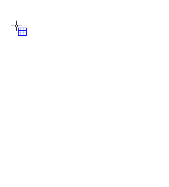
To enter an empty coordinate system (empty grid paper without any graphed formulas), select ‘Draw graph’ from the drawing tools icon bar, then choose ‘Coordinate system (no functions)’ from the properties toolbar. This option can also be found in the Graphs menu.
Once this option is selected, an empty grid will appear in the design. By default, this grid is square and ranges from -4 to 4 on both the x- and y-axis, with straight grid lines at an interval of 1 unit. You can use the options in the properties toolbar or context menu to adjust the properties of the grid or add a graphed formula.
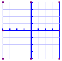
Figure 1. Empty grid inserted in a TactileView design.
2. Functions and formulas (examples)
TactileView includes two sets of ready to use example grids. These have already been optimized to depict the selected formula. You can use these graphs as a basis for your own by simply changing the formula(s).
Select ‘Draw graph’ from the drawing tools icon bar, then choose ‘Functions and formulas (examples)’ from the properties toolbar. Alternatively, this option can also be found in the Graphs menu.
In the dialog that appears you will find a list of sample graphs which each include one formula, ranging from simple to more complex. By choosing ‘Change formula’, you can edit the formula to create your own graph based on the sample. ‘Change coordinate system’ allows you to adjust the settings for the grid style and properties of the axes (such as the range). Use ‘Multiple formulas’ to add extra formulas to the grid (for more information on including multiple formulas in one grid, read the ‘Graphing multiple lines’ section).
Once you have selected a sample graph or when you are satisfied with the adjustments, you can choose to insert the graph a blank new document (click ‘Save in new document’) or place it in the currently active document (click ‘Save in current document’). You can also choose to replace the most recent grid in the current document (click ‘Replace the last grid’).
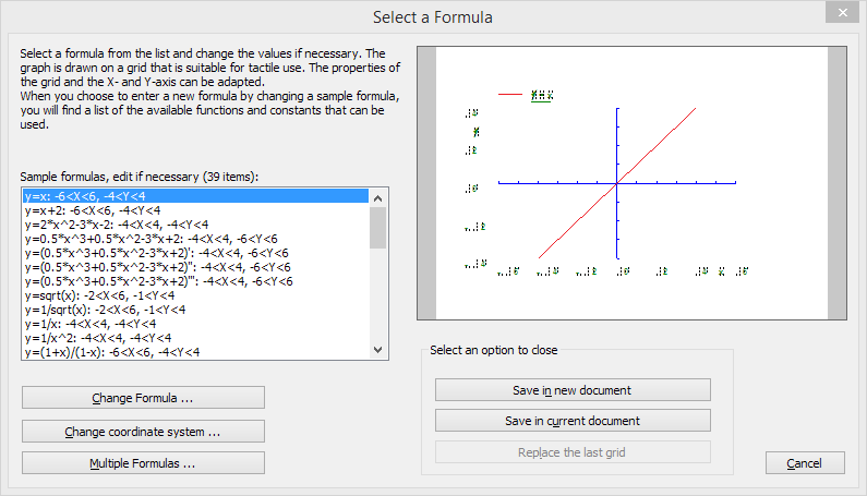
Figure 2. ‘Functions and formulas (examples)’ dialog; click on the image to enlarge.
Similar to ‘Functions and formulas’, the ‘Grids and graphs’ dialog contains a list of sample grids that can be used as is, or adapted to create your own grids. The list contains a number of variations of empty grids, as well as a list of grids that contain one or more formulas (arranged from simple to more complex). These examples are labelled as numbered TVGrids. Below these TVGrids, you will find any grids that were saved for reuse as MyGrids.
You can access this list of sample grids by selecting ‘Draw graph’ from the drawing tools icon bar, then choosing ‘Grids and graphs (advanced examples)’ from the properties toolbar. Alternatively, this option can also be found in the Graphs menu.
The list of properties of the selected sample graph is shown in the second list box. If you wish to adjust any of the settings, select it from this list and click ‘Change properties’.
If you have selected one of the MyGrids from the list, you have the option to remove it from the list of saved grids. When you have adjusted the selected MyGrid, you have the option to either save it as a new MyGrid or replace the edited MyGrid.
Once you have selected a sample graph, MyGrid or when you are satisfied with the adjustments, you can choose to insert the graph a blank new document (click ‘Save in new document’) or place it in the currently active document (click ‘Save in current document’). You can also choose to replace the most recent grid in the current document (click ‘Replace the last grid’).
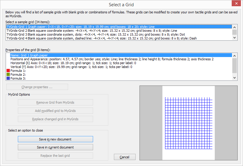
Figure 3. ‘Grids and graphs (advanced examples)’ dialog; click on the image to enlarge.
This option allows you to create a graph based on a formula that is entered using MathType as an equation editor. The math editor is also required to enter math that is too complex to be entered in linear format or when symbols are required that are not available on the keyboard. For more information on using MathType to enter mathematical expressions, please visit their website.
Once you have entered the equation in MathType, select it and copy it to the clipboard (Ctrl+C). Make sure that the entered formula is suitable for conversion to a graph. Next, switch to TactileView and select ‘Draw graph’ from the drawing tools icon bar, then choose ‘Add custom graph: equation editor’ from the properties toolbar. Alternatively, this option can also be found in the Graphs menu.
In the dialog that appears, select the preferred mathematical notation and click on ‘Paste math equation from clipboard’. The equation will now be displayed in both visual (linear and spatial) and braille format. Choose ‘OK’ to confirm.
In the formula dialog that appears, the options below the formula as well as the buttons ‘Positions and appearance’, ‘Horizontal (x) axis’ and ‘Vertical (y) axis’ allow you to adjust all the grid properties, formula labels, line style and axis properties; you can read an overview in the ‘Graph properties’ section. Use the ‘Apply’ button to refresh the graph preview after you have made any changes to the graph.
Once you are satisfied with the composed graph, select ‘OK’ to close the dialog and insert the graph in the design.
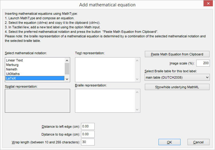
Figure 4. ‘Add custom graph: keyboard input’ dialog; click on the image to enlarge.
When you activate ‘Add custom graph: keyboard input’ from the Graphs menu or from the properties toolbar of ‘Draw graph’, a formula dialog will open. Enter the formula in the first entry field, making sure to use the correct syntax (e.g. 2*x instead of 2x, x^2 for x squared, etc.) similar to entering an equation in software such as Microsoft Excel. You can also select elements from the list of available functions and constants and insert them into the formula by double clicking on it or pressing the Enter key.
Once again, the options below the formula as well as the buttons ‘Positions and appearance’, ‘Horizontal (x) axis’ and ‘Vertical (y) axis’ allow you to adjust all the grid properties, formula labels, line style and axis properties; you can read an overview in the ‘Graph properties’ section. Use the ‘Apply’ button to refresh the graph preview after you have made any changes to the graph.
Once you are satisfied with the composed graph, select ‘OK’ to close the dialog and insert the graph in the design.
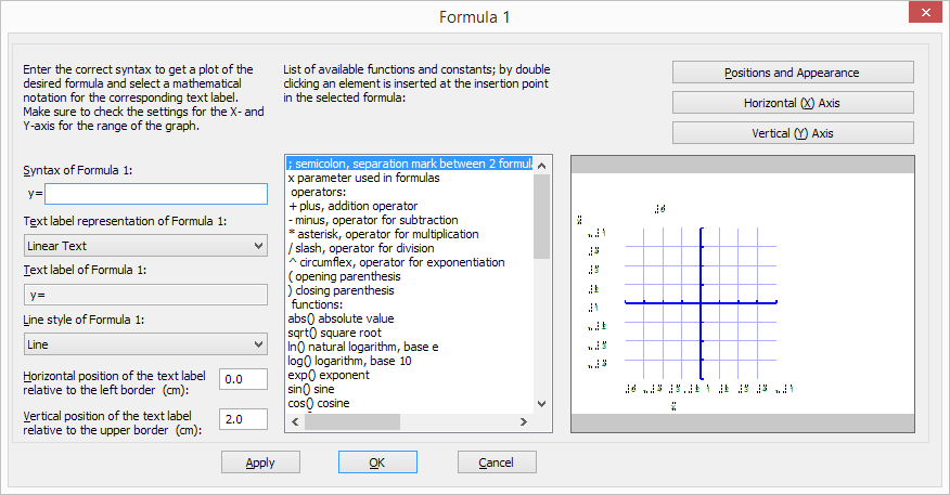
Figure 5. ‘Add custom graph: keyboard input’ dialog; click on the image to enlarge.


