Skip NavigationMenu

3.07 Bitmap and object drawing

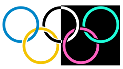
Any design in TactileView contains two layers: one is the underlying bitmap layer, the second contains the editable objects, figures and text labels that are placed ‘on top’ of the bitmap. Both layers will be visible on your prints, i.e. objects do not have to be fused in order to be printed.

Retouching

You can use the retouching tools (pen and eraser) to draw freehand lines or erase elements in the bitmap. Objects and figures are not affected by the retouching tools and need to be fused with the bitmap first to (partially) erase them. You can find out more by reading the ‘Retouching tools (pen and eraser)‘ section.

Fusing objects with the bitmap

Editable objects can be fused to a bitmap at any time. To fuse an object to the bitmap, select it and then choose the ‘Fuse with bitmap’ icon from the second vertical toolbar at the left side of the screen, or right-click it and choose ‘Fuse with bitmap’ from the context menu. You can also use Ctrl+B as a shortcut for fusing an object.

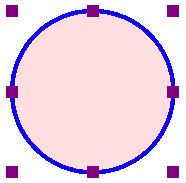
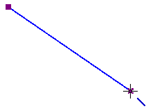
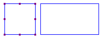
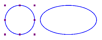
The editing markers (purple and/or red squares around the object) will disappear and the object will turn black and no longer be editable. The object is now part of the bitmap layer in your design and can be edited with the retouching tools.

If you accidentally fuse an editable object to the bitmap, you can choose ‘Undo’ from the Edit menu, press Ctrl+Z or click the ‘Undo’ icon from the tool bar across the top of the screen to undo this action and retrieve the editable object.

Please note that when you apply one of the filters to the entire design, all objects will be fused with the bitmap. If you want to avoid any objects from no longer being editable, you can also apply a filter locally on a selected area.

See also: ‘Filters; editing an imported image‘ and ‘Selecting area and editing parts of the design

Converting a selected area to an object

Objects that are part of a fused bitmap appear in black, and it is not possible to select them. To convert a selected area to an editable object, choose the ‘Select area’ icon from the left vertical toolbar, or choose ‘Select area’ from the Drawing Tools menu. Then click and drag the mouse to select a rectangular area around the part of the bitmap you wish to turn into an object.

Once the area is selected, it will be surrounded by a black dashed rectangle. Right-click anywhere inside the selected area and choose ‘Convert to figure’, or click on the large red marker on one of the sides of the selection. The selected area is now converted to a figure, which may be edited in the same way as any other figure object (image).

See also: ‘Selecting area and editing parts of the design

6.14 Using audio styles

Audio styles a great way to add more information to a drawing without having to make it larger to accommodate more text or graphical information. The audio information is accessed by using the file in explore mode, either on screen with a mouse or on a tactile copy on the Clickpad or Tactipad with the digital pen. For more information on explore mode, please refer to the Using Explore Mode and Using the Pen in Explore Mode with the Clickpad or Tactipad tutorials.

Audio styles can be added to any type of drawing object in TactileView (figures, squares, circles, dots, detected area, etc.). Audio styles may not be added to text labels, because text labels are automatically voiced by text-to-speech when the file is used in explore mode (the text contents of the label is used as an audio style).

Adding an audio style to be voiced by text-to-speech

To add an audio style to be voiced by text-to-speech to an object, select the object and then choose the ‘Audio style’ icon from the properties toolbar on the left side of the screen or right-click the object and choose ‘Audio style’ from the context menu. This will launch an audio style dialog, the top section of which allows you to specify the text to be voiced by synthetic speech from one of several sources.

The default choice is the ‘Self defined text’ radio button, which allows you to type the text you want voiced into the text field on the dialog. If you have text saved in a text file that you would like voiced instead, you can select the ‘Text from local file’ radio button, then choose the ‘Browse’ button to browse to and select your text file (.txt file). Once you have specified the text, you can check how the audio style will sound by selecting the ‘Test audio style’ button. When you are finished making changes, choose the ‘OK’ button to close the dialog and apply the audio style. The object will be shaded light pink to indicate that an audio style is associated with it.

The light red colour signifies the circle has an audio style

Figure 1. The light pink colour signifies an audio style is associated with the circle.

Attaching an existing sound file to an object

You can also attach an existing sound file to an object to have it played when the object is clicked while the file is in explore mode. In the audio style dialog, the bottom section allows you to specify a sound file to be used as an audio style.

The default choice is the ‘Local file’ radio button, which is used to attach a sound file to the object as an audio style. Select the ‘Browse URL’ button, locate the sound file you would like to use on your computer and select it. The file path to the sound file will now appear in the text field below the sound file type selection radio buttons. You can check how the audio style will sound by selecting the ‘Test audio style’ button. When you are finished making changes, choose the ‘OK’ button to close the dialog and apply the audio style. The light pink colour will now indicate an audio style is associated with the object.

NOTE:
If you have both a text-to-speech audio style and a sound file audio style attached to the same object, the text-to-speech will be voiced first and the sound file will play after it.

Recording an audio style from a microphone

Audio styles recorded from a microphone are played when the object is clicked with the mouse or digital pen while using the file in explore mode. Recorded styles are played after any text-to-speech styles are voiced. Before recording, you will need to ensure that you have a microphone connected to your computer. You can connect your microphone via the ‘Microphone’ dialog in the Settings menu.

When you have connected a microphone to your computer, you can record an audio style for an object by selecting the object, then choosing the ‘Record microphone’ icon from the properties toolbar on the left side of the screen, or by right-clicking the object and choosing ‘Record microphone’ from the context menu. As soon as you select this, recording begins and the icon in the tool bar changes to the ‘Stop recording’ icon. When you have finished speaking into the microphone, choose the ‘Stop recording’ icon from the tool bar or right-click the object and select ‘Stop recording’ from the context menu to stop the recording. Your recording will play back automatically as soon as you stop the recording, and the object will be shaded light pink to indicate that an audio style is associated with it.

NOTE:
Each object may only have one text-to-speech audio style and one recorded or sound file audio style associated with it. If you record an audio style for an object, it will replace any existing sound file you may have associated with that object previously.

Editing an existing audio style

To edit any type of audio style, select the object with the audio style you want to edit and then choose the Audio Style icon from the tool bar on the left side of the screen or right-click the object and choose Audio Style from the context menu. This will launch the same audio style dialog you used to create a text-to-speech audio style or attach an existing sound file.

To edit a synthesized speech audio style from self-defined text, edit the text in the text field. You can also remove the text-to-speech audio style by deleting the text from the text field in the top section of the dialog.

To edit a synthesized speech audio style from text from a local file, you will need to edit the text within the text file itself. To load text from a different file, select the Browse button, locate the new text file you would like to use and select it. You can also remove this audio style by deleting the file path to the local file from the text field in the top section of the dialog.

To edit an audio style played from a sound file, choose the ‘Browse URL’ button, browse to a different sound file on your computer and select it. It will replace the previous sound file, including any sound file recorded from a microphone, as the audio style for that object. To remove the sound file audio style, delete the file path of the sound file from the text field in the bottom section of the dialog.

When you are finished making changes, choose the ‘OK’ button to close the dialog and apply your changes.

If you would like to re-record an audio style from your microphone, simply follow the steps given above for recording from a microphone. You do not need to open the audio style dialog to do this. Please remember that recording an audio style for an object from the microphone will overwrite any other sound file audio style for that object.

7.07 Editing text labels (braille)

Any text label placed in the design can still be edited later on. You can change the contents of the label or adjust the size and position in the design.
Please note that labels may only be edited according to the input method used to create them. For example, a text label entered via braille (six-key) input may only be edited using six-key, and a raised print character label may only be edited as a raised print character label. Labels cannot be converted from one type of label to another.

For more details on placing and aligning a text label in the design, see: Add text label or Braille grid (text alignment).

Editing text label content
Text labels may only be edited using the same entry method with which they were created (computer keyboard entry or braille keyboard entry). To edit the content of the computer keyboard entry text label, double-click the label to place the cursor in the text and edit the content as desired directly in the design area. When this edit mode is active, you can drag with the mouse across the text or use the Shift key combined with the Home, End or arrow keys to make a text selection.
You can also right-click the label and choose ‘Text and position: computer keyboard input’ or click on the corresponding icon in the toolbar to bring up a text and position dialog. Make the desired changes and choose ‘OK’ to update the text in the label.

To edit the contents of a braille keyboard (six-key) entry label, double-click on the label to edit it directly in the design. Alternatively, you can right-click and choose ‘Text and position: braille keyboard input’ to bring up the text and position dialog. Edit the label content as desired using six-key entry. When you are finished, deselect the label when editing in the design or choose ‘OK’ to close the dialog and update the label.

Editing the contents of a text label in the edit mode on screen

Figure 1. Double click on a text label for direct editing.

Adjusting word wrap length
Word wrap length is the maximum number of characters per line of text in a text label. For example, a word wrap length of 10 will divide a text of 25 braille characters into three lines of text. Line breaks will be placed at the position of spaces to avoid breaking up words. The lines of braille text have a fixed height that matches the standardised height of embossed braille text.
The word wrap length can be adjusted by dragging the sides of a text label. The tooltip will display the value of the word wrap length. Alternatively, select ‘Text and position’ from the properties toolbar or context menu of the selected text label to enter a value for the word wrap length.

With the alignment frame enabled, the word wrap length will only be automatically be adjusted when placing a new label. If the label should fit within the limits of the alignment frame once placed in the design, the wrap length will have to be changed manually in the design or via the option ‘Automatically adjust word wrap length’ in the ‘Text and position’ dialog.

Adjusting word wrap length by dragging the sides of the text label

Figure 3. Adjusting the word wrap size by dragging the sides of the text label; the tooltip signifies the word wrap length.

Text label presentation on screen
The braille component of text labels can be hidden on screen for better readability. To view only the text of the labels in your document, select a text label and choose ‘Hide braille dots on screen’ from the properties toolbar. This setting will be applied to all text labels in the document. Choose ‘Show braille dots on screen’ to show braille on screen again.
For a complete list of settings for the way text labels are displayed on screen, select ‘Text label presentation: on screen’ either from the properties toolbar of a selected text label, or from the Settings menu. You can adjust the font colour, enable enlarged text for selected text labels and hide the text or braille component of text labels.

Note: Braille dots for text labels can be disabled on print seperately via ‘Text label presentation: on print’.

‘Text label presentation on screen’ icon: Icon for Text label presentation: on screen
‘Show/Hide braille dots on screen’ icons: Icon for Show braille dots on screen Icon for Hide braille dots on screen
Additional line spacing
You can choose to use extra line spacing between lines of text throughout the document. For example, a value of 0.5 will add an empty space of half the height of a braille character between two lines of text.
This can be selected by choosing ‘Additional line spacing’ from the properties toolbar or context menu of a selected text label.

Cutting, copying, pasting and deleting labels (all label types)
The fastest way to copy, cut, paste or delete a label is using hotkeys. To cut a label, select it and press CTRL+X on the keyboard. Cutting the label removes it from the file but stores it on the clipboard allowing you to paste it elsewhere in the file. The cut label can only be pasted until you cut or copy a different label or object.
To copy a label, select it and press CTRL+C. Copying leaves the original label but keeps a copy of it that you can paste somewhere else in the file. To paste a cut or copied label, press CTRL+V. To delete a selected label, press the Delete key on the keyboard.

Moving labels (all label types)
Once your label is selected, you can move it by clicking the center and dragging it to a new position. A four pointed arrow cursor indicates you can move the label.
You can also easily move the label to the center of the design area by right-clicking it and selecting Center from the context menu. You can move it only horizontally or only vertically by right-clicking it, selecting ‘Move the label or object only horizontally or vertically’ and then dragging it up or down to move it vertically without changing its horizontal position, or left or right to move it horizontally without changing its vertical position.

Moving a text label

Figure 3. The cursor with four arrows indicates the text label will be moved when dragged.

‘Centre text label’ icon: Centre text label icon
‘Move horizontally/vertically’ icon: Move horizontally or vertically icon

Resizing labels (mammoth braille labels and raised print character labels only)
You can resize a mammoth braille label in one of two ways. The first way is to scale a mammoth braille label manually. To do this, select it, then click a purple marker in one of the corners of the label and drag it diagonally until the label is the desired size. This resizes the mammoth braille inside the label to fit the new label size. The other way to resize a mammoth braille label is to right-click it and choose ‘Braille dot size’, which brings up a dialog on which you can specify the size of the mammoth braille relative to standard braille as a percentage. The default percentage is 300, which means the mammoth braille is three times larger than standard braille. Enter the desired size of the mammoth braille and choose OK to close the dialog, adjust the mammoth braille size and automatically resize the label to fit the new size of the mammoth braille.

Raised print character labels may also be resized in one of two ways. The first way is the same as for mammoth braille labels; select the raised print character label, then click a purple square in one of the corners of the label and drag it diagonally until the label is the desired size. This resizes the raised print characters inside the label. The other way is to right-click the raised print character label and choose ‘Font type’ and size from the context menu. This launches a dialog that allows you to choose any font on your computer for the label, to specify any available font style for that font and to define the desired font size. Once you have finished making selections, choose OK on this dialog to apply your choices to the label text. The raised print character label will be resized to fit the new size of the text.

NOTE:
Because braille characters have a fixed size, text labels created using either computer keyboard entry or braille keyboard entry may not be resized. However, you can determine the width of the text by adjusting the word wrap length of the text label. Read more >

Resize mammoth braille using the purple markers

Figure 4. Mammoth braille or letters and digits can be resized using the purple markers.

Rotating labels (all label types)
To rotate a label, right-click it and then choose ‘Rotation’ from the context menu or click the icon in the toolbar of the selected label. On the dialog that appears, enter the desired angle of rotation in degrees and choose OK to rotate the label. You can also use SHIFT+scroll wheel on a mouse to rotate a selected label.

Please keep in mind that embossers that print in a fixed grid of braille dots are not suitable for printing braille characters at an angle.

‘Rotation’ icon: Rotation icon:
Editing letters and digits
To edit the content of a raised print character label, simply double click on it to open the edit dialog. Alternatively, choose ‘Text and position’ from the context menu or properties toolbar. Edit the label content as desired, then choose ‘OK’ to close the dialog and update the text.
 
Editing mammoth braille
To edit the content of a mammoth braille label, simply double click on it to open the edit dialog. Alternatively, choose ‘Text and position’ from the context menu or properties toolbar. Edit the label content as desired, then choose ‘OK’ to close the dialog and update the mammoth braille label.

7.01 Differences between the text tools

In TactileView, there are 3 drawing tools that allow you to place tactile texts in your design, each with a distinctly different application:

1. Text labels; regular braille texts using one of the following input methods:

  • Computer keyboard input; regular text input converted to braille output
  • Braille keyboard input; direct input of braille characters using Perkins style braille keyboard
  • Math input; use an equation editor or the keyboard as input for mathematical braille notation

2. Mammoth braille; greatly enlarged braille characters
3. Draw letters and digits; large visual text characters

Once a text label is placed in the design it is preceded by a round coloured marker that signifies the input method. Computer keyboard input is signified by a green marker, braille keyboard input with orange and math input with blue-grey. By hovering over the marker with the mouse, a tooltip will show extra information about the text label. A marker with a white centre indicates the label is transparent.

‘Computer keyboard input’ icon: Icon for computer keyboard input
‘Braille keyboard input’ icon: Icon for braille keyboard input
‘Math input’ icon: Icon for math input
Printing braille text
The braille output differs slightly for each production method (swellpaper or different models of embossers). See the manual sections Printing with a braille embosser or Printing on swellpaper to find out the specific settings for your production method.

6.05 Filters; editing an imported image (.jpg, .png, …)

Images imported into TactileView need to be edited prior to printing using a combination of the filters and retouching tools. Because source images vary widely, it is helpful to experiment with the different filters to find out what works best for your image. If a filter does not produce the desired result, undo the action by selecting ‘Undo’ from the Edit menu or pressing CTRL+Z.
You can activate one of the filters by selecting ‘Filters’ icon in the left vertical toolbar, or selecting one from the Filters menu. For some of the filters, a horizontal slider allows you to adjust the extent in which it is applied. The filters are applied to the entire design and will fuse all objects in the design.

You can also apply filters to a selected area only, without affecting the rest of the design; see ‘Select area; editing parts of the design’. Please note: in the images on this page, the filters are only applied to the right-hand side of the image to show the effect compared to the original image on the left.

‘Filters’ icon: Filters icon

Convert to line drawing

One way to process the image so that it can better be embossed is to convert it to a line drawing. Select the Convert to Line Drawing option from the Filters menu. A slider bar will appear in the upper left corner of the screen. Drag the slider left or right until the image looks as desired.


Filter convert to line drawing applied on the right-hand side of the image

Figure 1. ‘Convert to line drawing’ filter.

‘Filter: convert to line drawing’ icon: Filter convert to line drawing icon

Convert to black and white

Some images can come out better when converted to black and white rather than to a line drawing. Select the Convert to Black and White option from the Filters menu. A slider bar will appear in the upper left corner of the screen. Drag the slider left or right until the image looks as desired.

Filter convert to black and white  applied on the right-hand side of the image

Figure 2. ‘Convert to black and white’ filter.

‘Filter: convert to black and white’ icon: Filter convert to black and white

Change line thickness

Use this filter to increase or decrease line thicknesses in the image all at once. If your image contains a lot of light, thin lines or a dark, thick lines, this filter is helpful to make them all thicker or thinner at the same time. Select Change Line Thickness from the Filters menu. When the slider appears at the upper left corner of the screen, slide it to the right to make lines thicker or to the left to make them thinner.

Filter line thickness  applied on the right-hand side of the image

Figure 3. Thicker lines by applying the line thickness filter.

‘Filter: change line thickness’ icon: Filter change line thickness icon

Add contours

This option allows you to add outlines around each different colored area in an image. Contours (black lines) are added at the transition point between one color and another and the thickness of the contour lines is controlled using the slider that appears at the upper left corner of the screen when you select the filter. This filter can be helpful for simple drawings that have well-defined areas in distinct colors, but is less useful when applied to photos or other images where color fades from lighter to darker without a distinct transition point.

Filter add contours  applied on the right-hand side of the image

Figure 4. ‘Add contours’ adds black contour lines to changes in colour in the image.

‘Filter: add contours’ icon: Filter add contours

Blur image

The use of this filter lets you soften or sharpen edges between areas of color in an image. Select Blur the Image from the Filters menu, then use the slider that appears at the upper left corner of the screen to adjust the image. Sliding the slider right will soften edges and sliding it left will sharpen the edges.

Filter blur image  applied on the right-hand side of the image

Figure 5. Right-hand side of the image is blurred with the ‘Blur image’ filter.

‘Filter: blur image’ icon: Filter blur image icon

Replace colours

This filter is mostly used to remove certain colours in the image by converting them to white or black. In the dialog that appears, you can select which colour should be replaced from the list of colours that are present in the design. You can also adjust the colour range to include similar shades in the colour replacement. Once you are finished replacing the desired colours, click ‘OK’ to confirm the changes.

Red colour replaced with purple

Figure 6. The red colour in the last olympic ring has been replaced by a dark purple colour.

‘Filter: blur image’ icon: Filter replace colour with colour icon

Negative

This option is mostly used when an image has a lot of black area. Choosing Negative from the Filters menu will exchange all colors in the image file with their opposites. Black areas become white, blue areas become orange, red areas become green, etc.

Filter negative  applied on the right-hand side of the image

Figure 7. ‘Negative’ filter applied to the right-hand side of the image.

‘Filter: negative’ icon: Filter negative icon

Rotating, mirroring and scaling the image

To rotate the entire image, select either ‘Rotate Clockwise’ or ‘Rotate anticlockwise’ from the Filters menu. The image will rotate 90 degrees in the direction you selected.

To mirror the image, select ‘Mirror Horizontally’ or ‘Mirror Vertically’ from the Filters menu. Mirroring horizontally flips the image left to right, like turning a page in a book. Mirroring vertically flips the image upside down, like turning a page in a wall calendar.

To scale the image, select it and then drag the blue square in the lower right corner of the design area diagonally to scale the image smaller or larger.

‘Filter: rotate clockwise/anticlockwise’ icons: Filter rotate clockwise icon Filter rotate counterclockwise icon
‘Filter: mirror horizontally/vertically’ icon: Filter mirror horizontally icon Filter mirror vertically icon
‘Filter: scale design’ icon: Filter scale design icon
‘Filter: fuse all objects with bitmap’ icon: Filter fuse all objects with bitmap icon

6.07 Draw objects; line, square, circle, …

 
The drawing tools icon bar contains all the drawing tools to create objects with specific shapes such as lines, dots, circles and squares. The objects provide accuracy in your drawings and are indicated in blue on screen.

General operation for the tools

After selecting a drawing tool, a second vertical toolbar will appear. Depending on the tool, this toolbar will present you with a number of options that can be selected before the object is placed in the design.

To place the object, move the mouse to the drawing area and click where the object should be placed. The cursor will also indicate the selected drawing tool. Hold and drag or click in a second position to determine the size and position of the object. Purple markers on or around the objects allow for repositioning, resizing or changing the proportions.

An object as a whole can be deleted by the delete key or selecting ‘Delete’ from the icon bar or context menu. It is not possible to erase parts from the object unless it has been fused to the bitmap (see: ‘Working with fused bitmaps‘).

After placing an object in the design, a second vertical toolbar will appear, presenting the specific properties for the drawn object. Reselecting the object later on will bring up the same properties icon bar.

A number of properties are common for all objects. These will be explained in a separate section: Editing object properties.

Drawing straight lines

To draw a straight line, choose the ‘Draw Straight Line’ icon from the toolbar on the left side of the screen. In the design area, click the starting position for your line, then click the end position.

Drawing a straight line

Figure 1. Drawing a straight line in the design.

‘Draw straight line’ icon: Draw straight line icon

Drawing squares and rectangles

To draw a square, choose the Draw Square-Rectangle icon from the tool bar on the left side of the screen. Click in the design to mark the position of the first corner, then move the mouse to determine the size of the square and click a second time to confirm. Alternatively, you can click and drag, then release at the opposite corner.

By dragging the markers in one of the four corners the size can be increased or decreased. Dragging inwards or outwards with the markers in the middle of the four sides will turn the square into a rectangle.

Square and rectangle (wider than the square)

Figure 2. A square and rectangle drawn in the design.

‘Draw square-rectangle’ icon: Draw square/rectangle icon

Drawing circles and ellipses

To draw a circle, choose the ‘Draw Circle-Ellipse’ icon from the left vertical tool bar on the left side of the screen. In the design area, click the location for the first position, then move the mouse until the circle is the desired size and click again to confirm. Alternatively, you can click and drag, then release at the opposite corner.

By dragging the markers in one of the four corners the size can be increased or decreased. Dragging inwards or outwards with the markers in the middle of the four sides will turn the circle into an ellipse.

Circle and ellipse

Figure 3. A circle and ellipse drawn in the design.

‘Draw circle-ellipse’ icon: Draw circle ellipse icon

Drawing triangles

To insert a triangle into your drawing, select the ‘Draw Triangle’ icon from the left vertical toolbar. Next, select what type of triangle to insert from the right vertical properties tool bar that appears.

The bottom four icons on this tool bar show the available types of triangles. From top to bottom, the triangle types available in the tool bar are right, isosceles, equilateral and scalene. Triangles may be changed from one type to another after you have placed them in your drawing, but it is easiest to select the appropriate triangle type prior to inserting the shape.

Once you have selected the type of triangle you want, click the point in the design area where you want one of the corners and then drag until the triangle is the desired size. Alternatively, you can click and drag, then release at the opposite corner.

The ‘Angles and lines’ dialog can be used for a more mathematically oriented notation. The corners of the triangle are marked with letters A, B and C.  By default they will only show on screen (green colour, not embossed). By checking ‘Characters A, B, C at corners’ in the ‘Angles and lines’ dialog, they will also be presented in braille characters once embossed.

The corners of the triangle can each be provided with 3 types of specific lines: altitude, median line and bisector, which will be embossed as dotted lines.

All four different types of triangles

Figure 4. Four different types of triangles: right, isosceles, equilateral and scalene. Equal or right corners are indicated in green.

‘Draw triangle’ icon: Draw triangle icon

Drawing polygons

A polygon consists of several lines that are connected as one object. To insert a polygon, choose the ‘Draw Polygon’ icon from the tool bar on the left side of the screen. Click in a number of positions in the design area to draw a polygon. To finish the polygon, click on the first anchor point (first purple marker) to close the polygon. Alternatively, you can click again on the last placed anchor point to make an open shape. You can also choose these two options from the toolbar or context menu by selecting ‘Close polygon’ or ‘Finalize the polygon (leave the last connection open)’.

When you have an open polygon selected, two green plus symbols on screen allow you to continue drawing at the ends of the polygon. You can also choose ‘Continue drawing at first/last endpoint’ from the context menu. The red border around a selected polygon can be used to resize it by dragging the purple markers.

You can choose between straight and curved lines between the anchor points. This allows you to make use of rounded curves in your design.

Polygon with straight lines on the left and curved lines on the right; a red dashed border with purple markers around the polygons can be used to resize the polygon

Figure 5. Two polygons show the difference between straight and curved lines.

‘Draw polygon’ icon: Draw polygon icon

Drawing freehand line or closed shape

To draw freehand lines or closed shapes, choose the Draw Freehand Line or Closed Shape icon from the tool bar on the left side of the screen. In the design area, click the desired starting location and drag the mouse to create the desired line. To create a closed shape, click the desired starting location and drag the mouse to create the desired shape, returning to the starting location before releasing the mouse button.

As with the polygon, you can choose between straight and curved lines between the anchor points. The dashed red border can be used to resize the entire object.

Freehand line
Freehand line with curved lines.

‘Draw freehand line or closed shape’ icon: Draw freehand line closed shape icon

Drawing dots

To add round dots to your design, select the ‘Draw filled dots’ from the let vertical toolbar, then click in your design to position the dot. The size of the dot can be changed with the purple markers. The dot size can range from only one braille dot up to a large filled circle of multiple centimetres in diameter.

Different sized dots
Different sized dots can range from a single braille dot to several centimeters in diameter.

‘Draw filled dots’ icon: Draw dots icon

5.03 Changing design orientation and size

In TactileView, the ‘design size’ refers to the size of the tactile graphic, represented on screen by the white area. The design size can be the size of a full sheet of paper, but can also be extended to span multiple pages; see: Paper size vs. design size.

Changing design size

By default, when you open a new document, the design will have the same size as a full sheet of paper. When you wish to add or remove white space to your design, you can drag the purple markers along the four sides of the design. Notice that this does not scale the contents of the design but only extends or narrows it.

Enlarging the design using the purple markers

Figure 1. Drag the purple markers to enlarge or reduce the design size.

Resizing the design

The blue marker in the bottom right corner can be used to scale the entire design, i.e. enlarge or reduce the design size and all elements. This will change the resolution of the design. Braille characters have a fixed size, so text labels will not be scaled. Keep in mind that text labels might start to overlap with other elements in the design.

Resizing the design by dragging the blue marker in the bottom right corner

Figure 2. Drag the blue marker in the bottom right corner to scale the design.

Change page orientation

The page orientation can be changed at any time to suit the dimensions of the design. The position and size of the image contents will not change, but the edges of the white area will be adapted automatically to fit the design to one or more full pages in the new page orientation. You can change the page orientation in several ways: select ‘Change the orientation to landscape/portrait’ from the toolbar of the design (right vertical toolbar when nothing is selected), from the ‘Page formatting’ toolbar in the second horizontal toolbar, or from the Design menu.

‘Page formatting’ icon: Page formatting icon
‘Change the orientation to landscape’ icon: Change the orientation to landscape
‘Change the orientation to portrait’ icon: Change the orientation to portrait

If the image contents fits within a single sheet of paper in the new page orientation, the excess white space will be trimmed in one direction, and added in the other. For example, when changing from portrait to landscape format, the white space on the bottom of the page will be trimmed and the design is widened. This change in page orientation is always reversible later on.

Change page orientation when the contents fits on a single sheet in the new orientation

Figure 1. The contents will fit on a single sheet (red border) after changing the page orientation; the white space at the bottom will be trimmed, the right side will be extended.

If on the other hand the original design would not fit within a single page in the new orientation, the design is automatically extended in both directions to fit on two pages. This change is also reversible.

Change page orientation when the contents does not fit on a single sheet in the new orientation

Figure 2. The contents of the design will only fit on two pages (red borders); the white space ate the bottom and right side will be extended to fit the design across both pages.

4.02 Creating and opening files

TactileView offers a number of different ways to begin making great tactile materials. You can create a file from scratch or start from a picture on your computer. Or you could get a head start by beginning from a pre-installed example file or one of the thousands of designs available in the online catalog.

1.Creating a new file

When you open the TactileView software, a new, blank document is created automatically. You can begin working in this document immediately. To open another new file, select ‘New’ from the File menu or press Ctrl+N. You can also click on the ‘Create a new document’ icon in the top horizontal toolbar.

Create a new document icon: Create a new file icon
2. Creating a new file by importing a picture

You can create a new document from a picture saved to your computer. To import a picture into TactileView, select ‘Open’ from the File menu or press Ctrl+O. In the Open dialog, browse to the location where your picture is stored and select it, then choose ‘Open’. A new TactileView document containing the picture is created.

Open icon: Open icon
3. Opening a pre-installed example file

A number of example files are installed with the TactileView software. To open one of these files, select the ‘Open TactileView Examples’ option from the File menu. A dialog box will appear with a list of available sample files. Select a file from the list, then choose the ‘Open’ button to open it in TactileView.

Open TactileView examples icon: Open TactileView examples icon
4. Downloading and opening a file from the online catalog

To download an existing file from the online catalog, open the Portal menu and choose ‘Download and Edit Design from Catalog’. This will launch a new window that will allow you to browse available files by category or search for something specific using the search field. Browsing by category is recommended for best results because of the variety of languages used for file titles and keywords.

Once you’ve chosen a category, select a design and choose the ‘Closer Look’ link (green arrow button) beneath it. This will launch a web browser window with a larger preview of the image in the file. Select the ‘Download & Edit’ link.

A dialog will pop up asking if you want to open or save the file. Select ‘Open’.

NOTE:
If this is the first time you are downloading a file from the TactileView catalog, Windows may open a dialog box asking what application to use to open the .bpx file. Choose the option that allows you to browse your computer for the desired application, and browse to C:\Program Files\TactileView\TactileV.exe on a 32-bit operating system or C:\Program Files (x86)\TactileView\TactileV.exe on a 64-bit operating system. If there is a checkbox available to always use this program to open this type of file, make sure it is checked, then select the ‘OK’ button.

The file will now open in TactileView.

Download and edit design from TactileView Catalog icon: Catalog icon

6.02 Add text label (braille)

Text labels are used to add texts in braille to your tactile diagrams, ranging from small texts labelling elements in the image to complete texts in braille. When using text labels, it is important to select the right braille table in order to get the correct braille output.

There are three different types of text labels, which are described in the following manual sections:

To place a text label in the design, select ‘Add text label’ from the drawing tools toolbar. The type of text label can be chosen from the right vertical properties toolbar. Click in the design to position the text label.

6.01 How to use the drawing tools icon bar

Drawing tools toolbar with the icons that activate the various drawing tools

The leftmost vertical icon bar offers you a number of tools to add (graphic) objects, modify a selected area or apply a filter to the entire design. The tools are clustered into groups of similar drawing tools. There are two ways of composing your design: by modifying the bitmap and placing objects in the design.

Drawing tools: manipulating the bitmap
The retouching tools allow you to draw directly in the bitmap, where the lines you draw have a fixed position. The set of filters allows you to change colours or change the as an example the thickness of lines with filters. When you open a saved image file (e.g. a scanned image or an image saved from the internet) it needs to be fused with the bitmap in order to edit the image.

Drawing tools: placing objects
The list of available objects includes lines, squares, circles, triangles and dots, but also more complex objects such as tables and mathematical grids. These are represented in blue, indicating they are not ‘fused with the bitmap’ and can still be changed whenever you wish.
A special category of tools allows you to add text to the design: text labels, mammoth braille and drawing letters and digits. These tools will allow adding text in braille or regular font to highlight certain elements in the design.

Properties in second vertical toolbar
Each tool has its own (second) vertical icon bar that will appear when you select a drawing tool or select the object (again) that was created with the tool. Most objects have some properties in common, such has position and size, whereas some other functions are specific for the tool or object.

See: Editing object properties.