Skip NavigationMenu

4.01 The 7 ways of creating a design

In TactileView, there are various ways of creating a tactile design, depending on the type of content you wish to create. For certain types of designs, specialised modules have been included in the software.
All 7 methods described below can be combined whenever needed in your designs.

1. Use premade designs from the TactileView catalog
The TactileView catalog contains thousands of premade designs, ready to be printed and used. Designers have uploaded the tactually usable designs they created. You can search for a particular design that you want to use, download it and make modifications needed before you produce them.
You can visit the TactileView designs catalog by selecting ‘Download and edit design from catalog’ from the Portal menu, or by clicking on the catalog icon in the top menu bar.
‘Download and edit design from TactileView catalog’ icon: Catalog icon
2. Convert images from the internet
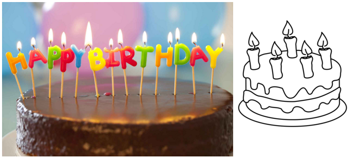
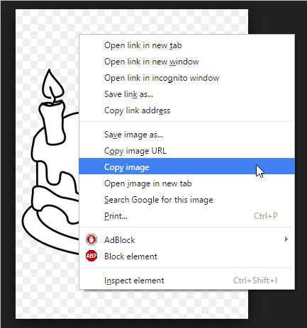
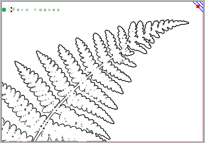
On the internet you can find an almost endless amount of images, many of which are suitable for production as tactile graphics. For some images only a minimum of effort is needed to adapt the image. By selecting the right image as a source, such as a line drawing instead of a more complex photo, a simple combination of applying filters and minimal use of retouching tools can be sufficient.
Editing an image from the internet

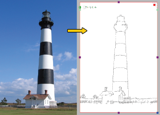
Figure 1. Tactile diagram based on an image found on the internet.

3. Convert scanner and webcam images
Images taken with a webcam or scanner can be used as a source for a tactile graphic. In most cases, the images that you scan or photograph will need to be processed for tactile use. By combining the filters and retouching tools, colours can be removed and the image converted to a line drawing. In the settings menu you can configure the setup for a scanner or webcam for the software.
‘Activate webcam’ icon: Activate webcam icon
‘Quick scan with scanner’ icon: Quick scan with scanner icon
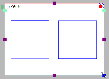
4. Create a design from scratch
With the series of drawing tools in the left vertical toolbar, a design can be partially or completely drawn from scratch in a blank design. This method often requires a little more effort than the previous three, but it gives the most flexibility in case no suitable images are available as a basis for your design.
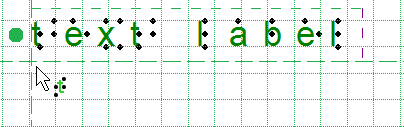
Most designs require a combination of different drawing tools. The objects (indicated in blue) for example, give great precision and access to convenient properties such as textures. Text in the correct braille table can be added anywhere in the design as clarification. Special symbols can easily be added from the figures library.

5. Create graphs based on an equation
Graphs are widely used in mathematics and many other subjects, but there are a lot of factors that determine the tactile usability of a graph. The mathematics module in TactileView will help you to easily create a graph based on any given equation. This module can be accessed by selecting the Graphs menu or the Graphs icon in the left toolbar.

Tactile graph in a TactileView design

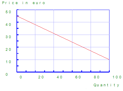
Figure 2. Tactile graph created with the mathematics module in TactileView.

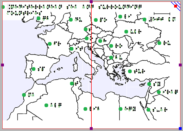
6. Create tactile maps
Producing maps of an area of any size (part of a city, region, country or even a continent) can be done with the map maker module in TactileView. Select ‘Compose map’ from the Portal menu, or click the map icon in the top toolbar.
The maps are composed on the RouteTactile website by selecting the area you wish to include in the map or which features (streets, rivers, buildings, etc.) should be included. Keep in mind that including more elements will increase the complexity of the map.
Tactile map with RouteTactile

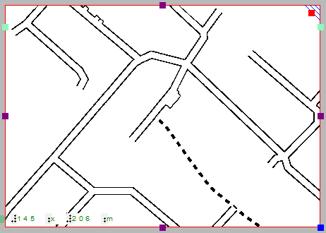
Figure 3. Tactile map created with RouteTactile.

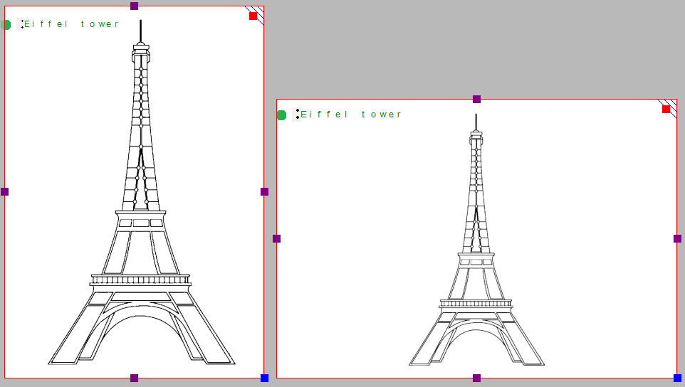
7. Combine text and graphics in one document
Texts can be included in TactileView documents, but for some purposes it is required to have a document where the graphics are part of a text book. The graphics can then be inserted in a braille editor such as Duxbury Braille Translator (DBT).
Image inserted in Duxbury Braille Translator

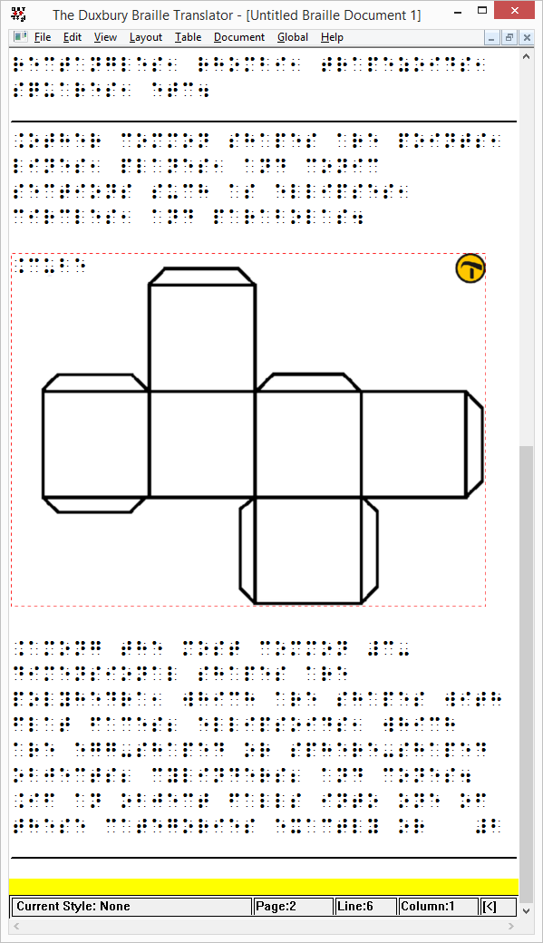
Figure 4. TactileView design inserted in Duxbury Braille Translator.

4.02 Creating and opening files

TactileView offers a number of different ways to begin making great tactile materials. You can create a file from scratch or start from a picture on your computer. Or you could get a head start by beginning from a pre-installed example file or one of the thousands of designs available in the online catalog.

1.Creating a new file

When you open the TactileView software, a new, blank document is created automatically. You can begin working in this document immediately. To open another new file, select ‘New’ from the File menu or press Ctrl+N. You can also click on the ‘Create a new document’ icon in the top horizontal toolbar.

Create a new document icon: Create a new file icon
2. Creating a new file by importing a picture

You can create a new document from a picture saved to your computer. To import a picture into TactileView, select ‘Open’ from the File menu or press Ctrl+O. In the Open dialog, browse to the location where your picture is stored and select it, then choose ‘Open’. A new TactileView document containing the picture is created.

Open icon: Open icon
3. Opening a pre-installed example file

A number of example files are installed with the TactileView software. To open one of these files, select the ‘Open TactileView Examples’ option from the File menu. A dialog box will appear with a list of available sample files. Select a file from the list, then choose the ‘Open’ button to open it in TactileView.

Open TactileView examples icon: Open TactileView examples icon
4. Downloading and opening a file from the online catalog

To download an existing file from the online catalog, open the Portal menu and choose ‘Download and Edit Design from Catalog’. This will launch a new window that will allow you to browse available files by category or search for something specific using the search field. Browsing by category is recommended for best results because of the variety of languages used for file titles and keywords.

Once you’ve chosen a category, select a design and choose the ‘Closer Look’ link (green arrow button) beneath it. This will launch a web browser window with a larger preview of the image in the file. Select the ‘Download & Edit’ link.

A dialog will pop up asking if you want to open or save the file. Select ‘Open’.

NOTE:
If this is the first time you are downloading a file from the TactileView catalog, Windows may open a dialog box asking what application to use to open the .bpx file. Choose the option that allows you to browse your computer for the desired application, and browse to C:\Program Files\TactileView\TactileV.exe on a 32-bit operating system or C:\Program Files (x86)\TactileView\TactileV.exe on a 64-bit operating system. If there is a checkbox available to always use this program to open this type of file, make sure it is checked, then select the ‘OK’ button.

The file will now open in TactileView.

Download and edit design from TactileView Catalog icon: Catalog icon

4.03 Importing images from the internet

Images from the internet often form a great source for a tactile image. The amount of different subjects that can be portrayed is virtually endless. However, selecting the right material from this vast resource can both improve the tactile quality and minimize the effort needed to convert the image into a tactile diagram.

Understanding which image works best

Virtually any image can be used as a basis for a tactile diagram, but some are more suitable than others. For example, some images are harder to understand when they converted to a tactile image. In general, a higher level of detail will result in a more difficult tactile diagram. Concepts such as shadows or three-dimensional perspective can be very hard to understand for a blind reader.

The second consideration is the amount of effort it takes to convert the image to a tactually usable design. Of course it depends greatly on the type of contents you wish to include in the image, but generally ‘less is more’: a simpler image takes less time to convert than a more detailed one.

An image needs to have enough features that can be understood by touch. This means that images often need to be simplified by isolating individual lines from the In most cases, line images are preferred as a basis for a design.

Two different birthday cards: a complex one on the left, a less detailed one on the right

Figure 1. The image on the right has less fine detail and is less complex, making a tactile version easier to read and taking less effort to edit than the image on the left.


Make clever use Google image search

Using Google, you can search for images that match any keywords that you enter. In most cases this will give thousands of results, so in many cases you will need to refine your search criteria. You could try searching for a synonym or closely related word (e.g. ‘trees’ or ‘woods’ instead of ‘forest’). If you speak multiple languages it can be helpful to search for the same concept in another language.

Google also provides some tools to refine the type of image you are looking for. You can find these by clicking on the ‘Search tools’ button. These allow you to make some useful selections for finding the right material for tactile use. The most important selections for tactile use are:

– Size: larger images are generally better than smaller images, since they provide a better image quality in which more detail is retained when enlarged. You can also select ‘Show sizes’ under ‘More tools’ to get a quick overview of the image sizes.

– Type: refine the type of images that are presented. ‘Line drawing’ or ‘Clip art’ both are highly suitable as a basis for a tactile image, as they are often already simplified into individual lines and will be closer to what is required for a tactile image. We always advise to check first if these types of images are available to minimize the amount of effort it takes to create a tactile image.

The other search tools, such as colour and time can be used to further refine your search results. Appropriate usage rights can be selected if it concerns reproduction.

Photo of a real birthday cake on the left, line drawing of a birthday cake on the right

Figure 2. By making use of the Search Tools, you can select line drawings (right) instead of more complicated images, such as the photo on the left; the line drawing is much easier to read and edit.

Placing the image in your TactileView design

Once you have found a suitable image, right click on it to open the context menu, then select ‘Copy image’. This will copy the image onto your clipboard. In TactileView, press Ctrl+V to paste the image in your design. This will place the image in the design area at the position of you mouse. You can also right click in an empty area of the design, then select ‘Paste’ to place the image on the position of the click. Or you can select ‘Paste’ from the Edit menu or click the ‘Paste’ icon in the top horizontal toolbar, which will place the image in the top left corner of the design.

If you have saved an image on your computer, you can choose ‘Import’ from the drawing tools icon bar, then select ‘Import SVG’ for svg images or ‘Import image from file’ for bitmap image (.jpg, .png, …), or select ‘Import image from file’ from the File menu. Next, click in the design where you wish to insert the image.

You can always resize or move the image to the required position in the design. Use the retouching tools (pen and eraser), a combination of the filters from the drawing tools toolbar or the Filters menu, or any of the other drawing tools to make the required adjustments to make the inserted image suitable for tactile use.

2015-10-08_11-55-25

4.04 Importing images from file (.svg, .png, .jpg, …)

Saved images can be used as a basis for your tactile designs. These can be bitmap images (.bmp, .png, .jpg, etc.) or SVG images. There are two ways to insert these files into your design.

Import image from file

To import a bitmap or SVG image file, select ‘Import’ from the drawing tools toolbar, then choose ‘Import SVG’ or ‘Import image from file’ from the context toolbar. A dialog will open in which you can browse and select the image file that you wish to use. Select ‘image files’ or ‘svg files’ as the type of file to limit the presented files to images suitable for importing. Once you have selected the correct image, click ‘Open’ to insert the image into your design. Next, click in the design to position the image.

‘Import’ icon: Import icon
‘Import SVG’ icon: Import SVG icon
‘Import image from file’ icon: Import image from file icon

Copy from Windows File Explorer
In Windows File Explorer, select the image file that you wish to insert in your design. Right click on the file and select ‘Copy’, or use the shortcut Ctrl+C. In TactileView, position the mouse where you want to insert the file and press Ctrl+V to paste the image. Alternatively, you can also select ‘Paste’ from the Edit menu, the top horizontal toolbar or by opening the context menu by right clicking in the design and selecting ‘Paste’.

‘Paste’ icon: Paste icon

4.05 Capture scanner or webcam image

Using a scanner or a webcam offers a flexible method to quickly import existing material you’re your design. Both methods create a bitmap image that will need some processing to turn it into a tactile usable design.

Settings menu – Scanner and Webcam

Make sure the devices are configured in the settings menu dialogs ‘Webcam’ and ‘Scanner’. A message will indicate when your device is not connected or configured when you try to start it.

Scanner

The scanner will create an image (bitmap) of the scanned document. This way, you can use existing images from text books or documents as a basis for your tactile graphics.

‘Quick scan with scanner’ icon: Quick scan with scanner icon

Webcam

The video content from the selected webcam is displayed in a small window beside the drawing area. The control buttons are available below this window. You can adjust the size of the webcam window by clicking ‘Enlarge/reduce the webcam view’. Pressing the shutter button of the webcam (‘Take webcam snapshot’) will record a snapshot image. You can rotate the webcam image if necessary by clicking ‘Rotate the webcam view’, and shut the webcam window down with ‘Deactivate webcam’.

Existing document or new document

Once you have recorded your scanner or webcam image, you will be asked whether you want to add it to the existing design or insert it in a newly created design. The image will be placed in the top left corner of your design. As the image is inserted as a figure, the size and position of the image can be adjusted .

Further processing

As with all other images (copied from internet or imported from file) further processing is usually required.

– Retouching (pen and eraser): fusing the image with the design bitmap allows you to refine parts of the image.
– Apply filters: colours have to be removed and the image usually has to be converted to a line drawing.
– Use text labels: add a title and other text labels to clarify the different parts of the image

For a full description of the respective tools, see also the section ‘Drawing tools toolbar’.

‘Activate webcam’ icon: Activate webcam icon

A separate window within TactileView shows that the webcam is activated for capturing images

Figure 1. A separate window shows the webcam is activated for capturing images; click on the image to enlarge.

Webcam control icons

Figure 2. Webcam controls: ‘Enlarge webcam view’, ‘Take webcam snapshot’, ‘Rotate webcam view’ and ‘Deactivate webcam’.

5.01 Layout tools

In TactileView, several tools are available to facilitate a precise design process and cope with regulations and conventions that specify the layout of a tactile diagram.

Right-up marker
Once the design is printed and in the hands of the reader, the right-up marker is tactile marker in the top right corner. This right-up marker helps to find the correct orientation of the diagram without having to explore the tactile diagram itself. This way you can easily find out if the design should be read in a portrait or landscape orientation.

When the marker is presented in blue on screen, it will be printed. By clicking on the red marker in the top right corner of the screen, the right-up marker can be selected or unselected. Alternatively, you can select ‘Draw right-up marker’ from the design toolbar (right vertical toolbar when nothing is selected) or the design context menu.

Right-up marker

Figure 1. The right-up marker as shown on screen.

‘Draw right-up marker’ icon: Icon for switching the right-up marker on or off

Alignment grids

TactileView provides two alignment grids that make it easier to get the right layout in your document. The braille grid allows you to align text labels in a fixed grid throughout the design, whereas the measurements grid is used to visualise the dimensions in your document to align objects. The grids are shown in green on screen and will not be printed. You can enable or disable these grids in the second vertical toolbar. This option can also be found in the View menu.

See: Alignment grids – braille grid and measurements grid.

Section of the measurements grid (left) and braille grid

Figure 2. A section of the measurements grid (left) and measurements grid.

‘Screen elements’ icon: Screen elements icon
‘Show grid’ icon: Show grid icon

Dot view / line view mode
The graphic capabilities for tactile images differ for each individual production medium. Use the ‘Design mode: dot view/line view’ to control the layout for the different print outputs.

See: Design mode: dot view/line view.


Text label alignment
For accurate placement of texts in your tactile graphics, text labels can be aligned horizontally or vertically with other labels in the design. You can select ‘Switch text label alignment on/off’ from the properties toolbar of a selected text label, or when placing a new label in the design.

As long as the alignment function is on, green ‘magnetic’ dotted lines will appear when moving a text label close to the horizontal or vertical position of another label in the design. The text label on which the moved label will be aligned will be highlighted. When you let go at this position, the moved label will automatically ‘snap’ to this alignment. The same applies to placing a new text label in your design. Please note that aligned text labels are not ‘connected’ but can still be moved and edited separately.

Green lines indicate text label alignment

Figure 3. Text label alignment with green dotted lines.

Centre object or text label
All objects in the toolbar tool have a ‘Centre’ option in their properties toolbar. With this option the object will move to the centre position of the paper. When the paper width is changed, the object will no longer be centred.

See: Editing object properties.

‘Centre’ icon: Icon for centering the text label

Only move horizontally, vertically or diagonally
By holding the Shift key and dragging a selected object or textlabel, the movement will only be in a perfectly horizontal, vertical or diagonal direction. This can also be switched on or off permanently by selecting ‘Restrict to horizontal, vertical and diagonal movement’ from the properties toolbar or context menu of the object or label.

See: Editing object properties.

‘Restrict to horizontal, vertical or diagonal movement’ icon: Move horizontally vertically diagonally icon

5.02 Portrait or landscape design

For tactile graphics, the image size has a big influence on tactile usability. TactileView provides several options to control both design and paper size for optimal tactile quality.

Multiple sheets of paper
The maximum size of paper that printers generally can handle is A4, A3, US Letter or Tabloid. However, diagrams can be larger than the maximum paper size when an image needs to be enlarged to retain the level of detail in the original image. Multiple sheets can be placed in rows and or columns to allow for tactile diagrams of any large size. The red paper border will indicate the size of the design and the number of sheets.

See also: Paper size vs. design size.

Amount of details in a tactile diagram
On one hand, the level of detail that can be presented in a tactile graphic is limited due the discriminatory capabilities of the fingertips. On the other hand, the relatively large size of braille dots and the minimal required distance in between dots also limit how much detail can be included.

The larger the design therefore, the more detail can be retained when printed with an embosser. This will help to control the complexity of the designs.

Tactile image of a fern

Figure 1. This image shows the shape of a fern branch, but might not contain sufficient tactile detail in the leaves. A separate image could be used to display leaf details.

Images as large as possible
Although there is a limitation to the size of an image, it is best practice to use as much of the paper as possible. Matching the design orientation to the dimensions of the tactile graphic (i.e. using landscape for wide images and portrait for higher ones) allows for optimal positioning on the paper. Rotating from landscape to portrait or vice versa may give a 30% larger image, which greatly improves the tactile usability.

Size comparison of portrait versus landscape designs

Figure 2. By choosing the right orientation, the image can be shown larger, maintaining more detail.

When changing the design orientation, the image will not be scaled. This way, the size and position of the elements in your design will not change and details will not be lost. However, the design will automatically be extended with extra white space or trimmed of excess empty white space in order to fit the new paper orientation.

It is best to think about the optimal size of the tactile diagram before starting the design: a higher level of detail will require a larger design size. Adjustments in size can always be made later by scaling the design with the purple markers around the edge. However, text labels have a fixed size. By scaling the image they might overlap the image or may end up too far from the elements in the drawing that they refer to.

5.03 Changing design orientation and size

In TactileView, the ‘design size’ refers to the size of the tactile graphic, represented on screen by the white area. The design size can be the size of a full sheet of paper, but can also be extended to span multiple pages; see: Paper size vs. design size.

Changing design size

By default, when you open a new document, the design will have the same size as a full sheet of paper. When you wish to add or remove white space to your design, you can drag the purple markers along the four sides of the design. Notice that this does not scale the contents of the design but only extends or narrows it.

Enlarging the design using the purple markers

Figure 1. Drag the purple markers to enlarge or reduce the design size.

Resizing the design

The blue marker in the bottom right corner can be used to scale the entire design, i.e. enlarge or reduce the design size and all elements. This will change the resolution of the design. Braille characters have a fixed size, so text labels will not be scaled. Keep in mind that text labels might start to overlap with other elements in the design.

Resizing the design by dragging the blue marker in the bottom right corner

Figure 2. Drag the blue marker in the bottom right corner to scale the design.

Change page orientation

The page orientation can be changed at any time to suit the dimensions of the design. The position and size of the image contents will not change, but the edges of the white area will be adapted automatically to fit the design to one or more full pages in the new page orientation. You can change the page orientation in several ways: select ‘Change the orientation to landscape/portrait’ from the toolbar of the design (right vertical toolbar when nothing is selected), from the ‘Page formatting’ toolbar in the second horizontal toolbar, or from the Design menu.

‘Page formatting’ icon: Page formatting icon
‘Change the orientation to landscape’ icon: Change the orientation to landscape
‘Change the orientation to portrait’ icon: Change the orientation to portrait

If the image contents fits within a single sheet of paper in the new page orientation, the excess white space will be trimmed in one direction, and added in the other. For example, when changing from portrait to landscape format, the white space on the bottom of the page will be trimmed and the design is widened. This change in page orientation is always reversible later on.

Change page orientation when the contents fits on a single sheet in the new orientation

Figure 1. The contents will fit on a single sheet (red border) after changing the page orientation; the white space at the bottom will be trimmed, the right side will be extended.

If on the other hand the original design would not fit within a single page in the new orientation, the design is automatically extended in both directions to fit on two pages. This change is also reversible.

Change page orientation when the contents does not fit on a single sheet in the new orientation

Figure 2. The contents of the design will only fit on two pages (red borders); the white space ate the bottom and right side will be extended to fit the design across both pages.

5.04 Paper size vs. design size

The maximum paper size that printers generally can handle is A4, A3, US Letter or Tabloid. However, diagrams can be larger than the maximum paper size when an image needs to be enlarged to retain the level of detail in the original image. Multiple sheets can be placed in rows and or columns to allow for tactile diagrams of any large size.

In your designs, the red paper border will indicate the size of the design and the number of sheets. Drag the purple markers on the edges of the design to add or remove white space in order to use more surface area for your design. Note that this only adds or removes a strip along the edge of the design, but does not scale (enlarge or reduce) the design contents in this direction. The blue marker in the bottom right corner can be used to scale the entire design.

A map is spread across two sheet of paper in order to show the countries in more detail.

Figure 1. The map is printed across two sheets of paper side to side in order to include sufficient detail.

By resizing the design, adding/removing space within the design or changing the paper orientation, it might become wider or higher than a full sheet of paper (i.e. the white space extends beyond the red border of the paper). If this excess strip does not contain design contents, it will be trimmed automatically when the file is printed. If on the other hand the design is smaller than a full page (i.e. does not reach completely to the red border), the page will be filled out by adding white space.

5.05 Alignment frame and grids

The two alignment grids combined with the alignment frame are useful tools on screen that help to manage the layout of your design by aligning the text labels and/or drawn elements. The braille grid is primarily used to align text labels in a regular grid and conform to certain layout guidelines, whereas the measurements grid is mostly used to align objects and visualize their size. The grids are shown in a light green colour on screen, but will not be printed or embossed.

For more details, see: Measurements grid (object alignment) and Braille grid (text alignment).

Alignment grids: measurements grid on the left, braille grid on the right

Figure 1. Example: measurements grid without alignment frame on the right, 

The settings dialog for both grids can be accessed by clicking on the light green marker on the right hand side of the braille grid between text lines 2 and 3, or via menu Settings > Alignment grids.

You can easily switch between the two grids by clicking on either of the grid icons in the second horizontal toolbar. Alternatively you can select ‘Show braille grid’ or ‘Show measurements grid’ from the View menu or select a grid via the Alignment grids settings dialog. You can switch grids off by clicking once more on the currently active grid or deselect it via the View menu or in the grids settings dialog.

Alignment frame

The alignment frame is a layout tool that can be used as a guide to limit the design to a specified area within the printable area of a page. This is presented in the design with a dashed red border, but will not be printed.

The width and height of the frame are limited to a whole number of braille characters and lines of braille text, respectively. You can adjust the top and left margin of the frame by dragging the four green markers that are placed along the top and left side of the design. Alternatively, you can enter the values for the frame size by opening the ‘Alignment frame and grids’ settings dialog via the green marker on the right-hand side of the design or via menu Settings.

When the alignment frame is enabled, a selected alignment grid will only be shown within the area of the frame. Text labels will then be automatically adjusted in width to fit within the frame.

Saving grid and frame settings as default

The alignment frame and grids are very useful to create consistent page formatting between different designs. In the settings dialog, you can therefore save the current grid and frame settings as default values by choosing ‘Save as default settings’. This ensures the same frame and grid size are used as the basis for all new documents.

These settings are also saved in the document. This way, when you wish to edit the design later on, the margins and grid size still match the design, even when the default grid properties for new documents might have changed.