Skip NavigationMenu

6.08 Draw table

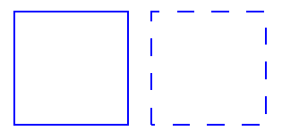
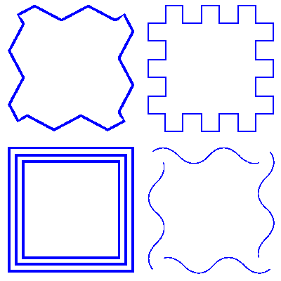
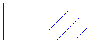
TactileView includes a number of tools for drawing and working with tables. Most editing commands for tables are the same as for other drawing objects, including the methods with which to move, center or delete a table, change its line or fill style, add audio labels or fuse it to the bitmap. For more information on these topics, please refer to Editing object properties, Adding audio styles and Working with fused bitmaps. The features and commands described in this tutorial are specific to tables.

Drawing a table

To add a table to your file, choose the ‘Draw table’ icon from the toolbar on the left side of the screen, then click and drag the mouse in the design to insert a table into your document. Your table will be created with the default number of rows and columns, but you can add and/or remove rows and columns as desired after the table has been inserted.

Another way to add a table to your file is to select ‘Draw table’ from the Drawing Tools menu. This launches a dialog, allowing you finer control over how the table is initially created.

To insert a table using this method, enter the desired location of the upper left corner of the table, then specify the size parameters, the number of rows desired and the number of columns desired. When setting the size, choose the ‘Enlarge/reduce’ radio button if you would like the cells in your table to be square, or choose the ‘Stretch’ radio button to allow adjustment of the height and width independently. Enter the desired cell width (and the height, if using the ‘Stretch’ option), the desired number of rows and the desired number of columns, then choose ‘OK’ to close the dialog and insert the table into your drawing.


Drawing a table in the design with the mouse
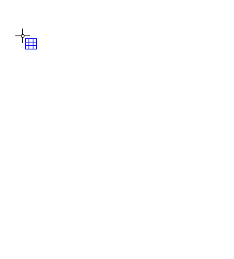
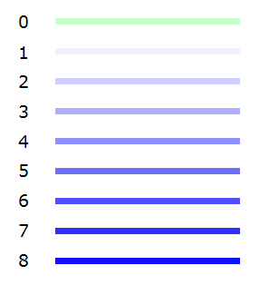
Figure 1. Drawing a table in the design with the mouse.

‘Draw table’ icon: Draw table icon

Adjusting the table size

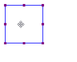
Once you have inserted the table into your drawing, you can adjust the overall table size. The objects and text labels that are placed within the table will be repositioned automatically so they remain positioned in the same cell (see below).

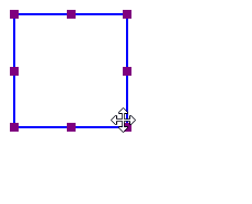
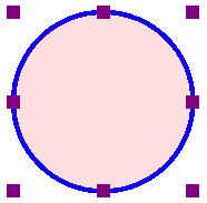
To adjust the size of the table, select the table so that purple squares appear along the outside edges of the table. To scale the table and preserve the height to width ratio, click a purple square in one of the corners of the table and drag it until the table is the desired size. The cells in the table will be scaled up or down automatically with the table and will maintain their height to width ratios.

To adjust the overall table width, click the center purple square on the right or left edge of the table and drag it until the table is the desired width. The cells in the table will be scaled automatically to maintain equal widths. Similarly, you can adjust the overall table height by clicking the center purple square on the top or bottom edge of the table and dragging it until the table is the desired height. The cells in the table will be scaled automatically to maintain equal heights.

Adding and removing rows and columns

By default, a new table has three columns and three rows; however, you can always adjust the number of rows and columns by inserting or deleting them. To do so, select ‘Insert or delete rows and columns’ from the properties toolbar or context menu.

In the dialog that appears, first make a selection whether you wish to add or remove rows or columns. Next, you need to specify which row(s)/column(s) should be deleted or at what position the row(s)/column(s) should be inserted.

– In the case of inserting, you can choose to place them ‘In front’ (i.e. on the left side of the table in the case of columns, on top for rows), ‘At the end’ (i.e. on the right or bottom) or after the specified column/row number (i.e. inside the table). You can choose to add a single or multiple rows or columns.
– In the case of deleting, you have the choice between ‘First’ (again, the leftmost column or top row), ‘Last’ (rightmost column or bottom row) or after the specified row/column number. Again, you can choose to remove multiple rows at a time.

Finally, you have to select if either:
– the table dimensions need to remain constant, i.e. the outer dimensions of the table remain the same but the cell size is adjusted to accomodate the new number of rows/columns; or
– the cell dimensions remain constant, i.e. the table size is adjusted to add or remove space for the new number of rows/columns.

Once you have made all selections, choose ‘OK’ to confirm.

‘Insert or delete rows and columns’ icon: Insert or delete columns and rows icon
Entering table contents

At any point after creating your table, you can enter contents into the cells. You can use the drawing tools from the left vertical toolbar or Drawing tool menu to place text labels or objects in the table. Objects inserted into a table may be edited just like objects that are not part of table contents (for more information, please refer to the ‘Drawing tools’ section of the manual). Inserting an object into the table contents will anchor it to the table, so that if you later move, stretch or scale the table, the object stays linked to the correct cell in the table.

As an alternative to drawing the object with the mouse, select the table and choose the ‘Table contents’ icon from the properties toolbar, or right-click the table and choose ‘Table contents’ from the context menu. This launches a dialog from which you can control the table content.

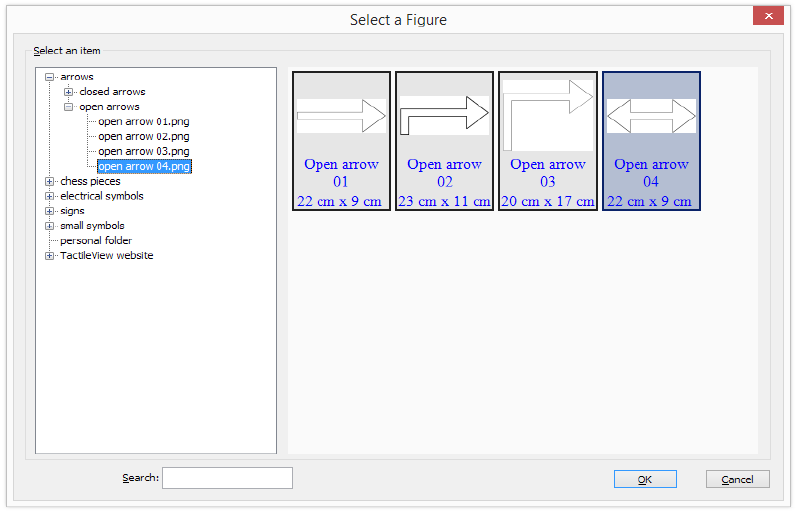
When you select an object type from this menu, a dialog will come up allowing you to give further information about the object you want to create. What is on the dialog will vary depending on which type of object you select. A size and position dialog will appear for straight lines, squares/rectangles, circles/ellipses, triangles, polygons, freehand lines/closed shapes, dots and tables. For the other objects, a dialog will appear in which the contents can be entered (e.g. text labels) or selected (e.g. figures).

The dialogs are very similar to the ones that appear when you access the drawing tools from the Drawing Tools menu, except that they also have edit boxes that allow you to select which cell to place the object in by specifying the desired row and column for the object.

This is the size and position dialog for inserting a square, but since it is being inserted into a table it has ‘Row in table’ and ‘Column in table’ edit boxes at the bottom. Make the desired selections to create your object and place it in the appropriate cell, then choose ‘OK’ to close the dialog and insert the object into the table. It will also appear as a listing in the table contents menu.

Scaling a table will reposition the object within the table
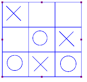
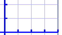
Figure 2. Scaling or moving a table will automatically reposition the contents in the table.

‘Table contents’ icon: Table contents icon

6.09 Draw graph

The ‘Draw graph’ icon shows the list of options for creating a tactile mathematical graph. You can also find these options in the Graphs menu. From this list, you have a choice to either use an empty grid, create a graph by entering your own formula or using one of the TactileView example graphs.

There are a lot of different aspects when it comes to mathematics in braille and creating or reading tactile graphs. The detailed introduction will explain everything you need to know about the background concepts. In the other entries in the ‘Graphs and math’ section of the manual you can read how to use different styles of graphs and learn how to create them using different input methods.

‘Draw graph’ icon: Draw graph icon

6.10 Import (image from file, svg and figure)

There are several ways in which you can add an image to your TactileView design.

  • When you regularly use the same icons or images, ‘Add figure’
  • Saved SVG image files can be added with ‘Import SVG’
  • Saved jpg, png or other bitmap images are added with ‘Import image from file’

These import functions are activated by selecting ‘Import’ from the left vertical toolbar, then selecting the specific tool from the right vertical toolbar.

‘Import’ icon: Import icon
‘Import SVG’ icon: Import SVG icon
‘Import image from file’ icon: Import image from file icon

Add figure

Figures are image objects that are useful when you wish to reuse certain symbols and shapes (such as arrows, electrical symbols, more abstract shapes, etc) in multiple documents. Once you have activated the ‘Add figure’ drawing tool, a dialog will appear in which you can You can browse through the different categories and select the figure you wish to use.

Once you click ‘OK’ to confirm your choice, the figure will be visible at the position of your mouse. Click anywhere to place the figure as an object in your design.If the object is not the desired size when it appears in the design area, you can edit it by dragging the purple markers on the corners and sides.

Settings – personal figures folder
TactileView contains a set standard icons, symbols and other figures. By selecting ‘Figures’ from the Settings menu, you can also select additional folders that contain your personal sets image files that you can use as figures.

Select area – Save as figure
When using the Select area tool, you can select ‘Save as figure’ from the context menu or properties toolbar. This saves the selected area as a figure that can later be reused and will include the bitmap layer as well as any objects within the selection. Keep in mind that text labels are not included in the figure. See the manual section ‘Select area‘ for more information.

Add figure dialog

Figure 1. From the dialog, choose one of the figures to insert in your design; click on the image to enlarge.

Import SVG and Import image from file

Vector graphics (svg files) as well as bitmap image files (jpg, png, bmp, etc.) can be imported in your design by selecting ‘Import SVG’ or ‘Import image from file’. In the dialog that opens, browse to the image file you wish to use and double click or select ‘Open’ to confirm the selection. Next, click anywhere to place the image as an object in the design. You can use the purple markers on the corners in case the image needs to be resized.

6.11 Draw mammoth braille

The dots of braille characters normally have a fixed distance, but this can be enlarged. In TactileView, the greatly enlarged braille is called ‘mammoth braille’ to distinguish from Jumbo braille (braille with increased dot distance).

NOTE: Mammoth braille is not used to place braille texts in the design, but could be used for ‘fun’ applications such as writing a name in a large braille character type. The braille dots will be displayed in blue on screen. The character that is represented by the dots is shown in grey behind the braille dots.

To draw a large braille in the design, select the ‘Draw mammoth braille’ icon from the left vertical toolbar. Click in the design where you wish to place the mammoth braille. Enter the contents in the dialog that appears and click ‘OK’. You can use the purple markers to resize the enlarged braille.

‘Mammoth braille’ icon: Draw mammoth braille icon

Mammoth braille; large blue dots and grey text in the design

Figure 1. Mammoth braille inserted in the design.

Difference in braille dot size using mammoth braille

Figure 2. The dot size of mammoth braille can be enlarged, as opposed to regular braille.

‘Braille dot size’ icon: Mammoth braille dot size icon

6.12 Draw letters and digits

NOTE: Keep in mind that this drawing tool is not intended to present texts in braille, but as a tool to show the contours and shapes of visual text characters. Various font types and font sizes can be used to illustrate font attributes such as serif, italic or bold.

To draw a text in the design, select the ‘Draw letters and digits’ icon from the left vertical toolbar. Click in the design where you wish to place the large text. Enter the contents in the dialog that appears and click ‘OK’. You can use the purple markers to resize the text, which should be large enough for tactile use to distinguish the characters.

‘Draw letters and digits’ icon: Draw letters and digits icon

Large blue letters drawn using 'Draw letters and digits'

Figure 1. Add large text to your design with ‘Draw letters and digits’

Large blue texts with different font sizes

Figure 2. Font type and size for letters and digits can be adjusted.

‘Font type and size’ icon: Font type and size icon

6.13 Editing object properties

The drawing tools for placing objects described in the previous manual sections, allow you to place objects by clicking and dragging in the drawing area. The blue colour will indicate that an element in the design is an object. Below, you can find the common properties that are shared by these objects in TactileView.

Properties in right vertical icon bar

As soon as the drawing tool is activated in the left icon bar, or when the object is placed or is selected in the design, the properties icon bar for that selection will appear. For most objects, the first icon in this bar allows you to determine the size and position by entering the values via edit fields.

‘Size and position’ icon: Size and position icon
 

Resizing objects (all object types)

Purple markers can be found on the corners and along the sides of the object. By dragging the markers on one of the four sides, you can adjust the width or height. For example, a square will become a rectangle. The markers in all four corners will scale the entire shape (both the width and height) maintaining the same aspect ratio.

For polygons and freehand lines, a red dashed box will appear around the object. The markers on the corners and sides of this box can be used to resize the entire object. The purple markers on the corners of the polygon or anchor points of the line are used to adjust the shape of the object.

Alternatively, all objects can be resized by selecting ‘Size and position’ (or similar) from the context menu or properties toolbar. In the ‘Size’ section of the dialog, choose the ‘Enlarge/Reduce’ radio button if you want to scale the entire object, or ‘Stretch’ to independently adjust the width and size without retaining their ratio. Next, specify the desired width or height and choose ‘OK’ to resize the object.

Resizing a square with the mouse

Figure 1. Resizing a square using the purple markers.

Moving objects (all object types)

You can move objects by holding the left mouse button and dragging it to another position, as indicated by the four-way arrow cursor. A green line will indicate the distance over which the object has moved. For more precise placement, you can use the arrow keys to move the object by 1 pixel or Shift+arrow keys for steps of 10 pixels.
Alternatively, select ‘Size and position’ (or similar) from the properties toolbar or context menu of an object to enter the position values via the ‘Size and position’ dialog. Enter the position relative to the top left corner of the design and click ‘OK’ to reposition the object.

Two additional functions in the properties toolbar help you to position an object in a specific way: you can either choose to horizontally centre it in the design, or only move it horizontally, vertically or diagonally (alternative: hold shift while moving the object).

Moving an object with the mouse

Figure 2. The green line indicates the moved distance when moving an object with the mouse.

‘Centre’ icon: Centre icon
‘Restrict to horizontal, vertical or diagonal movement’ icon: Move horizontally vertically diagonally icon

Rotation

The object can rotate over 360 degrees. Scrolling with the mouse while holding down the Shift key will rotate per 5 degrees, or use Shift+Ctrl+mouse wheel for more accurate rotation per degree. You can also set the rotation to a certain value by choosing the ‘Rotation’ icon and entering the angle in the dialog that appears.

‘Rotation’ icon: Rotation icon
 

Line style part 1: Solid and dashed lines

The outer border of the object will be a solid line of a certain (narrow) thickness. The line style will allow for a variation in pattern, thickness and texture for the border. Choose ‘Line style’ from the properties toolbar, then select your style elements from the dialog.

To change the line style, select the object and choose ‘Line style’ from the properties tool bar or context menu. In the dialog that opens, you can set the line properties for the object, including the line pattern (solid or dashed) and thickness in pixels. The dialog includes a preview of how your line will look as you make changes. Choose ‘OK’ to apply your changes to the object and close the dialog.

Keep in mind that thicker lines do not always benefit the tactile usability of your design; it is best to experiment which line styles work best for your embosser or printer.

Two squares with different line styles. The left one has a solid line, whereas the right square has a dashed line style.

Figure 3. Squares with different line styles: continuous lines (default) or dashed line style.

‘Line style’ icon: Line style icon


Line style part 2: Line textures

Besides solid and dashed line styles, you can also apply different line textures to the object outline. These incluse a series of waves, zigzag lines, double lines and various other patterns. To apply a line texture to the object, first choose ‘Line style’ from the properties toolbar or context menu. In the dialog, set the radio button under ‘Line texture’ to ‘Apply line texture’. Next, click the button ‘Choose texture’ to select the specific line texture you wish to use.

Most line textures require a sufficiently large line thickness to feel the characteristics of the pattern. The tactile result may vary for each embosser model or type of swellpaper, so it is advisable to experiment with different textures and sizes to get a feel for which settings work best for your embosser or printer.

Squares, triangles and polygons have straight lines that meet at the corners. Depending on the length of the line segment, the line pattern repeats a certain number of times and starts again on the next line segment. This means that the line pattern of the two line segments may not always join exactly in the corners. This effect is more prominent with some patterns but less noticeable in others.

Squares with varying line styles: zigzag, block wave, triple line and wave

Figure 4. Wave line texture applied as the line style for a square.

Surface properties part 1: Fill style – Texture

The Fill style will give you a wide variety of textures that add a tactile pattern in to the surface of the object. The pattern can be selected based on the preview. The patterns are made of repeated tiles. The tile size can be set to determine the fineness of the texture. The pattern can have its own rotation within the object, independent from the position and rotation of the object. This enables even more variation in textures, as the same texture can be used in various rotations, giving a different tactile experience.

In the dialog that opens you can set the fill properties, including selecting the fill texture style as well as its size and rotation angle.

If you wish to add a fill texture to the selected object, select the object and choose ‘Fill style: texture’ from the properties toolbar or context menu. In the dialog that opens, select the ‘Use texture fill’ radio button. Next, click on the ‘Choose texture’ button to open the list of available textures. Choose a texture from the list and click ‘OK’ to confirm. A preview of the chosen texture appears in the ‘Fill style’ dialog.

Use the ‘Tile size’ and ‘Texture rotation angle’ edit boxes to scale and rotate the texture. The relief height of the texture as well as the surface area in between can be adjusted when supported for the selected embosser. When you are finished making changes, choose ‘OK’ to apply the fill style.

Two squares with different fill styles. The left square has no fill style (default), whereas the right square has diagonal lines as a fill style.

Figure 5. Squares with different fill styles: no fill style (default) and diagonal lines.

‘Fill style: texture’ icon: Icon for Fill style: texture

Surface properties part 2: Transparency

The transparency of an object determines whether or not it will cover underlying object. In case the object is transparent, only the border is visible. All parts of the design that are overlapped by the object are still visible.

In case the object is non-transparent, all that is inside the object is covered by the white inner surface of the non-transparent object. Keep in mind that non-transparent objects might (completely) cover other elements in the design. You can change the order in which they are presented to determine which one is on top of the other.

See also: ‘Transparency and object stacking

‘Make object transparent’ icon: Make transparent icon
‘Make object non-transparent’ icon: Make non-transparent icon

Surface properties part 3: Fill style – colour

For production of the design on swellpaper, objects can have a colour as well. Select the desired colour from the dialog ‘Fill style: Colour’. Keep in mind that most embossers do not support printing in (coloured) ink, so this function does not apply to production with braille only.

‘Fill style: colour’ icon: Fill style colour icon
 

Audio information

The ‘Audio style’ function is used to add audible information to an object, giving the object an extra ‘layer’ of information. This layer consists of a text that is pronounced by a speech synthesizer (TTS). This functionality is used to create an audio-tactile diagram and can be explored using the TactileView ClickPad or TactiPad combined with the TactileView digital pen.

See also: ‘Using audio styles

‘Audio style’ icon: Audio style icon

Relief height

The relief height for the outline, surface and texture of objects can be selected separately. Keep in mind that this functionality is only available in the properties toolbar when using an embosser that supports variable dot height.

See also: Using variable relief height

‘Relief height: line, surface and texture’ icons: Relief height line icon Relief height surface icon Relief height texture icon
 

Deleting objects

You can delete the entire object by selecting ‘Delete’ in the properties toolbar or context menu, or by using the Delete key. When you only want to remove parts of an object, you first have to fuse it with the bitmap (Ctrl+B or ‘Fuse with bitmap’ from the properties toolbar or context menu). After this you can use the eraser tool to remove parts from the object.

‘Delete’ icon: Delete icon

6.14 Using audio styles

Audio styles a great way to add more information to a drawing without having to make it larger to accommodate more text or graphical information. The audio information is accessed by using the file in explore mode, either on screen with a mouse or on a tactile copy on the Clickpad or Tactipad with the digital pen. For more information on explore mode, please refer to the Using Explore Mode and Using the Pen in Explore Mode with the Clickpad or Tactipad tutorials.

Audio styles can be added to any type of drawing object in TactileView (figures, squares, circles, dots, detected area, etc.). Audio styles may not be added to text labels, because text labels are automatically voiced by text-to-speech when the file is used in explore mode (the text contents of the label is used as an audio style).

Adding an audio style to be voiced by text-to-speech

To add an audio style to be voiced by text-to-speech to an object, select the object and then choose the ‘Audio style’ icon from the properties toolbar on the left side of the screen or right-click the object and choose ‘Audio style’ from the context menu. This will launch an audio style dialog, the top section of which allows you to specify the text to be voiced by synthetic speech from one of several sources.

The default choice is the ‘Self defined text’ radio button, which allows you to type the text you want voiced into the text field on the dialog. If you have text saved in a text file that you would like voiced instead, you can select the ‘Text from local file’ radio button, then choose the ‘Browse’ button to browse to and select your text file (.txt file). Once you have specified the text, you can check how the audio style will sound by selecting the ‘Test audio style’ button. When you are finished making changes, choose the ‘OK’ button to close the dialog and apply the audio style. The object will be shaded light pink to indicate that an audio style is associated with it.

The light red colour signifies the circle has an audio style

Figure 1. The light pink colour signifies an audio style is associated with the circle.

Attaching an existing sound file to an object

You can also attach an existing sound file to an object to have it played when the object is clicked while the file is in explore mode. In the audio style dialog, the bottom section allows you to specify a sound file to be used as an audio style.

The default choice is the ‘Local file’ radio button, which is used to attach a sound file to the object as an audio style. Select the ‘Browse URL’ button, locate the sound file you would like to use on your computer and select it. The file path to the sound file will now appear in the text field below the sound file type selection radio buttons. You can check how the audio style will sound by selecting the ‘Test audio style’ button. When you are finished making changes, choose the ‘OK’ button to close the dialog and apply the audio style. The light pink colour will now indicate an audio style is associated with the object.

NOTE:
If you have both a text-to-speech audio style and a sound file audio style attached to the same object, the text-to-speech will be voiced first and the sound file will play after it.

Recording an audio style from a microphone

Audio styles recorded from a microphone are played when the object is clicked with the mouse or digital pen while using the file in explore mode. Recorded styles are played after any text-to-speech styles are voiced. Before recording, you will need to ensure that you have a microphone connected to your computer. You can connect your microphone via the ‘Microphone’ dialog in the Settings menu.

When you have connected a microphone to your computer, you can record an audio style for an object by selecting the object, then choosing the ‘Record microphone’ icon from the properties toolbar on the left side of the screen, or by right-clicking the object and choosing ‘Record microphone’ from the context menu. As soon as you select this, recording begins and the icon in the tool bar changes to the ‘Stop recording’ icon. When you have finished speaking into the microphone, choose the ‘Stop recording’ icon from the tool bar or right-click the object and select ‘Stop recording’ from the context menu to stop the recording. Your recording will play back automatically as soon as you stop the recording, and the object will be shaded light pink to indicate that an audio style is associated with it.

NOTE:
Each object may only have one text-to-speech audio style and one recorded or sound file audio style associated with it. If you record an audio style for an object, it will replace any existing sound file you may have associated with that object previously.

Editing an existing audio style

To edit any type of audio style, select the object with the audio style you want to edit and then choose the Audio Style icon from the tool bar on the left side of the screen or right-click the object and choose Audio Style from the context menu. This will launch the same audio style dialog you used to create a text-to-speech audio style or attach an existing sound file.

To edit a synthesized speech audio style from self-defined text, edit the text in the text field. You can also remove the text-to-speech audio style by deleting the text from the text field in the top section of the dialog.

To edit a synthesized speech audio style from text from a local file, you will need to edit the text within the text file itself. To load text from a different file, select the Browse button, locate the new text file you would like to use and select it. You can also remove this audio style by deleting the file path to the local file from the text field in the top section of the dialog.

To edit an audio style played from a sound file, choose the ‘Browse URL’ button, browse to a different sound file on your computer and select it. It will replace the previous sound file, including any sound file recorded from a microphone, as the audio style for that object. To remove the sound file audio style, delete the file path of the sound file from the text field in the bottom section of the dialog.

When you are finished making changes, choose the ‘OK’ button to close the dialog and apply your changes.

If you would like to re-record an audio style from your microphone, simply follow the steps given above for recording from a microphone. You do not need to open the audio style dialog to do this. Please remember that recording an audio style for an object from the microphone will overwrite any other sound file audio style for that object.

6.15 Using variable relief height

Some braille embosser models allow you to use different relief heights for the braille dots. In TactileView, this relief height can be applied to the blue objects (squares, blue lines, triangles, etc.) as well as the Detect shape tool, tables and graphs.

To find out which embossers are capable of embossing different dot heights, see: Properties of different braille embossers.

For a full overview of all object properties, see: Editing object properties.

Relief height: line, surface and texture

Normally, objects will be embossed using the highest dot height, as this usually gives the best tactile quality. In the case of image files, the colours of the image will be converted to different dot heights, where lighter colours result in lower dot height. This is the default setting for relief height and can always be selected as dot height by choosing ‘Standard’ as the value.

In TactileView, the relief height can be selected separately for the different components of objects. Firstly, you can select a dot height for the outline of the object. Secondly, the surface area of the object (i.e. the area within the outline of the object) can be given a separate height. Finally, if the object has a texture fill style, it can have a different relief height as well.

You can directly edit the relief height for the line, surface and texture by selecting ‘Relief height: line’, ‘Relief height: surface’ or ‘Relief height: texture’ from the properties toolbar or the context menu of the object. The dot height for the line can also be found in the ‘Line style’ dialog, whereas the dot height for the surface and texture can be found in the ‘Fill style: texture’ dialog.

The different dot heights are shown in the design using different shades of blue: a lighter shade signifies a lower dot height, whereas a darker shade corresponds with a higher dot height.

For graphs, you can select the relief height for the grid lines to make them less prominent and distinguish them from the axes and graph lines. By default, these grid lines will already have a lower value; you can edit the relief height by selecting ‘Size and position’ from the graph’s properties toolbar or context menu.

‘Relief height: line, surface and texture’ icons: Relief height line icon Relief height surface icon Relief height texture icon

Different colours signify the values for the relief height, ranging from 0 (no braille) to 8 (maximum dot height)

Figure 1. Different dot heights are shown with different shades of blue in the design.

In graphs, the grid lines have a lower dot height than the axes

Figure 2. The grid boxes in a graph have a lower dot height than the axes, as shown with the lighter blue colour.

Use contrast for tactile usability

Although the dot height can be set to 8 different heights, in reality the increments between these steps are very small. This means there will not be a distinguishable tactile difference between a dot height of 3 and 4. It is advisable to use sufficient contrast in relief height between different elements; for example, a value of 8 for the outline of an object and value of 2 for its surface.

Compatibility with other embossers

The relief height properties of objects are only available when you have a printer selected that supports variable dot height via menu File > Print Setup. A message will notify you when a document is opened that contains objects with variable relief height, but the selected embosser does not support this property. The variable relief height will still be visible in the design using lighter and darker shades of blue, but it is important to remember that the tactile output of the embosser or printer will differ: the outline and texture of the object will be embossed, but the relief height of the object’s surface will have no relief height.

In this situation, you can only edit the relief height for existing objects with a relief height not set to ‘default’. Once you set it to ‘default’, the relief height property of the object will no longer be available until you have an embosser selected that does support variable dot height.

7.01 Differences between the text tools

In TactileView, there are 3 drawing tools that allow you to place tactile texts in your design, each with a distinctly different application:

1. Text labels; regular braille texts using one of the following input methods:

  • Computer keyboard input; regular text input converted to braille output
  • Braille keyboard input; direct input of braille characters using Perkins style braille keyboard
  • Math input; use an equation editor or the keyboard as input for mathematical braille notation

2. Mammoth braille; greatly enlarged braille characters
3. Draw letters and digits; large visual text characters

Once a text label is placed in the design it is preceded by a round coloured marker that signifies the input method. Computer keyboard input is signified by a green marker, braille keyboard input with orange and math input with blue-grey. By hovering over the marker with the mouse, a tooltip will show extra information about the text label. A marker with a white centre indicates the label is transparent.

‘Computer keyboard input’ icon: Icon for computer keyboard input
‘Braille keyboard input’ icon: Icon for braille keyboard input
‘Math input’ icon: Icon for math input
Printing braille text
The braille output differs slightly for each production method (swellpaper or different models of embossers). See the manual sections Printing with a braille embosser or Printing on swellpaper to find out the specific settings for your production method.

7.02 Settings – Braille tables

With the 6 dots of regular braille, only 63 different combinations can be made (not including the space character). However, the languages from around the world use a far larger amount of letters and punctuation marks. To accommodate these differences using only the 63 available braille characters, each language or country uses a specific braille table (sometimes called rule-set, braille code or mapping).

This way, a braille character in one language can have a different meaning in another. It is crucial, therefore, to select the correct braille table for the visual impaired reader.

Once the braille table is chosen, TactileView will automatically produce the correct braille for text labels according to the inherent properties of braille script.

Braille table settings dialog

Via menu Settings > Braille tables, you can select your braille table of choice. There are three sets of braille tables:

– TactileView braille tables: these tables are currently only used for uploading designs to the TactileView catalog, but will be replaced completely in future releases;
– Liblouis braille tables: an open-source braille translator that contains a large number of languages and braille codes.
– Japanese braille table from Extra: a translator for Japanese braille that can be purchased from Extra.

The selected braille table will be your main braille table, which is used as a default for all new text labels that are placed in your design (including the title label). When you change your main braille table, all labels that are designated as such will be changed to the new table.

Braille tables settings dialog

Figure 1. Braille tables settings dialog; click on the image to enlarge.

Choosing which braille table to use

The large list of Liblouis braille tables is recommended over the TactileView tables, as they are now only used for uploading designs to the TactileView catalog or in cases where personal adaptations of a braille table are required.

Liblouis is an open-source braille translator containing an extensive list of braille tables for a wide range of countries and languages. For some there is just a single braille table available, whereas others (most notably English) have several alternatives. In general, they use the following elements in the table names to distinguish them:
– g0 or ‘comp’ for computer braille;
– g1 for uncontracted braille (letter by letter transcription);
– g2 for contracted braille (using abbreviations and contractions);
– g3 for non-standardised personal shorthands (rarely used).

Most of the braille tables without a specified grade will either be grade 1, or a specialised braille table such as mathematical braille notation.

The Japanese braille from Extra is only available once this package has been bought separately.

Once you have chosen your preferred braille table, click ‘OK’ confirm to save the selected main braille table. The main table is also recorded in the document when saved.

Using multiple braille tables in one document

By default, your main braille table is selected for new text labels. However, you can choose to use another braille table for individual text labels. This is useful for example when combining regular text with mathematical equations, or texts in different languages in their corresponding braille tables.

There are two ways of changing the braille table for a selected text label:
– From the properties toolbar or context menu, choose ‘Select braille table’ and select your preferred table from the list; you can choose from your main table, the 5 most recent tables or the complete list of Liblouis tables via ‘More braille tables’;
– Choose the braille table from the list of Liblouis table in the ‘Text and position’ dialog.

To get an overview of all the braille tables that are used in the document, first make sure nothing is selected. Next, choose ‘Show used braille tables’ from the properties toolbar; this option can also be found in the context menu that opens when right clicking in an empty part of the design. When this option is selected, the colour of the markers of all text labels in your design will signify the used tables; the legend near the top left corner shows which colour corresponds with which table.


Colours give an overview of the braille tables in the design

Figure 2. Overview of the braille tables that are used in the design.

Mathematical braille notation

When it comes to mathematical notation in braille, there is a number of additional aspects that come into play. These are also supported in TactileView. For a full overview, read the manual sections ‘Introduction on mathematical notations‘ and ‘Add mathematical label (equation)‘.

Mathematical text label
Figure 3. Mathematical text label.
Text label representation on screen

By default, the braille characters are shown on screen on top of the entered text to give the designer an idea of the occupied space. For better readability, the braille can also be disabled on screen by selecting ‘Hide braille dots on screen’ from the properties toolbar or context menu of the design or a selected text label. Choose ‘Show braille dots on screen’ to make them visible again. Alternatively, the braille can also be disabled via menu Settings > Text label presentation: on screen. See manual section ‘Editing text labels‘.

‘Hide braille dots on screen’ icon: Icon for Hide braille dots on screen
‘Show braille dots on screen’ icon: Show braille dots on screen icon
Opening documents with a different main braille table

When opening a document that was saved using a main table that is different from your current one, you can choose between:
– applying your current braille table to the document;
– use the original braille table in the document;
– use the original braille table and make this your default main braille table.