Skip NavigationMenu

5.06 Measurements grid (object alignment)

The measurements grid is composed of a regular grid of squares that visualize the physical dimensions of your design. This can be used for the alignment of objects in your design.

For a comparison with the braille grid, see: Alignment frame and grids or Braille grid (object alignment).

In the ‘Alignment grids’ settings dialog, you can select the size of the grid squares. The grid settings dialog can be opened by clicking on the light green markers on the righthand side of the screen or via menu Settings > Alignment frame and grids. You can choose from a number of convenient the grid square sizes based on your selected units of measurement, which can be selected in menu Settings > General.

When the alignment frame is enabled, the measurements grid will only be shown within this frame.

Elements of the measurements grid

Figure 1. Measurements grid shown across the entire design.

5.07 Braille grid (text alignment)

The braille grid is used to align text labels in a regular grid for consistency and to conform to certain layout guidelines for braille documents.

For a comparison with the measurements grid, see: Alignment grids or Measurements grid (object alignment).

Braille grid elements

Figure 1. Braille grid shown within the (optional) alignment frame.

Aligning text labels

The braille grid is composed of a regular pattern of cells the size of a braille character. This grid can be used to align text labels in this regular pattern throughout your design. This will ensure all characters are aligned above each other and that the lines of text are evenly spaced in the entire document, as is required in some guidelines for braille documents.

By default, text labels are ‘magnetically’ aligned (snapped) to the braille grid by dragging or placing the label with its edges close to the grid lines. Dashed green lines will indicate when the text label is aligned to the grid. You can switch off the alignment in the Alignment grids settings dialog by deselecting ‘Align text labels to grid’ or by disabling alignment in the context menu of a text label. Any text labels that extend beyond the edge of the braille grid are automatically resized to fit within the grid area.

The lines and characters in each line are numbered along the sides of the braille grid. By default, the title label is placed at character 1 of line 1.

Green dashed lines indicate the text label is aligned in the braille grid

Figure 1. Green dashed lines indicate the text label is aligned in the braille grid.

Braille cell size

The size of a braille character has been standardized, but not all braille embossers have a printing resolution that allows text to be embossed exactly matching this standard size. The grid cells on screen will represent the true size of the embossed braille characters. A red exclamation mark at the top left corner of the braille grid will notify you when the size of the embossed braille will differ from the standardized braille size.

The size of the grid cells will also be automatically adjusted when an 8 dot braille table is selected as the main braille table of the document.

A red exclamation mark near the top left corner of the grid signifies the braille cells have a non-standard size

Figure 2. A red exclamation mark near the top left corner of the grid signifies the braille cells have a non-standard size.

Additional line spacing

You can choose to use extra line spacing between lines of text throughout the document. For example, a value of 0.5 will add an empty space of half the height of a braille character between two lines of text. This line spacing is visible on screen in the braille grid.

This can be selected by clicking on the light green markers on the left hand side between text lines 2 and 3. Alternatively, the value can be changed in the grid settings dialog or by selecting ‘Additional line spacing’ from the properties toolbar or context menu of a selected text label.

Additional line spacing is applied to text labels and the braille grid

Additional line spacing adds white space between lines of text in the braille grid and text labels.

5.08 Design mode: dot view/line view

The graphic capabilities for tactile images differ for each individual production medium. Swellpaper has different properties than an embossed image, and each braille printer will differ in dot shape and placement.

‘Design mode: dot view’ in the second horizontal toolbar is used to display the specific graphic properties of the selected output medium. With dot view selected, the dots are continuously repositioned to match the printed outputs as you add to your design. This functions like a ‘live print preview’ in which you can directly edit your design and see the final output at the same time.

If you want to see the line drawing that the embossed image is based on or that is printed on swellpaper, simply go back to ‘Design mode: line view’.

An image of a shark in line view (left half of the screen) and dot view

Figure 1. The difference between displaying a design in line view (left) and dot view (right).

6.01 How to use the drawing tools icon bar

Drawing tools toolbar with the icons that activate the various drawing tools

The leftmost vertical icon bar offers you a number of tools to add (graphic) objects, modify a selected area or apply a filter to the entire design. The tools are clustered into groups of similar drawing tools. There are two ways of composing your design: by modifying the bitmap and placing objects in the design.

Drawing tools: manipulating the bitmap
The retouching tools allow you to draw directly in the bitmap, where the lines you draw have a fixed position. The set of filters allows you to change colours or change the as an example the thickness of lines with filters. When you open a saved image file (e.g. a scanned image or an image saved from the internet) it needs to be fused with the bitmap in order to edit the image.

Drawing tools: placing objects
The list of available objects includes lines, squares, circles, triangles and dots, but also more complex objects such as tables and mathematical grids. These are represented in blue, indicating they are not ‘fused with the bitmap’ and can still be changed whenever you wish.
A special category of tools allows you to add text to the design: text labels, mammoth braille and drawing letters and digits. These tools will allow adding text in braille or regular font to highlight certain elements in the design.

Properties in second vertical toolbar
Each tool has its own (second) vertical icon bar that will appear when you select a drawing tool or select the object (again) that was created with the tool. Most objects have some properties in common, such has position and size, whereas some other functions are specific for the tool or object.

See: Editing object properties.

6.02 Add text label (braille)

Text labels are used to add texts in braille to your tactile diagrams, ranging from small texts labelling elements in the image to complete texts in braille. When using text labels, it is important to select the right braille table in order to get the correct braille output.

There are three different types of text labels, which are described in the following manual sections:

To place a text label in the design, select ‘Add text label’ from the drawing tools toolbar. The type of text label can be chosen from the right vertical properties toolbar. Click in the design to position the text label.

6.03 Select area; editing parts of the design

The drawing tool ‘Select area’ enables you to manipulate a section of the design. After activating the tool, two types of functions become available: ‘Select Rectangle’ (default) and ‘Insert or remove space’. The rectangular selection allows you to make localized adjustments to the contents of your design. Inserting or removing horizontal/vertical space is used to locally adjust the size of the drawing canvas.

Select rectangle – define the selection

After choosing ‘Select area’ from the drawing tools icon bar or Drawing tools menu, move the mouse into the drawing area and click to set the first position of the first corner. Next, move the cursor and click a second time to complete the selection. Alternatively, you can also click and hold for the first position, then move the cursor and release at the second position.

A dotted rectangle will indicate which area is selected. This selection can be adjusted by dragging the purple markers around the selection. To reposition the selection, move the cursor over the rectangle, then click and hold to drag the selection to another position.

Alternatively, you can select ‘Size and position’ from the properties toolbar or context menu to adjust the selection.

Selecting an area in the design
Figure 1. Selecting an area in the design.

Select area icon: Select area icon
Select rectangle icon: Select rectangle icon

Icons around the selection for easy access

A number of small icons along the edges of the selection give quick access to a few functions for editing the selected area.

Mirroring horizontally flips the selected image left to right, like turning a page in a book. Mirroring vertically flips the image upside down, like turning a page in a wall calendar.

Rotation and mirroring the area can be performed by simply clicking on the corresponding icons. The large red is used to move the selected area of the bitmap, whereas the blue marker allows you to move all objects and text labels that are (partially) within the selection.

The right vertical toolbar will show the full list of options for manipulating the selected section of the design.

Rotate selection icons: Icons for rotating the selected area
Mirror selection icons: Icons for mirroring selected area

Red marker for moving the bitmap:
Red marker for moving the selected part of the bitmap
Blue marker for moving objects:
Blue marker for moving selected objects

Manipulate bitmap: crop, make selection white or fuse objects

To isolate the contents of the selected area from the rest of the design, select ‘Crop Area’. Only the content will remain as the design, as the area outside the selection will be removed.

Select ‘Paint Area White’  to fill the selected part of the bitmap with white. Any objects in the selection will not be affected and have to be fused first to make them white. You can either fuse all objects within the selection by selecting ‘Fuse the selected objects with the bitmap’, or fuse objects individually by selecting and then fusing them.

Crop area icon: Crop area icon
Paint area white icon: Paint area white icon
Edit selected area as figure (move and resize)

The selected area of the bitmap can be resized and moved by choosing ‘Convert to figure’. The purple markers around this figure can be used to resize the selection.

You can also choose ‘Save as figure (file)’ to save the figure to reuse it in other designs.

Save as figure (file) icon: Save as figure (file) icon
Convert to figure icon: Convert to figure icon
Apply filters

The selected content can be processed using the range of filters. These have the same functionality as the list of filters in the Filters menu, but will only be applied to the selection instead of the entire design.

See also Filters; editing an imported image (.jpg, .png, …)

Apply filters on the selection
Figure 2. Local adjustments by applying a filter to the selected area.

Adding/removing a vertical or horizontal area

The function ‘Selected strips’ can be used to remove the selected vertical or horizontal area, or to add this amount of white space to the design. To use this tool, activate ‘Select area’, then ‘Insert or remove space’.

A crosshair cursor will appear when you move the mouse to the drawing area. By clicking once, the first outline of the selection is positioned, as indicated by the dotted green lines. Next, move the mouse horizontally or vertically and click a second time to complete the selection of the strip. Once again, you can also click and drag, then release at the second position to define the selection.

The width of the horizontal or vertical selection can be adjusted by dragging the purple marker on the green dotted lines.

A preview when hovering over the green plus sign will display the addition, whereas hovering over the red minus sign shows the design with the deleted area. Simply clicking on either sign will confirm the action.

Add or remove horizontal or vertical area
Figure 3. Add or remove a horizontal or vertical area in the design.

Insert or remove space icon: Insert or remove space icon

6.04 Detect shape

The ‘Detect shape’ tool is used to add surface properties such as textures to selected parts of the design.

The ‘Detect Shape’ tool, as the name suggests, detects the shape of an area within the elements in the design. Select the ‘Detect shape’ tool from the left vertical toolbar, then click in the centre of the area in the design that you wish to edit. A red dotted line will indicate the contours of the detection.

Detect shape by clicking in an area of the design

Figure 1. Selecting an area of the design with the ‘Detect shape’ tool.

‘Detect shape’ icon: Detect shape icon

Fine-tuning the selection

In some cases, the shape detection might need some fine-tuning to get the exact shape you need. You can use the purple markers to adjust the anchor points of the shape, or click on one of the line segments to add another anchor point.

In other cases, the detection may not be successful because the area is not fully enclosed by lines or other parts of the design. Small gaps cause other areas to be linked to the area you wish to detect.

You can compensate for small gaps by choosing ‘Change shape detection criteria’ from the toolbar or context menu. In the dialog that opens, you can readjust the levels for gap reduction. A higher will result in less gaps in the shape detection; however the detected shape will also have slightly more spacing around it.

You can apply shape detection to coloured images as well. In the detection criteria, you can adjust the range of colours that will be included in the shape around the detection position.

The detection criteria dialog contains a preview of the detected area, in which white signifies which area is part of the selection. Once you have adjusted the criteria, click ‘Re-execute detection’ to improve the detected shape.

‘Change shape detection criteria’ icon: Change shape detection criteria

Detect shape dialog

Figure 2. Use the ‘Change shape detection criteria’ dialog to finetune the detected shape; click on the image to enlarge.

Add properties

When you are satisfied with the detected shape, you can add several properties to it, such as textures or an outline around the shape, just like any of the other (blue) objects.

See: Editing object properties.

Add properties to the detected area, such as Fill style: texture

Figure 3. Add properties to the detected shape, such as texture and line style.

6.05 Filters; editing an imported image (.jpg, .png, …)

Images imported into TactileView need to be edited prior to printing using a combination of the filters and retouching tools. Because source images vary widely, it is helpful to experiment with the different filters to find out what works best for your image. If a filter does not produce the desired result, undo the action by selecting ‘Undo’ from the Edit menu or pressing CTRL+Z.
You can activate one of the filters by selecting ‘Filters’ icon in the left vertical toolbar, or selecting one from the Filters menu. For some of the filters, a horizontal slider allows you to adjust the extent in which it is applied. The filters are applied to the entire design and will fuse all objects in the design.

You can also apply filters to a selected area only, without affecting the rest of the design; see ‘Select area; editing parts of the design’. Please note: in the images on this page, the filters are only applied to the right-hand side of the image to show the effect compared to the original image on the left.

‘Filters’ icon: Filters icon

Convert to line drawing

One way to process the image so that it can better be embossed is to convert it to a line drawing. Select the Convert to Line Drawing option from the Filters menu. A slider bar will appear in the upper left corner of the screen. Drag the slider left or right until the image looks as desired.


Filter convert to line drawing applied on the right-hand side of the image

Figure 1. ‘Convert to line drawing’ filter.

‘Filter: convert to line drawing’ icon: Filter convert to line drawing icon

Convert to black and white

Some images can come out better when converted to black and white rather than to a line drawing. Select the Convert to Black and White option from the Filters menu. A slider bar will appear in the upper left corner of the screen. Drag the slider left or right until the image looks as desired.

Filter convert to black and white  applied on the right-hand side of the image

Figure 2. ‘Convert to black and white’ filter.

‘Filter: convert to black and white’ icon: Filter convert to black and white

Change line thickness

Use this filter to increase or decrease line thicknesses in the image all at once. If your image contains a lot of light, thin lines or a dark, thick lines, this filter is helpful to make them all thicker or thinner at the same time. Select Change Line Thickness from the Filters menu. When the slider appears at the upper left corner of the screen, slide it to the right to make lines thicker or to the left to make them thinner.

Filter line thickness  applied on the right-hand side of the image

Figure 3. Thicker lines by applying the line thickness filter.

‘Filter: change line thickness’ icon: Filter change line thickness icon

Add contours

This option allows you to add outlines around each different colored area in an image. Contours (black lines) are added at the transition point between one color and another and the thickness of the contour lines is controlled using the slider that appears at the upper left corner of the screen when you select the filter. This filter can be helpful for simple drawings that have well-defined areas in distinct colors, but is less useful when applied to photos or other images where color fades from lighter to darker without a distinct transition point.

Filter add contours  applied on the right-hand side of the image

Figure 4. ‘Add contours’ adds black contour lines to changes in colour in the image.

‘Filter: add contours’ icon: Filter add contours

Blur image

The use of this filter lets you soften or sharpen edges between areas of color in an image. Select Blur the Image from the Filters menu, then use the slider that appears at the upper left corner of the screen to adjust the image. Sliding the slider right will soften edges and sliding it left will sharpen the edges.

Filter blur image  applied on the right-hand side of the image

Figure 5. Right-hand side of the image is blurred with the ‘Blur image’ filter.

‘Filter: blur image’ icon: Filter blur image icon

Replace colours

This filter is mostly used to remove certain colours in the image by converting them to white or black. In the dialog that appears, you can select which colour should be replaced from the list of colours that are present in the design. You can also adjust the colour range to include similar shades in the colour replacement. Once you are finished replacing the desired colours, click ‘OK’ to confirm the changes.

Red colour replaced with purple

Figure 6. The red colour in the last olympic ring has been replaced by a dark purple colour.

‘Filter: blur image’ icon: Filter replace colour with colour icon

Negative

This option is mostly used when an image has a lot of black area. Choosing Negative from the Filters menu will exchange all colors in the image file with their opposites. Black areas become white, blue areas become orange, red areas become green, etc.

Filter negative  applied on the right-hand side of the image

Figure 7. ‘Negative’ filter applied to the right-hand side of the image.

‘Filter: negative’ icon: Filter negative icon

Rotating, mirroring and scaling the image

To rotate the entire image, select either ‘Rotate Clockwise’ or ‘Rotate anticlockwise’ from the Filters menu. The image will rotate 90 degrees in the direction you selected.

To mirror the image, select ‘Mirror Horizontally’ or ‘Mirror Vertically’ from the Filters menu. Mirroring horizontally flips the image left to right, like turning a page in a book. Mirroring vertically flips the image upside down, like turning a page in a wall calendar.

To scale the image, select it and then drag the blue square in the lower right corner of the design area diagonally to scale the image smaller or larger.

‘Filter: rotate clockwise/anticlockwise’ icons: Filter rotate clockwise icon Filter rotate counterclockwise icon
‘Filter: mirror horizontally/vertically’ icon: Filter mirror horizontally icon Filter mirror vertically icon
‘Filter: scale design’ icon: Filter scale design icon
‘Filter: fuse all objects with bitmap’ icon: Filter fuse all objects with bitmap icon

6.06 Retouching tools; pen and eraser

Retouching: adding and erasing lines

All TactileView designs have a bitmap that acts as the ‘base layer’. This bitmap layer can be edited using the retouching tools.

See also: Working with fused bitmaps

Retouching

To draw freehand lines that are automatically part of the bitmap and not editable, select the ‘Retouching Adding lines’ icon from the toolbar on the left side of the screen, or select ‘Retouching: Adding lines’ from the Drawing Tools menu. Select the line thickness you would like to use prior to starting to draw by using the slider next to the properties toolbar. You can use Shift+scroll wheel for more convenient size adjustment while drawing in the design. In the properties toolbar or context menu, you can choose between a round or a square pen or eraser shape by selecting ‘Apply circular tip’ or ‘Apply square tip’. You can also choose to draw straight or curved lines by choosing ‘Use straight lines’ or ‘Free style (follow the mouse)’.

You can now use the mouse to draw in the design area. Anything you draw with this tool will automatically be part of the bitmap and will not be editable unless you select an area containing your drawing and convert it to a figure or use the ‘Detect shape’ feature to create an editable object from a freehand closed shape. The retouching mode will continue until you select another mode or drawing tool, or until you press the escape key on the keyboard.

‘Retouching: Adding lines’ icon: Retouching: adding lines icon

‘Line thickness’ icon: Line thickness icon

Line thickness or eraser width with slider or Shift+Scroll wheel

Figure 1. Use the slider or Shift+Scroll wheel to adjust the line thickness.

‘Use straight lines’ icon: Use straight lines icon - pen
‘Free style (follow the mouse)’ icon: Free style (follow the mouse) icon - pen

Retouching - Straight lines or Free style

Figure 2. Drawing straight or curved lines.

‘Apply circular tip’ icon: Apply circular tip icon
‘Apply square tip’ icon: Apply square tip icon

Retouching - Square or round tip

Figure 3. Using a circular or square pen tip.

Eraser

To erase lines in the bitmap, select the ‘Retouching: Erase’ icon from the tool bar on the left side of the screen, or select ‘Retouching: Erase’ from the Drawing Tools menu. The eraser width and shape can be adjusted in the same way as the line thickness of the pen, as well as using straight or curved lines and a circular or square eraser.

Begin erasing by dragging the mouse over the lines you would like to erase. The retouching mode will continue until you select another mode or drawing tool, or until you press the escape key on the keyboard. You can only erase any lines fused to the bitmap. Therefore, if you wish to erase a part of a blue object or inserted image, you will first need to fuse them with the bitmap. You can read more in the manual section Working with fused bitmaps.

‘Retouching: erase’ icon: Retouching: erase icon
‘Eraser width’ icon: Eraser width icon
‘Use straight lines’ icon: Use straight lines icon - eraser
‘Free style (follow the mouse)’ icon: Free style (follow the mouse) icon - eraser

Retouching with the eraser

Figure 4. Using the eraser to retouch a section in the design.

6.07 Draw objects; line, square, circle, …

 
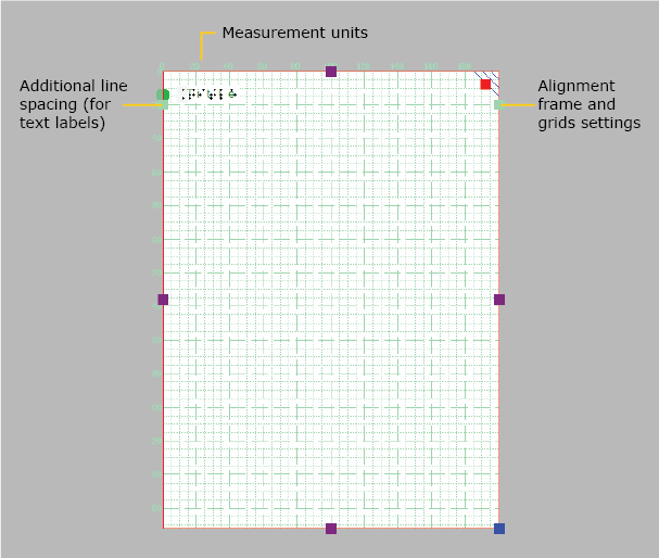
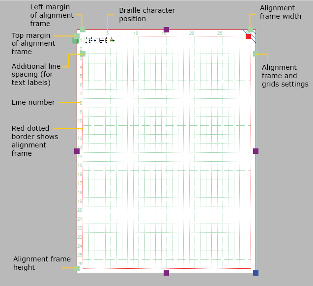
The drawing tools icon bar contains all the drawing tools to create objects with specific shapes such as lines, dots, circles and squares. The objects provide accuracy in your drawings and are indicated in blue on screen.

General operation for the tools

After selecting a drawing tool, a second vertical toolbar will appear. Depending on the tool, this toolbar will present you with a number of options that can be selected before the object is placed in the design.

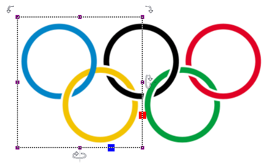
To place the object, move the mouse to the drawing area and click where the object should be placed. The cursor will also indicate the selected drawing tool. Hold and drag or click in a second position to determine the size and position of the object. Purple markers on or around the objects allow for repositioning, resizing or changing the proportions.

An object as a whole can be deleted by the delete key or selecting ‘Delete’ from the icon bar or context menu. It is not possible to erase parts from the object unless it has been fused to the bitmap (see: ‘Working with fused bitmaps‘).

After placing an object in the design, a second vertical toolbar will appear, presenting the specific properties for the drawn object. Reselecting the object later on will bring up the same properties icon bar.

A number of properties are common for all objects. These will be explained in a separate section: Editing object properties.

Drawing straight lines

To draw a straight line, choose the ‘Draw Straight Line’ icon from the toolbar on the left side of the screen. In the design area, click the starting position for your line, then click the end position.

Drawing a straight line

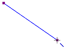
Figure 1. Drawing a straight line in the design.

‘Draw straight line’ icon: Draw straight line icon

Drawing squares and rectangles

To draw a square, choose the Draw Square-Rectangle icon from the tool bar on the left side of the screen. Click in the design to mark the position of the first corner, then move the mouse to determine the size of the square and click a second time to confirm. Alternatively, you can click and drag, then release at the opposite corner.

By dragging the markers in one of the four corners the size can be increased or decreased. Dragging inwards or outwards with the markers in the middle of the four sides will turn the square into a rectangle.

Square and rectangle (wider than the square)

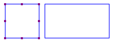
Figure 2. A square and rectangle drawn in the design.

‘Draw square-rectangle’ icon: Draw square/rectangle icon

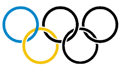
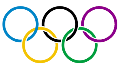
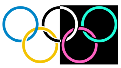
Drawing circles and ellipses

To draw a circle, choose the ‘Draw Circle-Ellipse’ icon from the left vertical tool bar on the left side of the screen. In the design area, click the location for the first position, then move the mouse until the circle is the desired size and click again to confirm. Alternatively, you can click and drag, then release at the opposite corner.

By dragging the markers in one of the four corners the size can be increased or decreased. Dragging inwards or outwards with the markers in the middle of the four sides will turn the circle into an ellipse.

Circle and ellipse

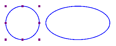
Figure 3. A circle and ellipse drawn in the design.

‘Draw circle-ellipse’ icon: Draw circle ellipse icon

Drawing triangles

To insert a triangle into your drawing, select the ‘Draw Triangle’ icon from the left vertical toolbar. Next, select what type of triangle to insert from the right vertical properties tool bar that appears.

The bottom four icons on this tool bar show the available types of triangles. From top to bottom, the triangle types available in the tool bar are right, isosceles, equilateral and scalene. Triangles may be changed from one type to another after you have placed them in your drawing, but it is easiest to select the appropriate triangle type prior to inserting the shape.

Once you have selected the type of triangle you want, click the point in the design area where you want one of the corners and then drag until the triangle is the desired size. Alternatively, you can click and drag, then release at the opposite corner.

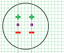
The ‘Angles and lines’ dialog can be used for a more mathematically oriented notation. The corners of the triangle are marked with letters A, B and C.  By default they will only show on screen (green colour, not embossed). By checking ‘Characters A, B, C at corners’ in the ‘Angles and lines’ dialog, they will also be presented in braille characters once embossed.

The corners of the triangle can each be provided with 3 types of specific lines: altitude, median line and bisector, which will be embossed as dotted lines.

All four different types of triangles

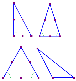
Figure 4. Four different types of triangles: right, isosceles, equilateral and scalene. Equal or right corners are indicated in green.

‘Draw triangle’ icon: Draw triangle icon

Drawing polygons

A polygon consists of several lines that are connected as one object. To insert a polygon, choose the ‘Draw Polygon’ icon from the tool bar on the left side of the screen. Click in a number of positions in the design area to draw a polygon. To finish the polygon, click on the first anchor point (first purple marker) to close the polygon. Alternatively, you can click again on the last placed anchor point to make an open shape. You can also choose these two options from the toolbar or context menu by selecting ‘Close polygon’ or ‘Finalize the polygon (leave the last connection open)’.

When you have an open polygon selected, two green plus symbols on screen allow you to continue drawing at the ends of the polygon. You can also choose ‘Continue drawing at first/last endpoint’ from the context menu. The red border around a selected polygon can be used to resize it by dragging the purple markers.

You can choose between straight and curved lines between the anchor points. This allows you to make use of rounded curves in your design.

Polygon with straight lines on the left and curved lines on the right; a red dashed border with purple markers around the polygons can be used to resize the polygon

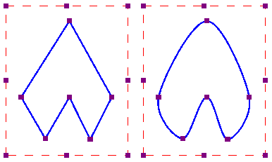
Figure 5. Two polygons show the difference between straight and curved lines.

‘Draw polygon’ icon: Draw polygon icon

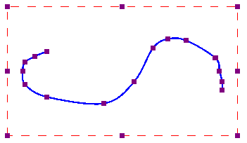
Drawing freehand line or closed shape

To draw freehand lines or closed shapes, choose the Draw Freehand Line or Closed Shape icon from the tool bar on the left side of the screen. In the design area, click the desired starting location and drag the mouse to create the desired line. To create a closed shape, click the desired starting location and drag the mouse to create the desired shape, returning to the starting location before releasing the mouse button.

As with the polygon, you can choose between straight and curved lines between the anchor points. The dashed red border can be used to resize the entire object.

Freehand line
Freehand line with curved lines.

‘Draw freehand line or closed shape’ icon:
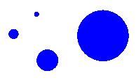
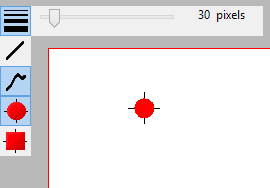
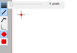
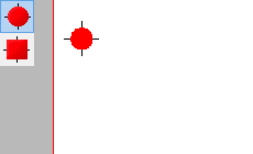
 Draw freehand line closed shape icon

Drawing dots

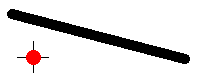
To add round dots to your design, select the ‘Draw filled dots’ from the let vertical toolbar, then click in your design to position the dot. The size of the dot can be changed with the purple markers. The dot size can range from only one braille dot up to a large filled circle of multiple centimetres in diameter.

Different sized dots
Different sized dots can range from a single braille dot to several centimeters in diameter.

‘Draw filled dots’ icon: Draw dots icon