Skip NavigationMenu

2.04 Registration for multiple user accounts on single computer

Your Software Registration Code (SPC), the registration code with which the TactileView software is registered, is valid for registration on one computer. However, multiple user accounts on the same computer can all make use of the same SPC to register TactileView.

Computer registration - 'All users (requires administrator rights)' or 'Current user only'

There are two ways to complete the registration for each Windows user account on the computer:

  1. Register for all users. This requires a Windows account with administrator rights. During registration, choose ‘All users’ to activate the registration for all user accounts on the same computer simultaneously.
  2. Current user only. This option can be used when you have no administrator rights. However, the registration will need to be repeated using the same SPC for all other user accounts that wish to use TactileView.

For full installation and registration instructions, see Installing software and Software registration with software product code (SPC).

3.04 Keyboard shortcuts

The following list of keyboard shortcuts are supported in TactileView. These shortcuts can be used to easily activate specific software functions, general operations, drawing tools and text editing functions. The list of shortcut keys for the drawing tools can be personalised to make them easier to remember (see below).

See Scroll wheel and key combinations for keyboard combinations with the scroll wheel.

TactileView shortcuts
Ctrl+B Fuse selected object with the bitmap
Ctrl+E Open current file in Explore mode: Speech and sound
Ctrl+I Play audio style
Ctrl+J Show properties of selected object
Ctrl+K Open context menu
Ctrl+L Start Menu driven design
Ctrl+R Explore colour composition
Ctrl+W Take webcam snapshot when activated

Drawing tools (default set, see below for personalisation)
T Text label
S Select area
H Detect shape
F Filters
U Retouching – adding lines
E Retouching – eraser
L Draw straight line
Q Draw Square-Rectangle
C Draw Circle-Ellipse
N Draw Triangle
P Draw Polygon
D Draw free hand line or closed shape
O Draw Dots
A Draw Table
G Draw Graph
I Import
M Mammoth braille
R Draw letters and digits
V Add voice memo

General shortcuts
Ctrl+N New document
Ctrl+O Open document
Ctrl+S Save
Ctrl+Shift+S Save as
Arrow keys Move object or anchor point by 1 pixel
Shift+Arrow keys Move object or anchor point by 10 pixels
Ctrl+X Cut
Ctrl+C Copy
Ctrl+P Print
Ctrl+Z Undo
Page Up Jump to previous page
Page Down Jump to next page
Esc Deactivate currently active drawing tool/deselect currently selected object
Ctrl+Tab Switch between open designs

Text editing
Home Jump to front of text line
End Jump to end of text line
Ctrl+Home Jump to start of text label
Ctrl+End Jump to end of text label
Shift+Arrow keys Select text
Shift+Left mouse click Select text between caret position and click position
Del or Backspace Delete selected text

Personalised drawing tools shortcuts

Via menu Settings > Keyboard shortcuts, the list of shortcuts that activate the drawing tools in the left vertical toolbar can be edited. The left column in the dialog contains the list of drawing tools; by clicking on the right column, you can assign a keyboard key that will act as the shortcut for the corresponding drawing tool. You can always return to the default list of shortcut keys by clicking on the ‘Reset default shortcut keys’ button.

Remember that each shortcut key can be used only once in the list, giving each drawing tool a unique key.

5.05 Alignment frame and grids

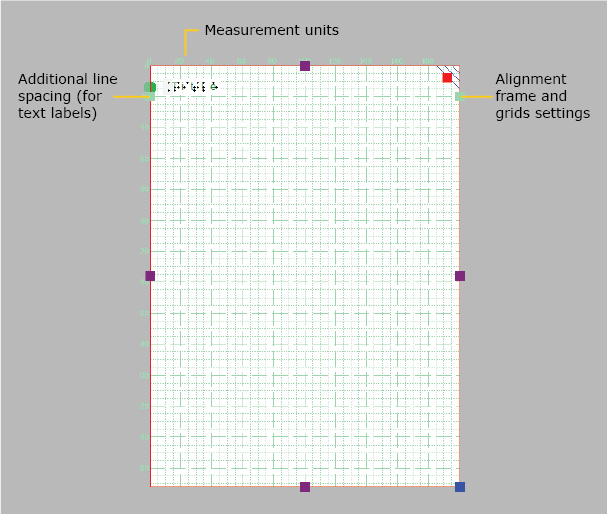
The two alignment grids combined with the alignment frame are useful tools on screen that help to manage the layout of your design by aligning the text labels and/or drawn elements. The braille grid is primarily used to align text labels in a regular grid and conform to certain layout guidelines, whereas the measurements grid is mostly used to align objects and visualize their size. The grids are shown in a light green colour on screen, but will not be printed or embossed.

For more details, see: Measurements grid (object alignment) and Braille grid (text alignment).
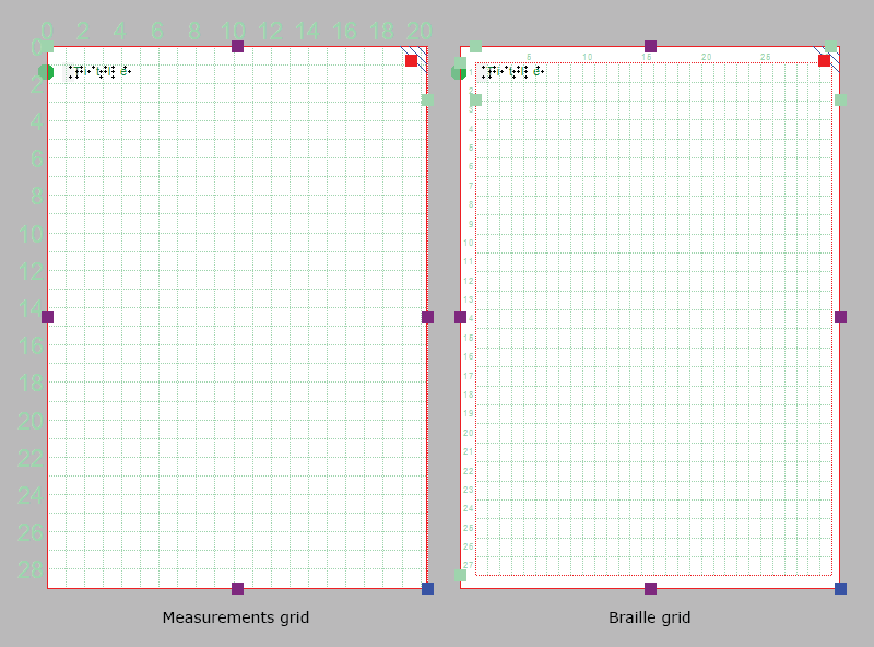
Alignment grids: measurements grid on the left, braille grid on the right

Figure 1. Example: measurements grid without alignment frame on the right,Ā 

The settings dialog for both grids can be accessed by clicking on the light green marker on the right hand side of the braille grid between text lines 2 and 3, or via menu Settings > Alignment grids.

You can easily switch between the two grids by clicking on either of the grid icons in the second horizontal toolbar. Alternatively you can select ‘Show braille grid’ or ‘Show measurements grid’ from the View menu or select a grid via the Alignment grids settings dialog. You can switch grids off by clicking once more on the currently active grid or deselect it via the View menu or in the grids settings dialog.

Alignment frame

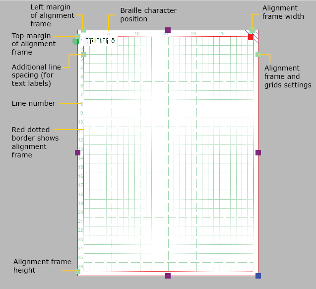
The alignment frame is a layout tool that can be used as a guide to limit the design to a specified area within the printable area of a page. This is presented in the design with a dashed red border, but will not be printed.

The width and height of the frame are limited to a whole number of braille characters and lines of braille text, respectively.Ā You can adjust the top and left margin of the frame by dragging the four green markers that are placed along the top and left side of the design. Alternatively, you can enter the values for the frame size by opening the ‘Alignment frame and grids’ settings dialog via the green marker on the right-hand side of the design or via menu Settings.

When the alignment frame is enabled, a selected alignment grid will only be shown within the area of the frame. Text labels will then be automatically adjusted in width to fit within the frame.

Saving grid and frame settings as default

The alignment frame and grids are very useful to create consistent page formatting between different designs. In the settings dialog, you can therefore save the current grid and frame settings as default values by choosing ‘Save as default settings’. This ensures the same frame and grid size are used as the basis for all new documents.

These settings are also saved in the document. This way, when you wish to edit the design later on, the margins and grid size still match the design, even when the default grid properties for new documents might have changed.

5.06 Measurements grid (object alignment)

The measurements grid is composed of a regular grid of squares that visualize the physical dimensions of your design. This can be used for the alignment of objects in your design.

For a comparison with the braille grid, see: Alignment frame and grids or Braille grid (object alignment).

In the ‘Alignment grids’ settings dialog, you can select the size of the grid squares. The grid settings dialog can be opened by clicking on the light green markers on the righthand side of the screen or via menu Settings > Alignment frame and grids. You can choose from a number of convenient the grid square sizes based on your selected units of measurement, which can be selected in menu Settings > General.

When the alignment frame is enabled, the measurements grid will only be shown within this frame.

Elements of the measurements grid

Figure 1. Measurements grid shown across the entire design.

5.07 Braille grid (text alignment)

The braille grid is used to align text labels in a regular grid for consistency and to conform to certain layout guidelines for braille documents.

For a comparison with the measurements grid, see: Alignment grids or Measurements grid (object alignment).

Braille grid elements

Figure 1. Braille grid shown within the (optional) alignment frame.

Aligning text labels

The braille grid is composed of a regular pattern of cells the size of a braille character. This grid can be used to align text labels in this regular pattern throughout your design. This will ensure all characters are aligned above each other and that the lines of text are evenly spaced in the entire document, as is required in some guidelines for braille documents.

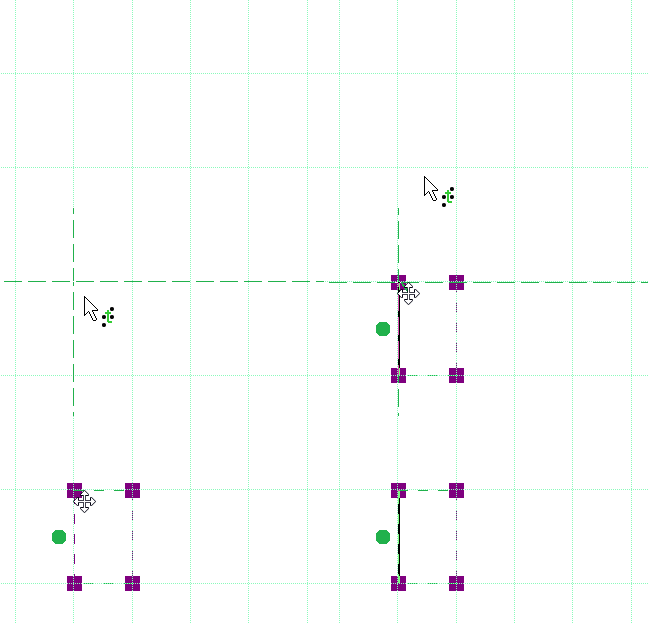
By default, text labels are ‘magnetically’ aligned (snapped) to the braille grid by dragging or placing the label with its edges close to the grid lines. Dashed green lines will indicate when the text label is aligned to the grid. You can switch off the alignment in the Alignment grids settings dialog by deselecting ‘Align text labels to grid’ or by disabling alignment in the context menu of a text label. Any text labels that extend beyond the edge of the braille grid are automatically resized to fit within the grid area.

The lines and characters in each line are numbered along the sides of the braille grid. By default, the title label is placed at character 1 of line 1.

Green dashed lines indicate the text label is aligned in the braille grid

Figure 1. Green dashed lines indicate the text label is aligned in the braille grid.

Braille cell size

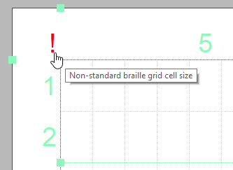
The size of a braille character has been standardized, but not all braille embossers have a printing resolution that allows text to be embossed exactly matching this standard size. The grid cells on screen will represent the true size of the embossed braille characters. A red exclamation mark at the top left corner of the braille grid will notify you when the size of the embossed braille will differ from the standardized braille size.

The size of the grid cells will also be automatically adjusted when an 8 dot braille table is selected as the main braille table of the document.

A red exclamation mark near the top left corner of the grid signifies the braille cells have a non-standard size

Figure 2. A red exclamation mark near the top left corner of the grid signifies the braille cells have a non-standard size.

Additional line spacing

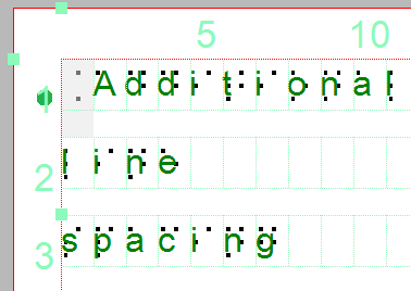
You can choose to use extra line spacing between lines of text throughout the document. For example, a value of 0.5 will add an empty space of half the height of a braille character between two lines of text. This line spacing is visible on screen in the braille grid.

This can be selected by clicking on the light green markers on the left hand side between text lines 2 and 3. Alternatively, the value can be changed in the grid settings dialog or by selecting ‘Additional line spacing’ from the properties toolbar or context menu of a selected text label.

Additional line spacing is applied to text labels and the braille grid

Additional line spacing adds white space between lines of text in the braille grid and text labels.

6.08 Draw table

TactileView includes a number of tools for drawing and working with tables. Most editing commands for tables are the same as for other drawing objects, including the methods with which to move, center or delete a table, change its line or fill style, add audio labels or fuse it to the bitmap. For more information on these topics, please refer to Editing object properties, Adding audio styles and Working with fused bitmaps. The features and commands described in this tutorial are specific to tables.

Drawing a table

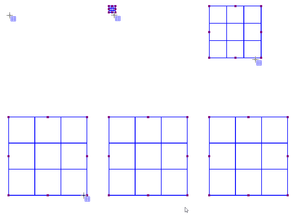
To add a table to your file, choose the ‘Draw table’ icon from the toolbar on the left side of the screen, then click and drag the mouse in the design to insert a table into your document. Your table will be created with the default number of rows and columns, but you can add and/or remove rows and columns as desired after the table has been inserted.

Another way to add a table to your file is to select ‘Draw table’ from the Drawing Tools menu. This launches a dialog, allowing you finer control over how the table is initially created.

To insert a table using this method, enter the desired location of the upper left corner of the table, then specify the size parameters, the number of rows desired and the number of columns desired. When setting the size, choose the ‘Enlarge/reduce’ radio button if you would like the cells in your table to be square, or choose the ‘Stretch’ radio button to allow adjustment of the height and width independently. Enter the desired cell width (and the height, if using the ‘Stretch’ option), the desired number of rows and the desired number of columns, then choose ‘OK’ to close the dialog and insert the table into your drawing.


Drawing a table in the design with the mouse
Figure 1. Drawing a table in the design with the mouse.

‘Draw table’ icon: Draw table icon

Adjusting the table size

Once you have inserted the table into your drawing, you can adjust the overall table size. The objects and text labels that are placed within the table will be repositioned automatically so they remain positioned in the same cell (see below).

To adjust the size of the table, select the table so that purple squares appear along the outside edges of the table. To scale the table and preserve the height to width ratio, click a purple square in one of the corners of the table and drag it until the table is the desired size. The cells in the table will be scaled up or down automatically with the table and will maintain their height to width ratios.

To adjust the overall table width, click the center purple square on the right or left edge of the table and drag it until the table is the desired width. The cells in the table will be scaled automatically to maintain equal widths. Similarly, you can adjust the overall table height by clicking the center purple square on the top or bottom edge of the table and dragging it until the table is the desired height. The cells in the table will be scaled automatically to maintain equal heights.

Adding and removing rows and columns

By default, a new table has three columns and three rows; however, you can always adjust the number of rows and columns by inserting or deleting them. To do so, select ‘Insert or delete rows and columns’ from the properties toolbar or context menu.

In the dialog that appears, first make a selection whether you wish to add or remove rows or columns. Next, you need to specify which row(s)/column(s) should be deleted or at what position the row(s)/column(s) should be inserted.

– In the case of inserting, you can choose to place them ‘In front’ (i.e. on the left side of the table in the case of columns, on top for rows), ‘At the end’ (i.e. on the right or bottom) or after the specified column/row number (i.e. inside the table). You can choose to add a single or multiple rows or columns.
– In the case of deleting, you have the choice between ‘First’ (again, the leftmost column or top row), ‘Last’ (rightmost column or bottom row) or after the specified row/column number. Again, you can choose to remove multiple rows at a time.

Finally, you have to select if either:
– the table dimensions need to remain constant, i.e. the outer dimensions of the table remain the same but the cell size is adjusted to accomodate the new number of rows/columns; or
– the cell dimensions remain constant, i.e. the table size is adjusted to add or remove space for the new number of rows/columns.

Once you have made all selections, choose ‘OK’ to confirm.

‘Insert or delete rows and columns’ icon: Insert or delete columns and rows icon

Entering table contents

At any point after creating your table, you can enter contents into the cells. You can use the drawing tools from the left vertical toolbar or Drawing tool menu to place text labels or objects in the table. Objects inserted into a table may be edited just like objects that are not part of table contents (for more information, please refer to the ‘Drawing tools’ section of the manual). Inserting an object into the table contents will anchor it to the table, so that if you later move, stretch or scale the table, the object stays linked to the correct cell in the table.

As an alternative to drawing the object with the mouse, select the table and choose the ‘Table contents’ icon from the properties toolbar, or right-click the table and choose ‘Table contents’ from the context menu. This launches a dialog from which you can control the table content.

When you select an object type from this menu, a dialog will come up allowing you to give further information about the object you want to create. What is on the dialog will vary depending on which type of object you select. A size and position dialog will appear for straight lines, squares/rectangles, circles/ellipses, triangles, polygons, freehand lines/closed shapes, dots and tables. For the other objects, a dialog will appear in which the contents can be entered (e.g. text labels) or selected (e.g. figures).

The dialogs are very similar to the ones that appear when you access the drawing tools from the Drawing Tools menu, except that they also have edit boxes that allow you to select which cell to place the object in by specifying the desired row and column for the object.

This is the size and position dialog for inserting a square, but since it is being inserted into a table it has ‘Row in table’ and ‘Column in table’ edit boxes at the bottom. Make the desired selections to create your object and place it in the appropriate cell, then choose ‘OK’ to close the dialog and insert the object into the table. It will also appear as a listing in the table contents menu.

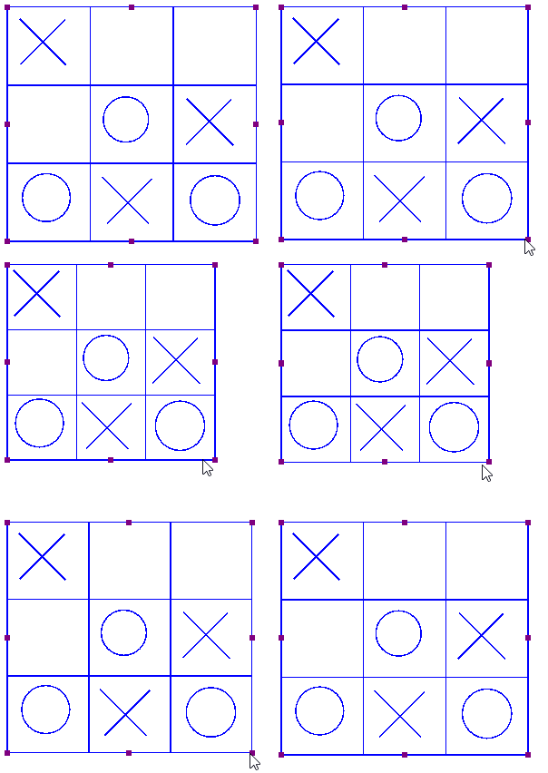
Scaling a table will reposition the object within the table
Figure 2. Scaling or moving a table will automatically reposition the contents in the table.

‘Table contents’ icon: Table contents icon

6.15 Using variable relief height

Some braille embosser models allow you to use different relief heights for the braille dots. In TactileView, this relief height can be applied to the blue objects (squares, blue lines, triangles, etc.) as well as the Detect shape tool, tables and graphs.

To find out which embossers are capable of embossing different dot heights, see: Properties of different braille embossers.

For a full overview of all object properties, see: Editing object properties.

Relief height: line, surface and texture

Normally, objects will be embossed using the highest dot height, as this usually gives the best tactile quality. In the case of image files, the colours of the image will be converted to different dot heights, where lighter colours result in lower dot height. This is the default setting for relief height and can always be selected as dot height by choosing ‘Standard’ as the value.

In TactileView, the relief height can be selected separately for the different components of objects. Firstly, you can select a dot height for the outline of the object. Secondly, the surface area of the object (i.e. the area within the outline of the object) can be given a separate height. Finally, if the object has a texture fill style, it can have a different relief height as well.

You can directly edit the relief height for the line, surface and texture by selecting ‘Relief height: line’, ‘Relief height: surface’ or ‘Relief height: texture’ from the properties toolbar or the context menu of the object. The dot height for the line can also be found in the ‘Line style’ dialog, whereas the dot height for the surface and texture can be found in the ‘Fill style: texture’ dialog.

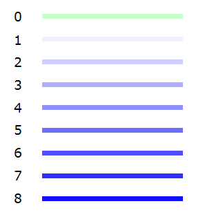
The different dot heights are shown in the design using different shades of blue: a lighter shade signifies a lower dot height, whereas a darker shade corresponds with a higher dot height.

For graphs, you can select the relief height for the grid lines to make them less prominent and distinguish them from the axes and graph lines. By default, these grid lines will already have a lower value; you can edit the relief height by selecting ‘Size and position’ from the graph’s properties toolbar or context menu.

‘Relief height: line, surface and texture’ icons: Relief height line icon Relief height surface icon Relief height texture icon

Different colours signify the values for the relief height, ranging from 0 (no braille) to 8 (maximum dot height)

Figure 1. Different dot heights are shown with different shades of blue in the design.

In graphs, the grid lines have a lower dot height than the axes

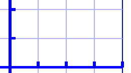
Figure 2. The grid boxes in a graph have a lower dot height than the axes, as shown with the lighter blue colour.

Use contrast for tactile usability

Although the dot height can be set to 8 different heights, in reality the increments between these steps are very small. This means there will not be a distinguishable tactile difference between a dot height of 3 and 4. It is advisable to use sufficient contrast in relief height between different elements; for example, a value of 8 for the outline of an object and value of 2 for its surface.

Compatibility with other embossers

The relief height properties of objects are only available when you have a printer selected that supports variable dot height via menu File > Print Setup. A message will notify you when a document is opened that contains objects with variable relief height, but the selected embosser does not support this property. The variable relief height will still be visible in the design using lighter and darker shades of blue, but it is important to remember that the tactile output of the embosser or printer will differ: the outline and texture of the object will be embossed, but the relief height of the object’s surface will have no relief height.

In this situation, you can only edit the relief height for existing objects with a relief height not set to ‘default’. Once you set it to ‘default’, the relief height property of the object will no longer be available until you have an embosser selected that does support variable dot height.

7.02 Settings – Braille tables

With the 6 dots of regular braille, only 63 different combinations can be made (not including the space character). However, the languages from around the world use a far larger amount of letters and punctuation marks. To accommodate these differences using only the 63 available braille characters, each language or country uses a specific braille table (sometimes called rule-set, braille code or mapping).

This way, a braille character in one language can have a different meaning in another. It is crucial, therefore, to select the correct braille table for the visual impaired reader.

Once the braille table is chosen, TactileView will automatically produce the correct braille for text labels according to the inherent properties of braille script.

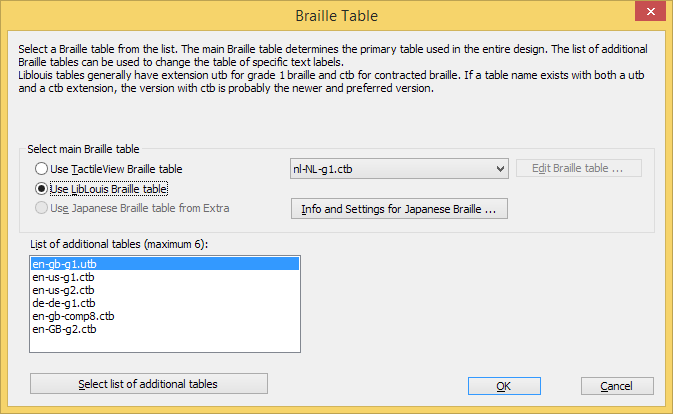
Braille table settings dialog

Via menu Settings > Braille tables, you can select your braille table of choice. There are three sets of braille tables:

– TactileView braille tables: these tables are currently only used for uploading designs to the TactileView catalog, but will be replaced completely in future releases;
– Liblouis braille tables: an open-source braille translator that contains a large number of languages and braille codes.
– Japanese braille table from Extra: a translator for Japanese braille that can be purchased from Extra.

The selected braille table will be your main braille table, which is used as a default for all new text labels that are placed in your design (including the title label). When you change your main braille table, all labels that are designated as such will be changed to the new table.

Braille tables settings dialog

Figure 1. Braille tables settings dialog; click on the image to enlarge.

Choosing which braille table to use

The large list of Liblouis braille tables is recommended over the TactileView tables, as they are now only used for uploading designs to the TactileView catalog or in cases where personal adaptations of a braille table are required.

Liblouis is an open-source braille translator containing an extensive list of braille tables for a wide range of countries and languages. For some there is just a single braille table available, whereas others (most notably English) have several alternatives. In general, they use the following elements in the table names to distinguish them:
– g0 or ‘comp’ for computer braille;
– g1 for uncontracted braille (letter by letter transcription);
– g2 for contracted braille (using abbreviations and contractions);
– g3 for non-standardised personal shorthands (rarely used).

Most of the braille tables without a specified grade will either be grade 1, or a specialised braille table such as mathematical braille notation.

The Japanese braille from Extra is only available once this package has been bought separately.

Once you have chosen your preferred braille table, click ‘OK’ confirm to save the selected main braille table. The main table is also recorded in the document when saved.

Using multiple braille tables in one document

By default, your main braille table is selected for new text labels. However, you can choose to use another braille table for individual text labels. This is useful for example when combining regular text with mathematical equations, or texts in different languages in their corresponding braille tables.

There are two ways of changing the braille table for a selected text label:
– From the properties toolbar or context menu, choose ‘Select braille table’ and select your preferred table from the list; you can choose from your main table, the 5 most recent tables or the complete list of Liblouis tables via ‘More braille tables’;
– Choose the braille table from the list of Liblouis table in the ‘Text and position’ dialog.

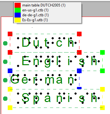
To get an overview of all the braille tables that are used in the document, first make sure nothing is selected. Next, choose ‘Show used braille tables’ from the properties toolbar; this option can also be found in the context menu that opens when right clicking in an empty part of the design. When this option is selected, the colour of the markers of all text labels in your design will signify the used tables; the legend near the top left corner shows which colour corresponds with which table.


Colours give an overview of the braille tables in the design

Figure 2. Overview of the braille tables that are used in the design.

Mathematical braille notation

When it comes to mathematical notation in braille, there is a number of additional aspects that come into play. These are also supported in TactileView. For a full overview, read the manual sections ‘Introduction on mathematical notations‘ and ‘Add mathematical label (equation)‘.

Mathematical text label
Figure 3. Mathematical text label.

Text label representation on screen

By default, the braille characters are shown on screen on top of the entered text to give the designer an idea of the occupied space. For better readability, the braille can also be disabled on screen by selecting ‘Hide braille dots on screen’ from the properties toolbar or context menu of the design or a selected text label. Choose ‘Show braille dots on screen’ to make them visible again. Alternatively, the braille can also be disabled via menu Settings > Text label presentation: on screen. See manual section ‘Editing text labels‘.

‘Hide braille dots on screen’ icon: Icon for Hide braille dots on screen
‘Show braille dots on screen’ icon: Show braille dots on screen icon

Opening documents with a different main braille table

When opening a document that was saved using a main table that is different from your current one, you can choose between:
– applying your current braille table to the document;
– use the original braille table in the document;
– use the original braille table and make this your default main braille table.

7.03 Braille tables – Inherent braille properties

In braille, many different conventions and variations are used. Below, you will find an overview of the aspects of braille that are supported in TactileView. By using text labels in TactileView with the correct braille table selected, in-depth knowledge of braille to still produce correct braille texts is not required. However, below you will find a list of the most prominent inherent properties of braille script that determine the layout of braille text labels in your designs.

Braille cell size, white space and composition signs

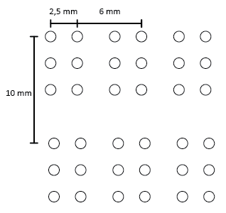
TactileView automatically ensures the braille is sized correctly (following the most commonly used distance of approx. 2,5 mm = 1/10 inch between braille dots) as well as using the correct distance between braille characters (approx. 6 mm) and lines of text (approx. 10 mm). A white space around the braille makes sure that there is enough space between adjacent objects or texts to ensure they can easily be distinguished with your fingertip. The braille grid can be used as a layout tool for alignment using these standard dimensions, see Braille grid (text alignment).

Other aspects that are specific to braille such as braille composition signs (capital letter sign, number sign, symbols, etc.) are also applied automatically. These composition signs are highlighted on screen with a light grey background. Remember that these composition signs differ significantly between different languages and braille tables.

Braille cell sizes visualised: distance between dots within a character (2,5 mm), width between two characters (6 mm) and two lines of braille text (10 mm).

Figure 1. Braille cell sizes.

Composition signs (capital, number, etc)

Figure 2. Capital sings as an example of composition signs; the rules for these signs vary between different languages and braille tables.

Six dots and eight dots

With the introduction of refreshable braille displays, two extra dots were added to form 8-dot braille. This way, using 255 braille characters are available (not including the space character) instead of the regular 63, allows a larger range of characters to be denoted in braille, such as mathematical symbols. Other notable differences with 6-dot braille are found in the braille composition signs.

For more consistency, braille display users that are familiar with reading 8-dot braille can use an 8-dot braille table producing designs from TactileView as well. Text labels (including the white space behind the braille) will automatically be higher to accommodate the addition of the two extra dots.

Comparison between 6-dot and 8-dot braille

Figure 3. Comparison between 6-dot and 8-dot braille (example: LibLouis tables en-us-g1.ctb and en-us-comp8.ctb).

Uncontracted (grade 1) versus contracted (grade 2) braille tables

To save space in an embossed braille document, frequently used syllables or entire words can be represented by a shorter combination of braille character or even a single character. This is called contracted braille or grade 2 braille.

As an example, the word ‘the’ would be denoted with three braille characters in uncontracted English braille. In contracted braille however, this is shortened to just a single character.

When using a contracted Liblouis table, these contractions and abbreviations are applied automatically. The reader must be familiar with these conventions to be able to read contracted braille. On screen and when the design is also printed in ink, the font size of the visible text is reduced to match the text position with the braille characters.

Comparison between contracted and uncontracted braille

Figure 4. Length difference between contracted and uncontracted braille.

12.04 Effect of printing properties on tactile usability

The tactile characteristics vary significantly between the different printing methods that are supported in TactileView. These differences have major influence on the tactile usability (how easily elements can be distinguished) of a design.

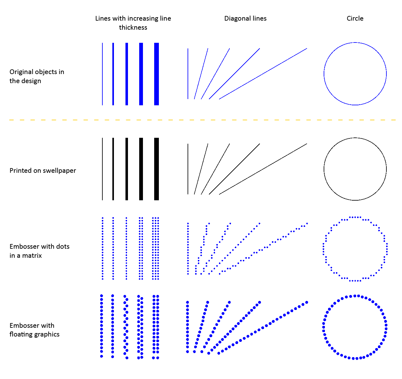
The printing methods can be divided into three broad groups: embossers with dots in a fixed matrix pattern, embossers with floating graphics and swellpaper. See Properties of different braille embossers for an overview of the properties of each supported embosser model.

Read the Drawing tools section in the TactileView manual to learn how to adjust the properties of the drawing tools, such as filters, retouching tools and the line thickness, line style and textures of objects.

Printing properties - effects on tactile usability

Figure 1. Comparison between the tactile properties of different printing methods.

Embossers with fixed dot matrix

In many braille embossers, the positioning of the dots that form the tactile graphic is limited to a matrix pattern of braille dots with a fixed distance between the rows/columns dots. The tactile graphics are limited to a comparatively low resolution because of the minimum size of a braille dot and their placement in the matrix. An empty space of at least 1 braille dot (or preferably more) is required to distinguish between neighbouring lines and shapes.

Line thickness Limited to a multiple of dots with a minimum of 1 braille dot
Diagonal lines and curves Composed of smallĀ  vertical and horizontal line sections
Distance between lines Minimum of 1 braille dot between neighbouring lines
Line styles Limited to relatively coarse line styles, as the gaps and dashes in the line pattern need to be at least the size of 1 braille dot
Textures Limited to coarse textures due to the matrix pattern and minimum size of texture lines/elements and the empty space between them

Embossers with free dot positioning

A number of braille embossers do not have a fixed dot matrix but instead allow the dots to be placed anywhere on the page with high accuracy. This way, the dots can follow curves very accurately. The size of the braille dots still limits the level of detail to a certain degree in order to avoid overlap with adjacent dots.

Line thickness Minimum thickness of 1 braille dot, with undulating ('zigzag') lines or multiple
Diagonal lines and curves Perfect diagonal lines and curves due to the floating point positioning
Distance between lines Can be positioned freely, but an empty space of at least the thickness of a braille dot is recommended
Line styles Limited to relatively coarse line styles, as the gaps and dashed in the line pattern have to be at least the size of 1 braille dot
Textures The minimum size of texture lines/elements and the distance between them results in a relatively coarse texture

Swellpaper

When printing on swellpaper, the TactileView design is printed directly in ink without any reduction in resolution (in contrast to the lower resolution of braille dots). This enables you to use fine details that are still distinguishable by touch.

Line thickness Can be varied in steps of 1 pixel
Diagonal lines and curves Perfect curves without limitations
Distance between lines Relatively small gaps between adjacent lines can still be distinguished due to the high resolution
Line styles Detailed line styles can be used as the minimum size of gaps and line segments can be very small
Textures Detailed textures can be used as the minimum size of the texture lines/elements and the empty space in between can be very small

Variable relief height for enhanced tactile usability

Some embossers support variable dot height as an additional method of distinguishing the lines in your design. For example, a lower dot height is applied to the grid lines in a graph in order to discriminate them from the axes and formula line.

This functionality is only available when supported by your embosser; see Properties of different braille embossers for an overview of embossers that support variable dot height and Editing object properties to find out how to apply variable dot height.