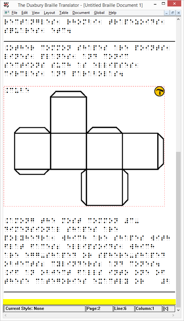
TactileView designs can now be inserted in Duxbury Braille Translator (DBT) documents! You can read more in our software manual section on TactileView and DBT.
Version 2.200 also saw the introduction of dot view as an alternative to the line view. You can find out all the details in the software manual section on dot view and line view.
Apply filters on a selected area
Previously, filters could only be applied on the entire design. In version 2.200, filters can now be applied on a selected area. To apply this, choose ‘Select Area’, then ‘Select Rectangle’. In the design, make a selection of the area on which you wish to apply a filter. Once you have made your selection, you will find the list of available filters in the right vertical toolbar.
8 dot braille supported
In previous TactileView versions, only 6 dot braille was available. In version 2.200 the 8 dot braille tables from the list of LibLouis braille tables is also supported. For example, this allows you to use braille notation in your designs matching the braille on a braille display. 8 dot braille can also be entered with braille keyboard input when your keyboard supports pressing up to 8 keys simultaneously.
When an 8 dot braille table is selected, you can choose to reduce the line height for lines of text that do not contain braille characters with dots 7 and 8. The line height will then be reduced to the size of 6 dot braille to save space. You can determine your preferences and select an 8 dot braille table via menu Settings > Braille Tables.
Mathematical notation in braille
In the previous release of TactileView, mathematical notion in braille was introduced. The list of available notations has now been extended with LaTeX and Dedicon (for Dutch users) as output in braille. You can simply enter your equation and automatically convert this into the selected mathematical braille notation.
You can select your preferred mathematical by choosing ‘Mathematical notation (equation editor) from the Settings menu. When your preferred notation method is not in this list, you can use the ‘linear text’ option to display the equation in your braille table as it is entered.
Adding or removing an area
Adding or removing a vertical or horizontal area in the design has been simplified. You can find this function by choosing ‘Select Area’, then ‘Insert or Remove Space’ (previously, this was one of the functions of the rectangular selection). To make a horizontal or vertical selection, click in the design for the first position, then hold and release for the second position; alternatively, you can also click two times to determine the two horizontal or vertical edges of your selection.
Two green dotted lines will show the edges of the selected area. You can drag these lines to adjust them. On these lines, a green plus and red minus sign allow you to add or remove the selected area of the design. By moving with your mouse over these signs, you will see a preview of adding or removing the area. Once you are satisfied with the placement of the selection, simply click on the plus or minus sign to confirm.
Embosser support extended
– Enabling printer support has been extended, including the Phoenix Gold model.
– Index Braille has released a new version of the printer driver for their V3 model range. This means that for both the V3 and V4 models, you can now use their printer driver for tactile graphics and no longer need to install the TactileView driver for V3 models.
– Print results for ViewPlus printers have been improved to give sharper lines and avoid small unwanted dots due to noise in the design.
Smaller changes
– The functionality for inserting svg images has been improved; for example, texts in svg’s are automatically converted into braille, including rotation when supported by your embosser. In the left vertical toolbar with drawing tools, inserting svg’s, other image files or figures have been grouped together.
– In TactileView designs, the right-up marker is automatically printed by default as a convenient indication of the page orientation for the VIP reader. This right-up marker is now visible on screen as well. It can be switched on or off when necessary by clicking on the red marker in the top right corner of the design.
– The size of the pen or eraser tool can now be changed using a horizontal slider. Alternatively, you can use the scroll wheel on your mouse while holding Shift to adjust the tool size. We have also added the choice between a round or square shape for more accuracy.
– The ‘Text label presentation’ dialog in menu Settings has been divided into ‘Text label presentation: on screen’ and ‘Text label presentation: on print’ to make a clearer distinction. Please keep in mind that these two representations can differ: e.g. you can choose to hide braille on screen for improved readability, but the braille will still be embossed when you do not disable it on print as well.
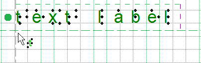
– When adding text labels, you can now type the contents directly in the design instead of in a text field in a dialog. This gives you better feedback about the placement and alignment of the braille text. The remainder of the options that were available in this dialog, such as braille table selection, can still be accessed via the right vertical toolbar.
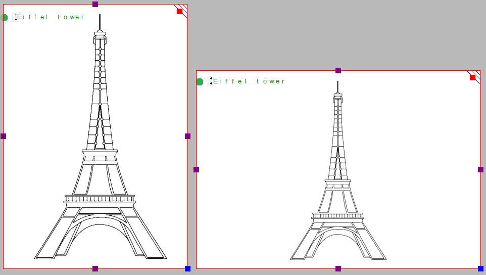
– When you open an image file (.jpg, .png, svg, …) as a new document, the image will no longer be fused with the bitmap but will be inserted as a figure. This gives more control over the size and position of the image.
– Image files can now be copied directly from any folder in Windows Explorer and paste it in your design as a figure. You can also browse for any saved image file by selecting ‘Add figure’ from the drawing tools toolbar, then choosing ‘Import image from file’. You can also find this option in the File menu.
– The horizontal toolbars have been rearranged slightly to give easier access to functions that beforehand were only available using the menus.
– A selected area can be rotated or mirrored by clicking on one of the four small icons around the selection. Combined with the aforementioned filters, this gives a more direct way of manipulating the contents of your design.
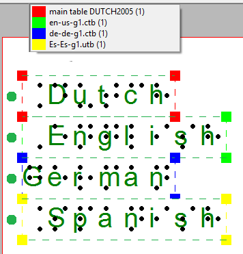
– Text labels automatically have a small white area behind the braille which covers all elements in the design to ensure there is enough space to properly read braille. However, in some cases such as text labels spanning multiple cells in a table, it can be useful to remove this white space. A transparent label is indicated with a white centre in the green, orange or blue-grey bullet in front of the label. Keep in mind that with the white space removed, lines can interfere with the braille text, so ensure there is sufficient spacing around the text label and no overlap with any lines.
– When placing blue dots, you can determine the size by scrolling with the mouse wheel while holding down Shift. The cursor will indicate the size of the dots that will be placed.
– For polygons and freehand lines, you can now choose between straight and curved lines between the anchor points. This allows you to make use of nice rounded curves in your designs.
– When you draw a polygon or freehand line you have the choice to close the shape (by clicking on the first marker) or to leave the shape open without a connection between the first and last markers (press Escape or choose ‘Finalize the polygon’ from the toolbar or context menu). When the polygon is open, you can easily continue drawing by clicking on one of the two green plus signs at either end point of the open polygon.
– Empty text labels will be removed automatically when deselected.
– For more convenient zooming using Ctrl+scroll wheel, the design will now stay centered on the position of the mouse.
– An additional step was added to the Configuration wizard in which the use of external software (currently MathType and Duxbury Braille Translator) can be configured.
– For some specific applications (e.g. printing on swellpaper) applying a colour to an object can be useful. You can give the blue object a colour by selecting Fill Style: Colour. To remove this colour, select white as fill style.
– The textures that can be applied to objects have been improved for better consistency and tactile usability. The ‘Fill Style: Texture’ dialog has been adjusted to make it easier to determine the right properties for the texture.
– Extra markers were placed on the edges of a triangle which allow you to scale the entire triangle, maintaining the proportions/angles.
– Previously, when a texture or line style was selected for an object, any newly drawn objects would get the same texture or line style. In the new version this is no longer the case in order to avoid having to manually switch off these properties for new objects.
– The command for rotation of objects or text labels has been changed slightly from only using the scroll wheel to holding down Shift+scrolling. This avoids repeated unintentional rotation when you want to scroll through the document. Use Ctrl+Shift+scroll wheel for more accurate rotation per 1 degree.
– The latest releases of the Liblouis braille tables (Liblouis 2.6.3 and Liblouisudtml 2.6.0) have been included.
Bug fixes
– Some problems with fusing or moving a table with text labels inserted have been solved.
– Mirroring a selection multiple times no longer causes incorrect rotation of the selected area.
– Some issues with processing production requests (teleprinting) solved and functionality extended.
– Transparency in images copied from web pages no longer
– Some issues with alignment when printing on certain paper sizes using Index printers have been fixed.
 Previous section
 Return to TactileView manual overview

 Green
Green Blue
Blue Black
Black Purple
 Red
Red Green is used for text labels entered with the regular computer keyboard;
 Orange for those that were created with Perkins style input;
 Grey/blue for mathematical textlabels, created with the MathType equation editor.
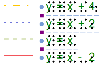
