Skip NavigationMenu

2.06 Settings menu

Settings menu

The configuration wizard leads you through the initial steps for setting up the software to accommodate your needs. However, additional options/dialogs can be found in the Settings menu. In this main menu, all the different settings of the software can be found, including those that are part of the configuration wizard.

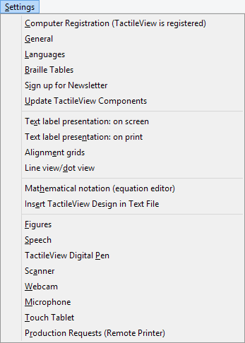
Most option names will probably speak for themselves. Each settings dialog has an explanatory introduction that will help to select the best setup for you. The list below gives an overview of the functionality of each option in the Settings menu and provides a general description of the purpose for the menu items.

Computer registration

The software product code (SPC) has to be entered in the registration window. After selecting ‘Registration via internet’, your registration data will be checked on the TactileView website to verify the validity of the registration. Please note that each SPC is valid for only one computer.

Configuration wizard: step 1

General

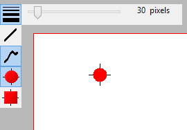
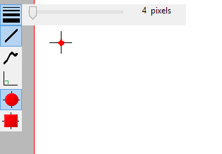
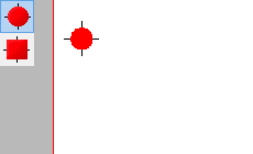
The units for the preferred measurement system can be set, as well as the reference position for these measurements. The size of the markers that can be ‘grabbed’ with the mouse to modify objects can be adjusted. A marker size of 5 pixels is the default.

The internet gateway to the TactileView internet catalog can be tested and configured. The name and e-mail address of the author that is uploading designs to the catalog can be entered here. The TactileView Viewmaster will send feedback on the graphic aspects and tactile usability of the designs to this e-mail address.

Configuration wizard: step 3

Languages

The user language in which the software texts are displayed can be set, as well as the language in which the text labels are written in the design. Setting the text label correct language is important for uploading the designs to the catalog, as text labels are translated in all the available languages.

Configuration wizard: step 3

Braille tables

The conventions for texts in braille differ per country or language. Select a braille table as the main braille from the extended list of the Liblouis set of tables (includes contracted braille). When entering a text label in the design with the drawing tool ‘Add text label’, the braille characters will be automatically generated according to the selected braille table.

Configuration wizard: step 2

Sign up for newsletter

The Thinkable newsletter is a resource in which we announce events and share ideas about the usage of TactileView and various other products by Thinkable. Our regular newsletter is a great way to stay in touch with our work and everything that’s going on at Thinkable, so we invite you to sign up and leave your feedback.

Configuration wizard: step 3

Update TactileView components

Technically the software is set up as a modular system. The various modules, such as the software texts that you find in menus and dialogs, are stored and maintained on a non-public section of the TactileView website. TactileView will download any new updates automatically each time the software is launched. This setup offers great flexibility and convenience to provide minor updates without requiring any action, so it is advised to have this setting switched on. Please note that an internet connection is required to receive updates.

Configuration wizard: step 3

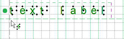
Text label presentation: on screen

The appearance of braille is quite different from the standard font and is hard to read for sighted users. Therefore the text that is added as a text label in the design can be displayed in standard font as well as in the equivalent braille characters, based on the selected braille table. The colour of the standard font (default green) can be changed or can be switched off completely.

Configuration wizard: step 3

Text label presentation: on print

Text labels printed on swellpaper can be represented both in braille and standard font, similar to the display on screen. The braille dots are printed in black. The visual font can be switched off or set to any preferred colour. For printing on swellpaper, make sure that the selected colour has no grey or black appearance.

Configuration wizard: step 2

Line view/dot View

Depending on the selected embosser type, the positioning and distance between the braille dots will vary. During the design phase it might be easier to work with continuous lines. For a close check of the tactile layout it can be useful to switch to dot view. While switching from one mode to the other an explanatory message will be displayed.

Mathematical notation (equation editor)

The MathType equation editor can be used to prepare mathematical equations in their spatial layout. The mathML expression is copied/pasted into TactileView. The equation can be expressed in braille using several mathematical notations. The preferred math notation is selected here.

Configuration wizard: step 4

Insert TactileView design in text file

TactileView designs can be embedded in documents that are produced with the Duxbury Braille Translator (DBT) See for more details also the section thirdparty software.

Configuration wizard: step 4

Figures

Arrows, electrical or chemical symbols, smileys, etc. can be added to the design as a figure by selecting the drawing tool ‘Import’, then choosing ‘Add Figure’. A library of figures is included, but new categories or figures can be added. In this settings dialog you can set the folder for your personal library of figures.

Speech

The Text-to-Speech engine (TTS) is selected in this dialog and performs two tasks.

The TTS vocalizes the software messages to support the use of a screen reader and is announcing the text that is supplied in the audio style for an object.

A design, once embossed, is called tactile diagram. In addition to the tactile information, an extra layer of audio information can be added to the design. Specific areas can be provided with an audio style (See also Editing object properties). The TTS is used for when exploring the audible information in a diagram.

TactileView digital pen

The TactileView digital pen acts as a connection between the software and the TactiPad drawing board or the TactileView ClickPad. For both setups, the software is providing additional functionality in combination with the hardware. Attention has to be payed to the position of the receiver and the calibration. The usage for this setup is targeted for visually impaired users of the digital pen and requires a high skill level.

See also the sections TactileView digital pen, TactiPad and ClickPad

Scanner

When a scanner is connected to the computer, it can be configured in this settings dialog. Select the option ‘Quick scan with scanner’ from the Portal menu or click on the scanner icon in the top toolbar to start the scanning process and insert the scan in the existing design or in a new document. For further processing use the drawing tools from the drawings tools icon bar.

Webcam

When the computer is equipped with a built-in webcam or an external one, select ‘Activate webcam’ from the Portal menu or click on the ‘Activate webcam’ icon in the top toolbar to start the webcam. The resulting image can be inserted in the existing design or in a new document. For further processing use the drawing tools from the drawings tools icon bar.

Microphone

The built in microphone or an external one can be configured for adding recordings as an audio style to an object. See: Editing object properties.

Touch tablet

A touch tablet can be connected to explore audio tactile diagrams. The settings are configured in this settings dialog. See also the section ‘Audio tactile diagrams’.

Production requests (remote printer)

Not everyone has access to a production facility (swellpaper or braille embosser) for tactile graphics. In combination with the TactileView website, printers can be made accessible for remote printing by other users. This feature requires a software and printer installation that is made available to others as a so-called production facility.

To upload your production requests to a remote printer, a customer code and teleprint code are required to keep track of which design has to be produced on which embosser for which customer.

For the production facility, a customer code and an printer identification code are required to retrieve the production requests from the TactileView website.

6.06 Retouching tools; pen and eraser

Retouching: adding and erasing lines

All TactileView designs have a bitmap that acts as the ‘base layer’. This bitmap layer can be edited using the retouching tools.

See also: Working with fused bitmaps

Retouching

To draw freehand lines that are automatically part of the bitmap and not editable, select the ‘Retouching Adding lines’ icon from the toolbar on the left side of the screen, or select ‘Retouching: Adding lines’ from the Drawing Tools menu. Select the line thickness you would like to use prior to starting to draw by using the slider next to the properties toolbar. You can use Shift+scroll wheel for more convenient size adjustment while drawing in the design. In the properties toolbar or context menu, you can choose between a round or a square pen or eraser shape by selecting ‘Apply circular tip’ or ‘Apply square tip’. You can also choose to draw straight or curved lines by choosing ‘Use straight lines’ or ‘Free style (follow the mouse)’.

You can now use the mouse to draw in the design area. Anything you draw with this tool will automatically be part of the bitmap and will not be editable unless you select an area containing your drawing and convert it to a figure or use the ‘Detect shape’ feature to create an editable object from a freehand closed shape. The retouching mode will continue until you select another mode or drawing tool, or until you press the escape key on the keyboard.

‘Retouching: Adding lines’ icon: Retouching: adding lines icon

‘Line thickness’ icon: Line thickness icon

Line thickness or eraser width with slider or Shift+Scroll wheel

Figure 1. Use the slider or Shift+Scroll wheel to adjust the line thickness.

‘Use straight lines’ icon: Use straight lines icon - pen
‘Free style (follow the mouse)’ icon: Free style (follow the mouse) icon - pen

Retouching - Straight lines or Free style

Figure 2. Drawing straight or curved lines.

‘Apply circular tip’ icon: Apply circular tip icon
‘Apply square tip’ icon: Apply square tip icon

Retouching - Square or round tip

Figure 3. Using a circular or square pen tip.

Eraser

To erase lines in the bitmap, select the ‘Retouching: Erase’ icon from the tool bar on the left side of the screen, or select ‘Retouching: Erase’ from the Drawing Tools menu. The eraser width and shape can be adjusted in the same way as the line thickness of the pen, as well as using straight or curved lines and a circular or square eraser.

Begin erasing by dragging the mouse over the lines you would like to erase. The retouching mode will continue until you select another mode or drawing tool, or until you press the escape key on the keyboard. You can only erase any lines fused to the bitmap. Therefore, if you wish to erase a part of a blue object or inserted image, you will first need to fuse them with the bitmap. You can read more in the manual section Working with fused bitmaps.

‘Retouching: erase’ icon: Retouching: erase icon
‘Eraser width’ icon: Eraser width icon
‘Use straight lines’ icon: Use straight lines icon - eraser
‘Free style (follow the mouse)’ icon: Free style (follow the mouse) icon - eraser

Retouching with the eraser

Figure 4. Using the eraser to retouch a section in the design.

12.06 Printing multiple designs; booklet

TactileView includes a convenient tool that allows you to consecutively print multiple designs. This option can be accessed by choosing ‘Print multiple designs’ from the File menu.

Tip: a bound booklet can already signify the page orientation, so in some cases it may be beneficial to switch off the right-up marker for the document.

Preparing the print list as a TXT file

In a few steps, you can easily create a print list. You can choose between a direct selection of the printed files (1a) or preparing the print list in advance (1b).

1a. Multiple file selection

In the dialog that opens, you can select the files that you wish to include in your print list. Hold down Ctrl to add single designs to the selection, or hold Shift to add consecutive files. Once you have all the files selected, click ‘Open’.

The next dialog allows you to save the file selection as a .txt print list. This list needs to be saved in the same folder that contains the selected designs. Enter a file name and click ‘Save’ to confirm. If you do not wish to use the print list again later on you can also skip by clicking ‘Cancel’.

1b. Use a previously prepared print list (TXT file)

You can create a print list in advance with any text editor such as Word or Notepad, or select a print list that was created previously following the steps in 1a.

Each line in the print list must contain one file name, including the .bpx file extension. If the file is located in a subfolder, include this before the file name, followed by a forward slash. Make sure that all file names are correct, including any spaces or punctuation marks. Designs can be included multiple times if necessary. Your print list should look like this:

file name 1.bpx
subfoldername/file name 2.bpx
file name 3.bpx

Save your print list as a .txt file in the folder that contains the TactileView designs. In TactileView, select ‘Print multiple designs’ from the file menu, then choose ‘Single selection: list with file names (*.txt)’ and select your saved print list. Click ‘Open’ to continue.

2. Select print order

In the next dialog, you can select the order in which the designs should be printed. You can choose ‘Original order’ to print the designs in the order in which they are included in the print list. ‘Reversed original order’ can be used to ensure the last file in the print list is on the bottom of the stack. ‘Alphabetical order’ and ‘Reversed alphabetical order’ can be especially useful is the file names already include ordered numbering.

Any files in the list that cannot be located will not be printed. The print job will continue with the next file name in the list.

Text and graphics combination

TactileView has the option to embed designs in a text document that was created with the Duxbury Braille Translator (DBT). When using DBT, you can use more advanced lay-out features such as page numbering, headers and footers, etc.

See: Inserting graphics in Duxbury Braille Translator

6.04 Detect shape

The ‘Detect shape’ tool is used to add surface properties such as textures to selected parts of the design.

The ‘Detect Shape’ tool, as the name suggests, detects the shape of an area within the elements in the design. Select the ‘Detect shape’ tool from the left vertical toolbar, then click in the centre of the area in the design that you wish to edit. A red dotted line will indicate the contours of the detection.

Detect shape by clicking in an area of the design

Figure 1. Selecting an area of the design with the ‘Detect shape’ tool.

‘Detect shape’ icon: Detect shape icon

Fine-tuning the selection

In some cases, the shape detection might need some fine-tuning to get the exact shape you need. You can use the purple markers to adjust the anchor points of the shape, or click on one of the line segments to add another anchor point.

In other cases, the detection may not be successful because the area is not fully enclosed by lines or other parts of the design. Small gaps cause other areas to be linked to the area you wish to detect.

You can compensate for small gaps by choosing ‘Change shape detection criteria’ from the toolbar or context menu. In the dialog that opens, you can readjust the levels for gap reduction. A higher will result in less gaps in the shape detection; however the detected shape will also have slightly more spacing around it.

You can apply shape detection to coloured images as well. In the detection criteria, you can adjust the range of colours that will be included in the shape around the detection position.

The detection criteria dialog contains a preview of the detected area, in which white signifies which area is part of the selection. Once you have adjusted the criteria, click ‘Re-execute detection’ to improve the detected shape.

‘Change shape detection criteria’ icon: Change shape detection criteria

Detect shape dialog

Figure 2. Use the ‘Change shape detection criteria’ dialog to finetune the detected shape; click on the image to enlarge.

Add properties

When you are satisfied with the detected shape, you can add several properties to it, such as textures or an outline around the shape, just like any of the other (blue) objects.

See: Editing object properties.

Add properties to the detected area, such as Fill style: texture

Figure 3. Add properties to the detected shape, such as texture and line style.

3.05 Scroll wheel and key combinations

A number of software features are easily accessible by using the scroll wheel when operating the software with your mouse. The description below gives an overview of the different operations using the scroll wheel for better efficiency when drawing.

Operation Shortcut
Pan vertically through design Scroll up/down
Zoom in Ctrl + scroll up
Zoom out Ctrl + scroll down
Rotate selected object 5 degrees Shift + scroll up/down
Rotate selected object 1 degree Shift + alt + scroll up/down
Increase/decrease line thickness Shift + scroll up/down
Increase dot size Shift + scroll up/down

Pan vertically through the design (Scroll up/down)

When the mouse is in the design area, scrolling up or down with the mouse wheel (no keys pressed) will allow you to move vertically through the design.

Zooming in/out (Ctrl + scroll up/down)

To view a particular part of the design in more detail, you can zoom in by using Ctrl + scroll up. Ctrl + scroll down will zoom out in order to view a larger section of the design.

Rotation of objects (Shift + scroll, Shift + Ctrl + scroll)

Almost all objects (including textlabels) can be rotated any number of degrees. The angle for the rotation can be set in an edit field by clicking ‘Rotation’ in the object’s toolbar. For easy access, a selected object can be rotated in steps of 5 degrees by using Shift + scroll wheel up/down. For more accuracy, Ctrl + shift + scroll up/down will rotate the object in steps of 1 degree.

Increase/decrease of line thickness or dot size (Shift + scroll up/down)

The value for the line thickness, the eraser width or the size of the blue dots can be set by entering a value in the respective dialogs. While drawing, the size can be easily adjusted Shift + scroll wheel.

6.03 Select area; editing parts of the design

The drawing tool ‘Select area’ enables you to manipulate a section of the design. After activating the tool, two types of functions become available: ‘Select Rectangle’ (default) and ‘Insert or remove space’. The rectangular selection allows you to make localized adjustments to the contents of your design. Inserting or removing horizontal/vertical space is used to locally adjust the size of the drawing canvas.

Select rectangle – define the selection

After choosing ‘Select area’ from the drawing tools icon bar or Drawing tools menu, move the mouse into the drawing area and click to set the first position of the first corner. Next, move the cursor and click a second time to complete the selection. Alternatively, you can also click and hold for the first position, then move the cursor and release at the second position.

A dotted rectangle will indicate which area is selected. This selection can be adjusted by dragging the purple markers around the selection. To reposition the selection, move the cursor over the rectangle, then click and hold to drag the selection to another position.

Alternatively, you can select ‘Size and position’ from the properties toolbar or context menu to adjust the selection.

Selecting an area in the design
Figure 1. Selecting an area in the design.

Select area icon: Select area icon
Select rectangle icon: Select rectangle icon

Icons around the selection for easy access

A number of small icons along the edges of the selection give quick access to a few functions for editing the selected area.

Mirroring horizontally flips the selected image left to right, like turning a page in a book. Mirroring vertically flips the image upside down, like turning a page in a wall calendar.

Rotation and mirroring the area can be performed by simply clicking on the corresponding icons. The large red is used to move the selected area of the bitmap, whereas the blue marker allows you to move all objects and text labels that are (partially) within the selection.

The right vertical toolbar will show the full list of options for manipulating the selected section of the design.

Rotate selection icons: Icons for rotating the selected area
Mirror selection icons: Icons for mirroring selected area

Red marker for moving the bitmap:
Red marker for moving the selected part of the bitmap
Blue marker for moving objects:
Blue marker for moving selected objects

Manipulate bitmap: crop, make selection white or fuse objects

To isolate the contents of the selected area from the rest of the design, select ‘Crop Area’. Only the content will remain as the design, as the area outside the selection will be removed.

Select ‘Paint Area White’  to fill the selected part of the bitmap with white. Any objects in the selection will not be affected and have to be fused first to make them white. You can either fuse all objects within the selection by selecting ‘Fuse the selected objects with the bitmap’, or fuse objects individually by selecting and then fusing them.

Crop area icon: Crop area icon
Paint area white icon: Paint area white icon

Edit selected area as figure (move and resize)

The selected area of the bitmap can be resized and moved by choosing ‘Convert to figure’. The purple markers around this figure can be used to resize the selection.

You can also choose ‘Save as figure (file)’ to save the figure to reuse it in other designs.

Save as figure (file) icon: Save as figure (file) icon
Convert to figure icon: Convert to figure icon

Apply filters

The selected content can be processed using the range of filters. These have the same functionality as the list of filters in the Filters menu, but will only be applied to the selection instead of the entire design.

See also Filters; editing an imported image (.jpg, .png, …)

Apply filters on the selection
Figure 2. Local adjustments by applying a filter to the selected area.


Adding/removing a vertical or horizontal area

The function ‘Selected strips’ can be used to remove the selected vertical or horizontal area, or to add this amount of white space to the design. To use this tool, activate ‘Select area’, then ‘Insert or remove space’.

A crosshair cursor will appear when you move the mouse to the drawing area. By clicking once, the first outline of the selection is positioned, as indicated by the dotted green lines. Next, move the mouse horizontally or vertically and click a second time to complete the selection of the strip. Once again, you can also click and drag, then release at the second position to define the selection.

The width of the horizontal or vertical selection can be adjusted by dragging the purple marker on the green dotted lines.

A preview when hovering over the green plus sign will display the addition, whereas hovering over the red minus sign shows the design with the deleted area. Simply clicking on either sign will confirm the action.

Add or remove horizontal or vertical area
Figure 3. Add or remove a horizontal or vertical area in the design.

Insert or remove space icon: Insert or remove space icon

3.06 Transparency and object stacking

All blue objects with the exception of lines have two components: the outline (e.g. the tree sides of a triangle) and the object’s surface (the area in between those three lines). The object’s surface can be given a combination of different properties, such as textures and transparency.

The transparency comes into play when two or more objects are (partly) overlapping. When the object is transparent, all blue parts of the objects ‘below’ it will be visible and included on the print. When the object is not transparent, (parts of) the object below will be covered.

Select ‘Change to cover underlying image (is now transparent)’ from the properties toolbar or context menu to make the object non-transparent. Vice versa, select ‘Change to make the underlying image visible (is now not transparent)’ to make the object transparent.

The influence of transparency of objects

Figure 1. The circle on the left is transparent, revealing the square below; the circle on the right is non-transparent and covers the square.
 
‘Make object transparent’ icon: Make transparent
‘Make object non-transparent’ icon: Make non-transparent icon

Control overlap with Object Stacking
By default, the order in which the objects are placed in the design determines the stacking order, i.e. which object is ‘on top’ and will overlap ‘lower’ object(s). Objects that were placed later will be on top of earlier placed objects.

You can easily get an overview of the stacking order of the objects in your design by selecting ‘Screen elements’ from the second horizontal toolbar, then choosing ‘Show object stacking’. When this is activated, the object order is indicated with green numbers for transparent objects and orange numbers for non-transparent objects. The lowest numbers will be on top, e.g. object 1 will cover object 3 when it is not transparent.

If you want to reverse the object order, select the object that you wish to move below or on top of another object, then select ‘To back’ or ‘To front’ to move it below or on top of the other object(s) respectively.

Orange and green numbers show the stacking order of the objects

Figure 2. The green and orange numbers show the stacking order of the circles and squares.
 
‘Screen elements’ icon: Screen elements icon
‘Show object stacking’ icon: Object stacking icon
‘To front’ icon: To front icon
‘To back’ icon: To back icon

5.08 Design mode: dot view/line view

The graphic capabilities for tactile images differ for each individual production medium. Swellpaper has different properties than an embossed image, and each braille printer will differ in dot shape and placement.

‘Design mode: dot view’ in the second horizontal toolbar is used to display the specific graphic properties of the selected output medium. With dot view selected, the dots are continuously repositioned to match the printed outputs as you add to your design. This functions like a ‘live print preview’ in which you can directly edit your design and see the final output at the same time.

If you want to see the line drawing that the embossed image is based on or that is printed on swellpaper, simply go back to ‘Design mode: line view’.

An image of a shark in line view (left half of the screen) and dot view

Figure 1. The difference between displaying a design in line view (left) and dot view (right).

5.01 Layout tools

In TactileView, several tools are available to facilitate a precise design process and cope with regulations and conventions that specify the layout of a tactile diagram.

Right-up marker
Once the design is printed and in the hands of the reader, the right-up marker is tactile marker in the top right corner. This right-up marker helps to find the correct orientation of the diagram without having to explore the tactile diagram itself. This way you can easily find out if the design should be read in a portrait or landscape orientation.

When the marker is presented in blue on screen, it will be printed. By clicking on the red marker in the top right corner of the screen, the right-up marker can be selected or unselected. Alternatively, you can select ‘Draw right-up marker’ from the design toolbar (right vertical toolbar when nothing is selected) or the design context menu.

Right-up marker

Figure 1. The right-up marker as shown on screen.

‘Draw right-up marker’ icon: Icon for switching the right-up marker on or off

Alignment grids

TactileView provides two alignment grids that make it easier to get the right layout in your document. The braille grid allows you to align text labels in a fixed grid throughout the design, whereas the measurements grid is used to visualise the dimensions in your document to align objects. The grids are shown in green on screen and will not be printed. You can enable or disable these grids in the second vertical toolbar. This option can also be found in the View menu.

See: Alignment grids – braille grid and measurements grid.

Section of the measurements grid (left) and braille grid

Figure 2. A section of the measurements grid (left) and measurements grid.

‘Screen elements’ icon: Screen elements icon
‘Show grid’ icon: Show grid icon

Dot view / line view mode
The graphic capabilities for tactile images differ for each individual production medium. Use the ‘Design mode: dot view/line view’ to control the layout for the different print outputs.

See: Design mode: dot view/line view.


Text label alignment
For accurate placement of texts in your tactile graphics, text labels can be aligned horizontally or vertically with other labels in the design. You can select ‘Switch text label alignment on/off’ from the properties toolbar of a selected text label, or when placing a new label in the design.

As long as the alignment function is on, green ‘magnetic’ dotted lines will appear when moving a text label close to the horizontal or vertical position of another label in the design. The text label on which the moved label will be aligned will be highlighted. When you let go at this position, the moved label will automatically ‘snap’ to this alignment. The same applies to placing a new text label in your design. Please note that aligned text labels are not ‘connected’ but can still be moved and edited separately.

Green lines indicate text label alignment

Figure 3. Text label alignment with green dotted lines.

Centre object or text label
All objects in the toolbar tool have a ‘Centre’ option in their properties toolbar. With this option the object will move to the centre position of the paper. When the paper width is changed, the object will no longer be centred.

See: Editing object properties.

‘Centre’ icon: Icon for centering the text label

Only move horizontally, vertically or diagonally
By holding the Shift key and dragging a selected object or textlabel, the movement will only be in a perfectly horizontal, vertical or diagonal direction. This can also be switched on or off permanently by selecting ‘Restrict to horizontal, vertical and diagonal movement’ from the properties toolbar or context menu of the object or label.

See: Editing object properties.

‘Restrict to horizontal, vertical or diagonal movement’ icon: Move horizontally vertically diagonally icon

5.02 Portrait or landscape design

For tactile graphics, the image size has a big influence on tactile usability. TactileView provides several options to control both design and paper size for optimal tactile quality.

Multiple sheets of paper
The maximum size of paper that printers generally can handle is A4, A3, US Letter or Tabloid. However, diagrams can be larger than the maximum paper size when an image needs to be enlarged to retain the level of detail in the original image. Multiple sheets can be placed in rows and or columns to allow for tactile diagrams of any large size. The red paper border will indicate the size of the design and the number of sheets.

See also: Paper size vs. design size.

Amount of details in a tactile diagram
On one hand, the level of detail that can be presented in a tactile graphic is limited due the discriminatory capabilities of the fingertips. On the other hand, the relatively large size of braille dots and the minimal required distance in between dots also limit how much detail can be included.

The larger the design therefore, the more detail can be retained when printed with an embosser. This will help to control the complexity of the designs.

Tactile image of a fern

Figure 1. This image shows the shape of a fern branch, but might not contain sufficient tactile detail in the leaves. A separate image could be used to display leaf details.

Images as large as possible
Although there is a limitation to the size of an image, it is best practice to use as much of the paper as possible. Matching the design orientation to the dimensions of the tactile graphic (i.e. using landscape for wide images and portrait for higher ones) allows for optimal positioning on the paper. Rotating from landscape to portrait or vice versa may give a 30% larger image, which greatly improves the tactile usability.

Size comparison of portrait versus landscape designs

Figure 2. By choosing the right orientation, the image can be shown larger, maintaining more detail.

When changing the design orientation, the image will not be scaled. This way, the size and position of the elements in your design will not change and details will not be lost. However, the design will automatically be extended with extra white space or trimmed of excess empty white space in order to fit the new paper orientation.

It is best to think about the optimal size of the tactile diagram before starting the design: a higher level of detail will require a larger design size. Adjustments in size can always be made later by scaling the design with the purple markers around the edge. However, text labels have a fixed size. By scaling the image they might overlap the image or may end up too far from the elements in the drawing that they refer to.