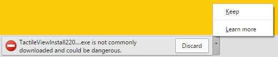
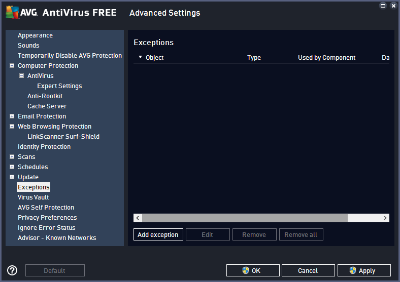
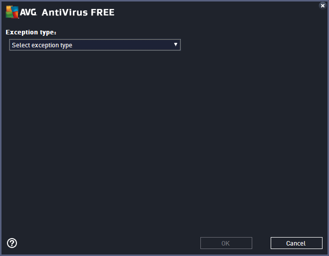
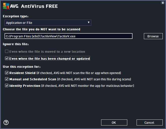
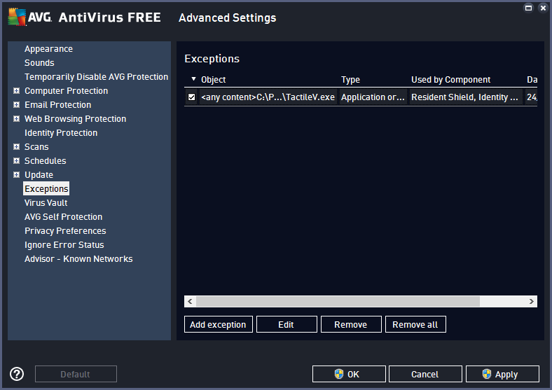
Skip NavigationMenu

5.05 Alignment frame and grids

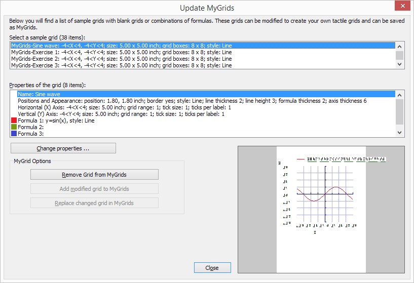
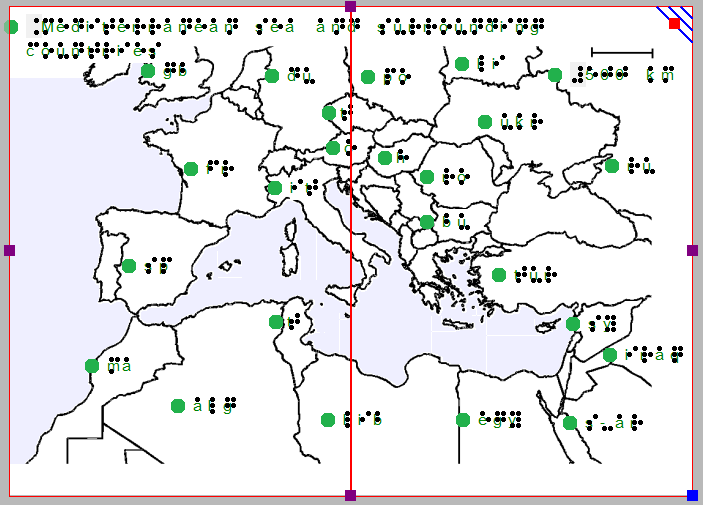
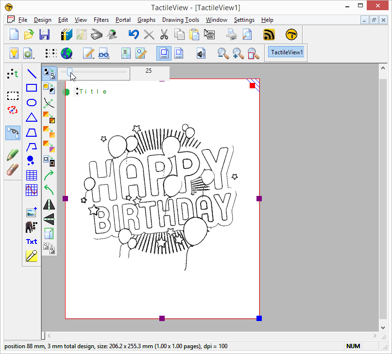
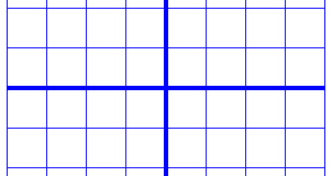
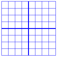
The two alignment grids combined with the alignment frame are useful tools on screen that help to manage the layout of your design by aligning the text labels and/or drawn elements. The braille grid is primarily used to align text labels in a regular grid and conform to certain layout guidelines, whereas the measurements grid is mostly used to align objects and visualize their size. The grids are shown in a light green colour on screen, but will not be printed or embossed.

For more details, see: Measurements grid (object alignment) and Braille grid (text alignment).

Alignment grids: measurements grid on the left, braille grid on the right

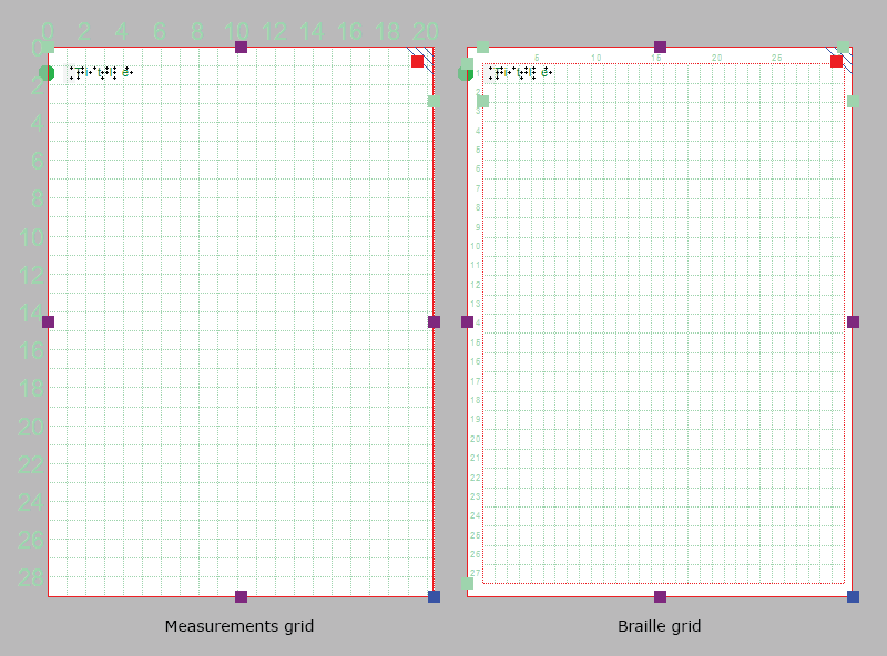
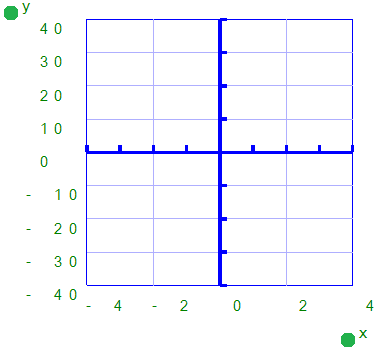
Figure 1. Example: measurements grid without alignment frame on the right, 

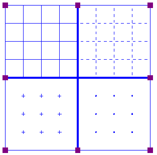
The settings dialog for both grids can be accessed by clicking on the light green marker on the right hand side of the braille grid between text lines 2 and 3, or via menu Settings > Alignment grids.

You can easily switch between the two grids by clicking on either of the grid icons in the second horizontal toolbar. Alternatively you can select ‘Show braille grid’ or ‘Show measurements grid’ from the View menu or select a grid via the Alignment grids settings dialog. You can switch grids off by clicking once more on the currently active grid or deselect it via the View menu or in the grids settings dialog.
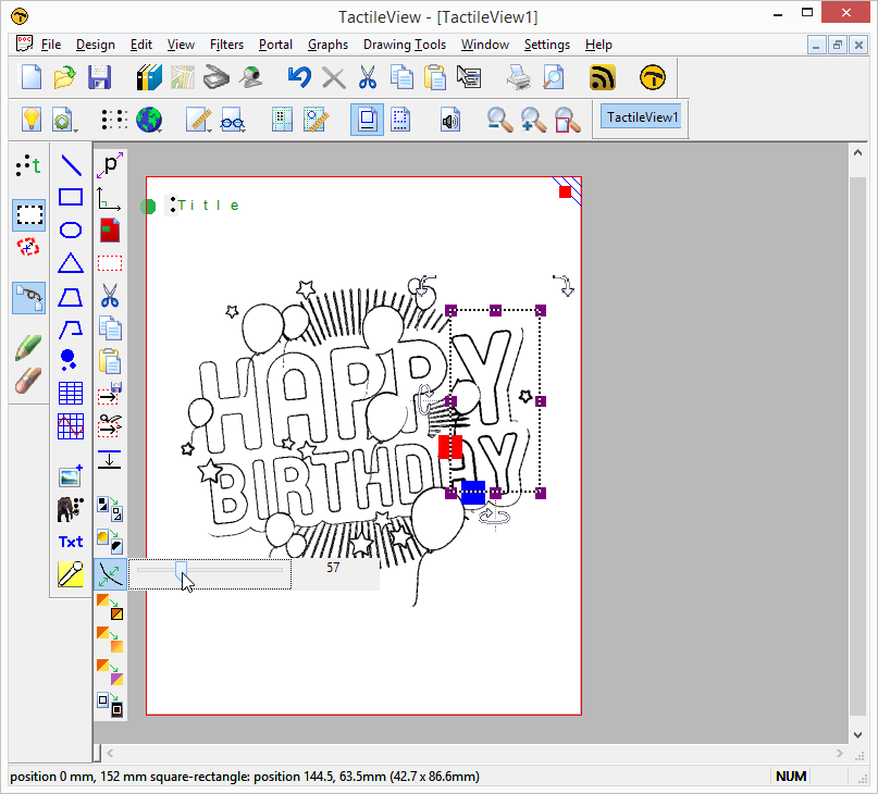
Alignment frame

The alignment frame is a layout tool that can be used as a guide to limit the design to a specified area within the printable area of a page. This is presented in the design with a dashed red border, but will not be printed.

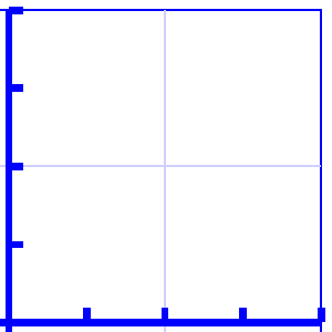
The width and height of the frame are limited to a whole number of braille characters and lines of braille text, respectively. You can adjust the top and left margin of the frame by dragging the four green markers that are placed along the top and left side of the design. Alternatively, you can enter the values for the frame size by opening the ‘Alignment frame and grids’ settings dialog via the green marker on the right-hand side of the design or via menu Settings.

When the alignment frame is enabled, a selected alignment grid will only be shown within the area of the frame. Text labels will then be automatically adjusted in width to fit within the frame.

Saving grid and frame settings as default

The alignment frame and grids are very useful to create consistent page formatting between different designs. In the settings dialog, you can therefore save the current grid and frame settings as default values by choosing ‘Save as default settings’. This ensures the same frame and grid size are used as the basis for all new documents.

These settings are also saved in the document. This way, when you wish to edit the design later on, the margins and grid size still match the design, even when the default grid properties for new documents might have changed.

5.04 Paper size vs. design size

The maximum paper size that printers generally can handle is A4, A3, US Letter or Tabloid. However, diagrams can be larger than the maximum paper size when an image needs to be enlarged to retain the level of detail in the original image. Multiple sheets can be placed in rows and or columns to allow for tactile diagrams of any large size.

In your designs, the red paper border will indicate the size of the design and the number of sheets. Drag the purple markers on the edges of the design to add or remove white space in order to use more surface area for your design. Note that this only adds or removes a strip along the edge of the design, but does not scale (enlarge or reduce) the design contents in this direction. The blue marker in the bottom right corner can be used to scale the entire design.

A map is spread across two sheet of paper in order to show the countries in more detail.

Figure 1. The map is printed across two sheets of paper side to side in order to include sufficient detail.

By resizing the design, adding/removing space within the design or changing the paper orientation, it might become wider or higher than a full sheet of paper (i.e. the white space extends beyond the red border of the paper). If this excess strip does not contain design contents, it will be trimmed automatically when the file is printed. If on the other hand the design is smaller than a full page (i.e. does not reach completely to the red border), the page will be filled out by adding white space.

4.04 Importing images from file (.svg, .png, .jpg, …)

Saved images can be used as a basis for your tactile designs. These can be bitmap images (.bmp, .png, .jpg, etc.) or SVG images. There are two ways to insert these files into your design.

Import image from file

To import a bitmap or SVG image file, select ‘Import’ from the drawing tools toolbar, then choose ‘Import SVG’ or ‘Import image from file’ from the context toolbar. A dialog will open in which you can browse and select the image file that you wish to use. Select ‘image files’ or ‘svg files’ as the type of file to limit the presented files to images suitable for importing. Once you have selected the correct image, click ‘Open’ to insert the image into your design. Next, click in the design to position the image.

‘Import’ icon: Import icon
‘Import SVG’ icon: Import SVG icon
‘Import image from file’ icon: Import image from file icon
Copy from Windows File Explorer
In Windows File Explorer, select the image file that you wish to insert in your design. Right click on the file and select ‘Copy’, or use the shortcut Ctrl+C. In TactileView, position the mouse where you want to insert the file and press Ctrl+V to paste the image. Alternatively, you can also select ‘Paste’ from the Edit menu, the top horizontal toolbar or by opening the context menu by right clicking in the design and selecting ‘Paste’.
‘Paste’ icon: Paste icon

Tutorial 1: Creating a tactile design based on an imported image

In this tutorial we will show you the basic steps how to convert an existing image file into a TactileView design that is suitable for tactile use. Some images require less editing than others, so in many cases you can simply skip some of the 12 steps below.

As an example in this tutorial, we will show how to create different tactile birthday cards. Below, we will show how to edit an image from the internet, but any digital image file can be imported as a basis for a tactile design, including a scan from a book, a webcam image or a saved image file from a digital document. The further steps of editing the image will be identical, regardless of the image source.

You can follow along with the video or scroll down to read the step by step guide.


Step by step guide

1. Finding a suitable image (Google image search)

Using Google Image Search to find a suitable image. In this example, an image of a birthday card is selected.

1.1 Use Google Image search to find your image. Go to Google Image search and type in the keyword(s) of the image that you wish to convert. Try different keywords if you cannot find a suitable image, e.g. ‘Mercedes logo’ instead of just ‘Mercedes’. In some cases, using English keywords may give more results than in other languages. Adding ‘drawing’ or ‘clip art’ to the search may also give better results.
See also: Importing images from the internet >


Using the Search Tools in Google to refine the image search, for example by selecting 'line drawing' as image type.

1.2 Refine the Google search results if necessary. Select Search tools > Type > Line drawing for more suitable images if necessary. In general, line drawings or vector images are more easily converted to a tactile image.
See also: Importing images from the internet >


Copying the image in the web browser.

1.3 Select and copy or save the image. Once you have found the right image, select it and right click > Copy image; alternatively, you can right click and save the image on your computer if you wish to save it for later use.
See also: Importing images from the internet >


2. Importing the image in TactileView

Opening a new design in TactileView.

2.1 Create a new design in TactileView. Launch the TactileView software and open a new file.
See also: After launching the software >


Pasting the image of the birthday card in the TactileView design.

2.2 Option A: Paste the image in the design. If you chose to copy the image, you can right click in the design area and select ‘Paste’ to place the image in the design. Alternatively you can use Ctrl+V or click on the ‘Paste’ icon in the top toolbar.
See also: Importing images from the internet >

Option B: Import the image from file. If you chose to save the image, select the ‘Import’ icon from the drawing tools toolbar and choose ‘Import image from file’. You can also find this option in the File menu. Browse to the file, select ‘Open’ and click on the position in the design where you wish to insert it in the document.
See also: Importing images from file >

2.3 Resize the image. Make sure that the image is large enough for tactile use and fits well within the design, leaving small margins around the edges. Use the purple markers on the corners and sides to resize the image.


3. Editing the image for tactile use

Applying an overall filter to the imported image to convert it to a line drawing that is suitable for tactile use.

3.1 Apply an overall filter to make the image suitable for tactile use. Filters help to reduce the complexity of images and filter out the tactile suitable graphic information. In this example, the filter ‘Convert to line drawing’ with a setting of 25 is applied.
See also: Filters; editing an imported image >


Applying a local filter to enhance the tactile properties in a selected area.

3.2 Apply local filters to adjust a selected area. Some images might require some additional, local adjustments for optimal usability.
See also: Select area; editing parts of the design >


Removing unwanted elements with the eraser tool.

3.3 Retouch the image. Select ‘Retouching: erase’ or ‘Retouching: adding lines’ from the drawing tools toolbar or Drawing tools menu to retouch the filtered image. Use the eraser to remove any unwanted elements or use the pen to fill in any missing parts of the image.
See also: Retouching tools; pen and eraser >


4. Adding explanatory text

Editing the title text label gives a first description of the image.

4.1 Edit the design’s title label. This text label gives the first description of the design’s contents.
See also: Add text label >


The text

4.2 Replace or clarify any texts in the image with text labels. Use the eraser to remove the existing visual text or add lines that refer to the visual text. Select ‘Add text label’ to insert text labels in braille to replace or clarify the existing texts.
See also: Add text label >


Additional text labels indicate the position of some balloons on this birthday card.

4.3 Add extra text labels required for interpreting the image by touch. These additional labels can make the image easier to interpret for the VIP reader.
See also: Add text label >

8.03 Graph properties for best tactile usability

When it comes to tactile graphs, there are several properties that together determine the tactile usability. The three elements in a graph (the equation in braille, grid paper with coordinate system and the curve of the formula) can be configured individually to achieve the optimal tactile result. Personal preferences of the VIP reader as well as the properties of the printer that will be used both need to be taken into account. Therefore we advise you to test the settings described below first to find what works best for you.

Choosing the best graph properties

The mathematical formula(s) and range of the axes are generally the most important elements when you create a new graph. All other aspects of the grid are for tactile presentation purposes. Reading a tactile graph can be complex enough on its own, so choosing the optimal settings for your production method (swellpaper or the type of braille embosser) is important. This works best if you can imagine the result of each setting in advance. The list below gives an overview of all the settings that are related to a tactile graph.

Graph properties

  1. Coordinate system and grid paper

The coordinate system (the axes of the graph) and grid paper (the regular grid that indicates the values of the graph) form the frame in which the graph will be plotted.
Select ‘Positions and appearance’ from the properties toolbar or context menu of the graph to access the ‘Appearance’ settings for the coordinate system and grid paper.

Coordinate system – X and Y axis

– Line thickness of the axis; thicker axis lines can be used to distinguish the axes more easily from the thinner grid lines, but also take up more space and tear more easily on some embossers.

Grid paper

– Draw border to surround the axis; this places a rectangular frame around the entire grid.

– Style of auxiliary lines for grid boxes; you can choose from: line, cross, dot, dash and none.

– Thickness of the auxiliary lines for grid boxes; use thinner lines to make the grid boxes less prominent for better contrast with the formula lines.

– Relief height of auxiliary lines for grid boxes; you can make the grid lines less prominent and more easily distinguished from the axes and formulas by lowering the line height. This is only available for embossers that support variable dot height.


The axes are thicker than the grid box lines for easy distinction.

Figure 1. Differences in line thickness are used for easy tactile distinction between the grid boxes and axes.

The ends of the graph are indicated by the bounding border

Figure 2. A border is used around the edges of the graph.

Four different grid box styles: lines, dashed lines, crosses and dots

Figure 3. Four different grid box styles: line, dash, cross and dot.

A lower relief height can be used for the grid boxes when supported by the embosser.

Figure 4. A lower line height, indicated with a lighter blue colour, can be used for easy distinction of the grid boxes.

  1. X and Y axes

These settings can be adjusted separately for the horizontal (X) and vertical (Y) axis.

– Extreme values for the axis; this determines the range in which the graph is shown.

– Subdivision of the axis: units per grid box and units per tick; you can choose the interval that is used for the grid boxes and ticks along the axis to easily read the values of the graph.

– Ticks per text label; you can choose whether a numeric value should be placed at each tick, more spaced out (e.g. 1 text label for every 2 ticks) or only at the origin/ends.

– Number of decimals of the values along the axis; some graphs might require more decimal numbers.

– Position of the labels relative to the graph’s border; this allows you to create enough space between the grid and value labels along the axis. In the design, you can also drag the purple marker below or left of the values to move them to the required position with the mouse.

– Name for the axis; by default, these are ‘x’ and ‘y’, but you can change this to suit the graph (e.g. ‘Number purchased’ and ‘Price’).

– Horizontal and vertical position of the axis name; these determine the position of the axis name label. In the design, you can drag this label to the required position with the mouse. Double click on a formula label to edit it.

– A thickness of the axes of 0 pixels allows you to produce a formula line without any coordinate system, when only the shape of the mathematical function is important without the corresponding values. For this application, it is best to disable the grid boxes and the border surrounding the graph.


The range for the axes and positions of the ticks, grid boxes and value labels determines the layout of the axes of the graph

Figure 5. The range for the axes and positions of the ticks, grid boxes and value labels determines the layout of the axes of the graph

The axes can be labeled, such as 'Quantity' and 'Price in euro'

Figure 6. The axes can be labeled individually (X and Y are the default labels).

Graph without coordinate system, showing only the formula lines

Figure 7. A graph using a thickness of 0 pixels for the axes shows only the formula lines.

  1. Formula lines

The settings for each formula line that is presented in the graph can be adjusted separately.

– Formula syntax; enter the mathematical equation that will be plotted.

– Text label representation of the formula; the legend above the graph shows which formulas are presented. You can choose from an number of mathematical representations; alternatively, you can choose to enter your own name (e.g. ‘Surface area’) or choose not to include a label.

– Line style for the formula; by default, each formula gets a different tactile line style to distinguish multiple formulas in a graph. This line style is also presented in the formula legend above the graph. Different colours are used on screen for easy visual recognition.

– Position of the text label; by default, the text labels for the formulas are placed above the graph. In the design, you can also move these with the mouse.


Different line styles are used for the formulas in the graph, as signified in the fomula legend.

Figure 8. Different line styles are used for the formulas in the graph, as signified in the fomula legend. Different colours are used on screen to easyly distinguish the formulas visually.

1.06 Download and installation troubleshooting

TactileView software has been around for over a decade and is completely safe in use, but due to the limited number of users, some virus scanners, web browsers or Windows may automatically block TactileView. Here are a few ways to solve the most common problems when downloading and installing the software.

Downloading the software – browsers

Some browsers might block a downloaded file when it is not downloaded regularly.

Google Chrome

After downloading TactileView, Google Chrome might block launching the downloaded file.

Message in Google Chrome: "TactileViewInstall2200.exe is not commonly downloaded and could be dangerous."

This is encountered mostly with new releases or development versions of TactileView. Click on the small arrow on the right to show more options, then choose ‘Keep’ to dismiss this message.


Internet Explorer

When the security level in Internet Explorer is set to ‘High’, a message will appear when you download TactileView.

Internet Explorer warning message: "Your current security settings do not allow this file to be downloaded."

To solve this, click on the gear icon in the top right corner and go to Internet Options. In the Security tab, reduce the security level to ‘Medium-high’. You can now retry to download the software installer. Next, choose to save or run the TactileView installer.


Other browsers

In case another web browser blocks your downloaded file, check the security settings of the browser or any virus scanner add-ons. If these are too strict, try to lower the security level and retry to download the file.


Installing the software

Windows SmartScreen

Windows Smartscreen message: "Windows SmartScreen prevented an unrecognised application from starting. Running this application might put your PC at risk."

Windows SmartScreen will often block when the TactileView installer is launched for the first time.

Windows Smartscreen warning: clicking 'More info' allows you to select 'Run anyway'

To continue with the installation, click on ‘More info’, then select ‘Run anyway’.


Virus scanners

As with browsers, the security level of your virus scanner will determine whether launching TactileView will be allowed. Lowering the security level will usually solve the problem. The example below shows how to resolve the problem when a lower security level will still block TactileView. In this example AVG is shown, but other virus scanners will provide similar options.

AVG step 1 (screenshot)

1. Go to ‘Options’ and select ‘Advanced settings’.

AVG step 2 (screenshot)

2. From the list of options, select ‘Exceptions’ and click on ‘Add exception’.

AVG step 3 (screenshot)

3. Select ‘Application or File’ as Exception type.

AVG step 4 (screenshot)

4. In the list of options that appears, browse to the location of the TactileView executable file; by default this will be C:\Program Files (x86)\TactileView\TactileV.exe. Check ‘Even when the file has been changed or updated’ to avoid having to repeat this process after a software update. Click ‘OK’ to confirm.

AVG step 5 (screenshot)

5. You will now see TactileView in the list of exceptions. You need administrator rights to confirm the changes by clicking ‘OK’.


8.06 Saving grids as MyGrids

The example grids (empty grid paper as well as graphs) are called TVGrids. These examples can be modified to use them as the basis for your own graphs. Any grid can be added to this list by saving them as MyGrids. This allows you to easily store them for later use. You can find your saved MyGrids below the list of TVGrids in ‘Grids and graphs (advanced examples)’.

You can save a selected grid as MyGrid by selecting ‘Add to MyGrids’ from the properties toolbar or context menu. Enter agrid name as a reference, then click ‘Yes’ to save the grid.

‘Add to MyGrids’ icon: Add to MyGirds icon

Menu Graphs – Update MyGrids

If you wish to modify or remove any of the saved MyGrids, select ‘Update MyGrids’ from the Graphs menu and select one from the list.

To modify a MyGrid, select ‘Change properties’ to make the desired changes. After you have applied the changes, you can choose to save the modified grid as a new MyGrid by selecting ‘Add modified grid to MyGrids’ or overwrite the existing one by choosing ‘Replace changed grid in MyGrids’. You can also choose to delete one of the MyGrids from the list by selecting ‘Remove grid from MyGrids’.


Update MyGrids dialog

Figure 1. The ‘Update MyGrids’ dialog allows you to edit the list of saved graphs; click on the image to enlarge.

11.03 Considerations

As mentioned in ‘Introducing the TactileView tactile graphics suite’, using the TactileView digital pen in most cases requires a high level of experience. We strongly suggest to practise the various skills in a certain order to develop the necessary skills before starting to use and combine the products in the TactileView Graphics Suite.

Depending on the amount of support at hand, we recommend to take care of some preconditions to avoid disappointment in using the TactileView digital pen. Make sure all sections in the category ‘Using TactileView with a screen reader’ are mastered as well.

Why drawing with the digital pen on the TactiPad?

Do you wish to digitize the drawing that you create on the TactiPad drawing board? Do you want to share your digital designs with others for further processing? Or do you want to use the objects in TactileView for more accuracy in your drawings?

If you answered ‘yes’ to any of these questions, there are specific advantages to using the digital pen to combine the functionality of both TactileView and the TactiPad. In other cases, the separate use of both products will usually be sufficient.

Keep in mind that the skill level of the combination of products is

Please note, we bring up this question while the effort involved in to creating a digital design is relative high.

Why using a TactileView ClickPad?

By its nature, braille characters have a fixed size that takes up a relatively large amount of space in a tactile graphic. For diagrams in which many (braille) text labels are required, the addition of an audio information layer can help to reduce the amount of space needed for text information. Specific areas in design can be provided with audio labels that provide spoken information. When clicking with the digital pen on the position of the audio style, its content will be pronounced. The audio content can be text (using Text to speech) as well as music or microphone recordings (.mp3 files).

See the section ‘Adding audio style’ to find out how audio styles can be added to the design.

TactileView version 1.950 – release notes

The software has been tested and prepared for Windows 8. The support for a touchscreen, one of the elements of the Windows 8 interface, is implemented.
Drawing objects with your finger or zoom in/out (pinching) or rotating objects has never been so easy.

The TactileView drivers have been prepared for 64-bit Windows. Especially the combination with the Index embossers Version 4, has gone through an extensive testing procedure. See the ‘Index’ section below.

File menu

In the file menu the option ‘Import SVG’ is added. This allows you to import files with file format SVG. To clarify: The ‘Open’ option will open files in TactileView format (BPX), JPG, PNG, TIF and GIF.
The File menu option ‘Print Multiple Documents’ has been changed to select and print a list of designs more easily. This can be done by selecting multiple designs from a folder or by creating firstly a .txt-file with the file names.
When files in the print list could not be found (either due to a misspelled file name or wrong document location), the list can be changed by selecting a replacing file and saving the corrected print list.

Settings menu

In the Settings menu, the ‘Braille Tables’ option has been extended with the inclusion of the LibLouis braille translation. This is an open source system for the use of various braille tables in different languages, including contracted braille. With the incorporation of this system, TactileView can now apply multiple braille tables in the same document.
Settings – Braille tables: First of all, create your own list of braille tables that you want to apply when creating or editing a design. As you enter a new text label or edit an existing one, you can then select a braille table that you like to apply to the selected text label.
In order to get an overview of the different braille tables that are applied to present the text labels in the current document, the function ‘Braille table overview’ in the toolbar or context menu of the design can be selected. This will present the names of the braille tables in a specific colour. The respective labels in the design will have markers with the corresponding colour.
The presentation of the textlabels in normal font is based on the number of braille characters. In other words, when a textlabel has braille contractions, a smaller fonttype is used in order to avoid overlapping in the design.

Graphs menu

A new option has been added to the Graphs menu: ‘Functions and Formulas. Here you can find a list of all the mathematical functions and constants that can be used in a formula.
Also a list of sample formulas is available in this menu option. All settings can be changed to create the formula that suits your needs. This option uses the same underlying technique as in the Grids and Graphs menu. This option presents a list of Grids and Graphs, based on a number of sample formulas.
The grids an formula list contains quite a number of settings to be able to create a tactile usable graph.
The names of the grids are localized.

Index printers

Although Index Braille AB provides drivers for its printers, you should install a TactileView driver.
After you have installed the standard driver from Index, the TactileView printer driver can be installed via the TactileView program, menu option File – Install Braille printer.
Depending on your printer model:
For Index printer model V4 select the type: Index Printer (V4 0.5 mm).
The printer port must be set to the same value as is selected by the Index driver.
Make sure you have the latest Index firmware version 1.4.2 build 60 uploaded to the embosser.
For models Version 3 select the type: Index Printer (V3 0.5 mm).
Note 1. If you connect an other Index Printer to the same physical USB port, the USB port number will change and you have to make the same change for the TactileView printer driver. The easiest way to do this is to install the TactileView driver again with the new port setting.
Note 2. The paper format selected in the printer should always be in portrait position. TactileView rotates a design that is in landscape format to portrait format before sending the output to the printer.

TactileView version 1.900 – release notes

A few esthetical changes have been made to the icons in the toolbars and they are separated in groups with similar functions.
The colour scheme has been extended with a green colour that is used to add information to certain objects. This colour is used in the design and in the corresponding tool icons in the toolbar. The green indicators on the screen will not be printed in the design, unless specified.
The icons for the tool ‘Add Text Label’ and ‘Draw Letters and Digits’ have been adjusted to explain the two different tools to avoid confusion. (You mainly want to have text in the design with the proper Braille characters. Users tend to select the draw character at first sight).
The selection tool has got a few more options: ‘Add to bitmap’ and ‘Mirror vertically or horizontally’. These are also available for figures in the design.
Two new objects have been added: triangles and tables.
The triangle object enables you to create a triangle with preset properties like a right angle or 2 or 3 equal sides. When you select a triangle in the design you will see green indicators for the type of the triangle and characters A, B en C to indicate the corners. Via an option in the context menu you can have these indicators printed as well. Extra lines from any of the 3 angles to the opposite side (altitude, median line and bisector) can be selected to be drawn automatically.
The table object allows you to create a tactile framework divided into rectangles. The context menu will allow you to adjust the size of the table or add or remove specific rows or columns.
In the individual cells you can place other objects from the left vertical toolbar. You still can change the properties of the elements in the cells from the respective tool bar.
‘Show or hide order of objects’ will list the order in which the objects have been added to your design. Especially when you want to make sure that overlapping objects are well presented either transparent or not, you may find this feature useful. The numbers in the middle of the objects will turn green or orange, corresponding with the transparency icon / setting in the objects context menu. An orange number shows that the object is not transparent and that you see the contour lines of the object while the underlying object is (partly) covered, whereas green indicates that the object is transparent and the objects below can be seen through it.
The option ‘Create Map’ in the Portal menu is restored. Not only can you create street maps, but also maps of larger areas, even up to the whole world. The option will establish a contact with the RouteTactile website where you can also select various layers to define the map of choice, depending on the zoom level.
The help option ‘Sounds’ has been relocated to the Settings option ‘TactileView digital pen’, in which the playback volume can be set relative to the other sound and speech output signals.
More printer options have been added. You can now use the Index V4 range of embossers.
The software has been extended with the Index V4 range of embossers. Especially the resolution of 0.5 mm will create very nice shapes and curves. In order to use your Index V4 embosser, please make sure that your unit is equipped with firmware version 1.4.2 or higher.
You may find firmware upgrade instruction at Index website:
http://www.indexbraille.com/en-us/support/knowledge-base/service/firmware-upgrade-v4-embossers-1-2-x-and-higher
In this case it is enough to select a “minor upgrade”.
To access these downloads from www.indexbraille.com the user has to register and be logged in on the site.