Skip NavigationMenu

8.02 Text label – Math input (equation in braille)

Currently, there are three options for entering a mathematical text label in your TactileView design:

  1. Enter the equation in a regular text label, using the corresponding braille table;
  2. Use six-key entry (braille keyboard) to directly enter the math in braille;
  3. Enter the mathematical expression using a math editor (MathType).

Options 1 and 2 require knowledge about the mathematical braille notation you are using in order to enter the equation correctly. Option 3 allows you to enter math and convert it automatically to the desired notation in braille, but this requires MathType as a math editor. In the upcoming service release, a fourth method will be included, which allows you to enter the equation in linear notation and have it converted automatically (i.e. this will not require knowledge of the braille notation or a mathematical editor).

1. Using a regular text label

When you know the rules of the mathematical braille notation you wish to use, you can use a regular text label to enter it in your design. Select ‘Add text label’ from the drawing tools icon bar, then select ‘Text and position: computer keyboard input’ from the properties toolbar. Click in the design where you want to place the equation. Make sure to include the correct spaces, parentheses and other specific aspects of the mathematical notation. MathType is required when you wish to use symbols that are not on your keyboard.

Next, make sure to select the correct braille table for the notation you are using. You can select the braille table by choosing ‘Select braille table’ from the properties toolbar or context menu. The following braille tables are recommended for the different mathematical notations:

  • nemeth.ctb for Nemeth;
  • ukmaths.ctb for UKmaths;
  • marburg.ctb for Marburg notation;
  • en-us-comp8.ctb or similar for LaTeX;
  • Dutch braille table for Dedicon notation.

‘Add text label’ icon: Icon for placing a text label
‘Computer keyboard input’ icon: Icon for computer keyboard input
‘Select braille table’ icon: Select braille table icon

2. Using six-key entry

If you know the mathematical braille code and wish to simply use braille keyboard (six-key) entry for direct input of the desired characters, please refer to the ‘Different types of text labels‘ section for instructions on adding text labels through six-key entry.


‘Braille keyboard input’ icon: Icon for braille keyboard input

3. Equation with math editor (MathType)

You can use MathType as a math editor to automatically convert the entered equation to the desired braille notation. The math editor is also required to enter math that is too complex to be entered in linear format or when symbols are required that are not available on the keyboard. For more information on using MathType to enter mathematical expressions, please visit their website.

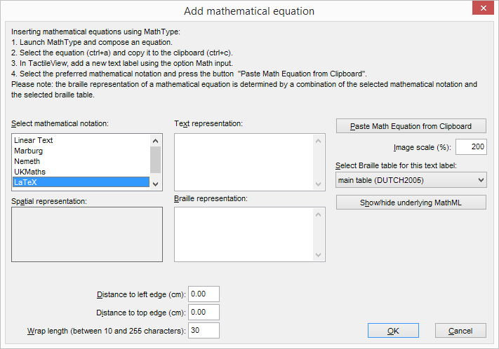
Once you have entered the equation in MathType, select it and copy it to the clipboard (Ctrl+C). Switch to TactileView, select ‘Add text label’ and choose ‘Text and position: math input’ from the properties toolbar. Click in the design where you wish to position your mathematical label.

In the dialog that appears, select the preferred mathematical notation and click on ‘Paste math equation from clipboard’. The equation will now be displayed in both visual (linear and spatial) and braille format.

The dialog also allows you to adjust the location in which you would like to insert the label (if different than where you originally clicked in the file) by filling in the distance fields. You can size the label by specifying the maximum number of characters you would like it to have before the text wraps to the next line. Choose ‘OK’ to confirm and close the dialog.

Mathematical text labels may be moved and edited the same as other text labels. For more information, please refer to the ‘Editing text labels‘ section.


‘Math input’ icon: Icon for math input

Mathematical text label in a TactileView design

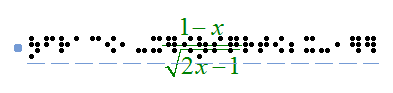
Figure 1. A mathematical equation in TactileView; LaTeX and en-us-comp8.ctb were used as mathematical notation and braille table.

8.04 Creating a graph

TactileView offers a very powerful graphing feature, which allows you to enter formulas and have them graphed over a specified range. TactileView gives you precise control over the styles used in your graph for the functions, axes, gridlines, labels and more. You can also move and resize your graph like any other drawing object.

There are several possible approaches of creating a new graph. You can choose an empty grid as a basis (see paragraph 1), select one of the TactileView graph examples and adapt it to form your own (see paragraphs 2 and 3), or create a new graph based on the entered formula (see paragraphs 4 and 5). You can also save any graph as ‘MyGrid’ for reuse in later designs (see section ‘Save graph as MyGrid for later use’).

You can read an overview of all the tactile properties that determine the tactile usability of a graph in the ‘Graph properties’ section. For more information on the different mathematical notations in braille, read the ‘Introduction on mathematical notations‘ section.

1. Coordinate system (no functions)

To enter an empty coordinate system (empty grid paper without any graphed formulas), select ‘Draw graph’ from the drawing tools icon bar, then choose ‘Coordinate system (no functions)’ from the properties toolbar. This option can also be found in the Graphs menu.

Once this option is selected, an empty grid will appear in the design. By default, this grid is square and ranges from -4 to 4 on both the x- and y-axis, with straight grid lines at an interval of 1 unit. You can use the options in the properties toolbar or context menu to adjust the properties of the grid or add a graphed formula.


Coordinate system (no functions) icon: Coordinate system (no functions) icon

Empty grid ranging from -4 to 4 along both axes.

Figure 1. Empty grid inserted in a TactileView design.

2. Functions and formulas (examples)

TactileView includes two sets of ready to use example grids. These have already been optimized to depict the selected formula. You can use these graphs as a basis for your own by simply changing the formula(s).

Select ‘Draw graph’ from the drawing tools icon bar, then choose ‘Functions and formulas (examples)’ from the properties toolbar. Alternatively, this option can also be found in the Graphs menu.

In the dialog that appears you will find a list of sample graphs which each include one formula, ranging from simple to more complex. By choosing ‘Change formula’, you can edit the formula to create your own graph based on the sample. ‘Change coordinate system’ allows you to adjust the settings for the grid style and properties of the axes (such as the range). Use ‘Multiple formulas’ to add extra formulas to the grid (for more information on including multiple formulas in one grid, read the ‘Graphing multiple lines’ section).

Once you have selected a sample graph or when you are satisfied with the adjustments, you can choose to insert the graph a blank new document (click ‘Save in new document’) or place it in the currently active document (click ‘Save in current document’). You can also choose to replace the most recent grid in the current document (click ‘Replace the last grid’).


‘Functions and formulas (examples)’ icon: Functions and formulas (examples) icon

Functions and formulas dialog

Figure 2. ‘Functions and formulas (examples)’ dialog; click on the image to enlarge.

3. Grids and graphs (advanced examples)

Similar to ‘Functions and formulas’, the ‘Grids and graphs’ dialog contains a list of sample grids that can be used as is, or adapted to create your own grids. The list contains a number of variations of empty grids, as well as a list of grids that contain one or more formulas (arranged from simple to more complex). These examples are labelled as numbered TVGrids. Below these TVGrids, you will find any grids that were saved for reuse as MyGrids.

You can access this list of sample grids by selecting ‘Draw graph’ from the drawing tools icon bar, then choosing ‘Grids and graphs (advanced examples)’ from the properties toolbar. Alternatively, this option can also be found in the Graphs menu.

The list of properties of the selected sample graph is shown in the second list box. If you wish to adjust any of the settings, select it from this list and click ‘Change properties’.

If you have selected one of the MyGrids from the list, you have the option to remove it from the list of saved grids. When you have adjusted the selected MyGrid, you have the option to either save it as a new MyGrid or replace the edited MyGrid.

Once you have selected a sample graph, MyGrid or when you are satisfied with the adjustments, you can choose to insert the graph a blank new document (click ‘Save in new document’) or place it in the currently active document (click ‘Save in current document’). You can also choose to replace the most recent grid in the current document (click ‘Replace the last grid’).


‘Grids and graphs (advanced examples)’ icon: Grids and graphs (advanced examples) icon

Grids and graphs dialog

Figure 3. ‘Grids and graphs (advanced examples)’ dialog; click on the image to enlarge.

4. Add custom graph: equation editor

This option allows you to create a graph based on a formula that is entered using MathType as an equation editor. The math editor is also required to enter math that is too complex to be entered in linear format or when symbols are required that are not available on the keyboard. For more information on using MathType to enter mathematical expressions, please visit their website.

Once you have entered the equation in MathType, select it and copy it to the clipboard (Ctrl+C). Make sure that the entered formula is suitable for conversion to a graph. Next, switch to TactileView and select ‘Draw graph’ from the drawing tools icon bar, then choose ‘Add custom graph: equation editor’ from the properties toolbar. Alternatively, this option can also be found in the Graphs menu.

In the dialog that appears, select the preferred mathematical notation and click on ‘Paste math equation from clipboard’. The equation will now be displayed in both visual (linear and spatial) and braille format. Choose ‘OK’ to confirm.

In the formula dialog that appears, the options below the formula as well as the buttons ‘Positions and appearance’, ‘Horizontal (x) axis’ and ‘Vertical (y) axis’ allow you to adjust all the grid properties, formula labels, line style and axis properties; you can read an overview in the ‘Graph properties’ section. Use the ‘Apply’ button to refresh the graph preview after you have made any changes to the graph.

Once you are satisfied with the composed graph, select ‘OK’ to close the dialog and insert the graph in the design.


‘Add custom graph: equation editor’ icon: Add custom graph: equation editor icon

Add custom graph: equation editor dialog

Figure 4. ‘Add custom graph: keyboard input’ dialog; click on the image to enlarge.

5. Add custom graph: keyboard input

When you activate ‘Add custom graph: keyboard input’ from the Graphs menu or from the properties toolbar of ‘Draw graph’, a formula dialog will open. Enter the formula in the first entry field, making sure to use the correct syntax (e.g. 2*x instead of 2x, x^2 for x squared, etc.) similar to entering an equation in software such as Microsoft Excel. You can also select elements from the list of available functions and constants and insert them into the formula by double clicking on it or pressing the Enter key.

Once again, the options below the formula as well as the buttons ‘Positions and appearance’, ‘Horizontal (x) axis’ and ‘Vertical (y) axis’ allow you to adjust all the grid properties, formula labels, line style and axis properties; you can read an overview in the ‘Graph properties’ section. Use the ‘Apply’ button to refresh the graph preview after you have made any changes to the graph.

Once you are satisfied with the composed graph, select ‘OK’ to close the dialog and insert the graph in the design.


‘Add custom graph: keyboard input’ icon: Add custom graph: keyboard input icon

Add custom graph: keyboard input dialog

Figure 5. ‘Add custom graph: keyboard input’ dialog; click on the image to enlarge.

11.05 Using Explore Mode (ClickPad)

Explore mode allows you to interact with a TactileView file the way a user will. For example, when you click a text label in a file while using explore mode, the text label will be voiced via text-to-speech instead of becoming selected so that you can edit it like it does in design mode. Similarly, the audio labels for drawing objects will play when the object is clicked, instead of the object becoming selected for editing.

Limited options for changing audio information in the file are available within explore mode, but otherwise files cannot be edited from this mode. If you would like to make changes to anything else in the file, you must switch back to design mode to do so.

You can control some user settings from explore mode, such as selecting a voice or initiating digital pen calibration. For information on calibrating the digital pen or using it with a file in explore mode, please refer to the Connecting and Calibrating the Digital Pen and Using Explore Mode with the Digital Pen tutorials.

Entering explore mode

In order to use a file in explore mode, you must first open it in TactileView, which defaults to design mode when a file is opened. Once you have a file open, explore mode can be activated in one of three ways: by selecting the Explore with Speech and Sound icon from the tool bar across the top of the screen, by selecting the Explore with Speech and Sound option from the View menu or by pressing CTRL+E.

Exploring a file

When you first open a file in explore mode, certain information about the file is automatically voiced. The name of the currently selected speech voice is spoken, as well as the title of the file. TactileView also tells you how many audio styles (audio labels) are in the file when you first enter explore mode.

You can explore the file by clicking different items in the file with the mouse. The digital pen provides an accessible way to explore the file. For more information on using the digital pen with TactileView files in explore mode, please refer to the Using Explore Mode with the Digital Pen tutorial.

When you click on a text label, the text in the label is spoken via text-to-speech. When you click on an object with an audio label, the audio label is played. If the audio label contains both synthesized speech and a sound file, the synthesized speech will begin first and then the sound file will play. Clicking on a blank area or on an object other than a text label that does not have an audio label will cause TactileView to voice “empty.”

Changing an object’s audio label

If you discover an object that does not have an audio label and want to add one, you can right-click it and choose Change Audio Style for Object option from the context menu. This brings up the audio label properties dialog, which allows you to create an audio label the same way you would in design mode. For more information on the options on this dialog, please refer to the Adding and Editing Audio Labels tutorial. When you are done making changes, choose the OK button to close the dialog and apply your audio label.

You can also edit existing audio labels for an object by right-clicking the object and choosing Change Audio Style for Object from the context menu to bring up the audio label properties dialog. Make any desired changes on this dialog, then choose the OK button to close the dialog and apply your changes to the audio label.

Adding a voice memo

Sometimes it can be useful to add an audio label without attaching it to a drawing object. This is especially true when the file you’re working with is a fused bitmap, because nothing in a fused bitmap is selectable. This type of audio label, called a voice memo, is shown in the file and can be clicked to hear the audio information, but it will not be embossed in the drawing when the file is embossed.

To add a voice memo, right-click anywhere in the file and choose the Place Voice Memo option from the context menu. To define your voice memo area as a small circle, click the place in the file where you’d like the voice memo to be. To create a line as the voice memo area, click and drag the mouse to draw the line, then release it. To create a freehand closed shape as the voice memo area, click and drag the mouse to draw the shape, releasing the mouse button close to the starting point of the freehand shape object.

As soon as you have defined the voice memo area, the software will begin recording from the computer’s microphone to create the voice memo content. If you wish to record from the microphone for your voice memo, begin speaking into the microphone immediately and then click anywhere in the file to finish recording. If you would like to create a different type of voice memo, simply click anywhere in the file after defining the voice memo area to quickly end the recording process, then right-click the voice memo area to bring up the standard audio label properties dialog and define your audio label as desired.

Setting the voice for text-to-speech

To choose a different voice for synthesized speech for audio and text labels, right-click anywhere in the file, pick the Select a voice option from the context menu and choose the desired voice from the pull-down list to the right. TactileView will immediately begin using the newly-selected voice for synthesized speech.

Exiting explore mode

When you wish to return to design mode, press ESC on the keyboard or right-click anywhere in the file and choose Quit Explore Mode in the context menu.

12.01 Printing with a braille embosser

Before printing a file from TactileView, ensure that the driver for your embosser has been installed on the computer; see Properties of different braille embossers for instructions for each supported embosser model or Embosser driver installation for an overview of the tactile properties of the embossers.

To check if your embosser is ready for printing, go to the Windows Control Panel and select ‘Devices and printers’. If the embosser is installed correctly, you should see it online in the list of available printers.

Online and offline printer icons in Windows Control panel

Figure 1. Offline (left) and online printer icons in Windows Control panel.

Print setup
Once you have verified that the printer driver is installed on the computer, select ‘Print setup’ from the file menu. In the dialog that opens, select your embosser from the printer name list. Next, select the paper size you want to emboss on, and choose the print orientation. Click ‘OK’ to apply your settings to the document and close the dialog.
If you changed any of the options on the screen, this will affect how the active document will be printed. Depending on the size of your design and the selected paper size and orientation, the design may not make full use of the available space on the paper, or the design may run over onto a second page; see the manual sections Paper size vs. design size and Changing design orientation and size.

Print preview
Check how your document will print by selecting ‘Print preview’ from the File menu or the corresponding icon in the top horizontal icon bar. This will open a preview of how your document will print and represents the exact embossed and/or printed output.
You can use the buttons above the preview to examine the document as it will be printed, including the number of pages and ink version if applicable.

When you wish to get a preview of the dot placement directly in your design, active the Design mode: dot view from the second horizontal toolbar.


‘Print preview’ icon: Print preview icon
‘Print’ icon: Print icon

Print document
When your document appears in the preview the way you want it to print, select ‘Print’ from the File menu or press CTRL+P to bring up the Print dialog. This is a standard Windows print dialog, which allows you to select which pages to print and how many copies. Make the desired selections, then choose the ‘OK’ button to close the dialog and print the file.

‘Print’ icon: Print icon

6.08 Draw table

TactileView includes a number of tools for drawing and working with tables. Most editing commands for tables are the same as for other drawing objects, including the methods with which to move, center or delete a table, change its line or fill style, add audio labels or fuse it to the bitmap. For more information on these topics, please refer to Editing object properties, Adding audio styles and Working with fused bitmaps. The features and commands described in this tutorial are specific to tables.

Drawing a table

To add a table to your file, choose the ‘Draw table’ icon from the toolbar on the left side of the screen, then click and drag the mouse in the design to insert a table into your document. Your table will be created with the default number of rows and columns, but you can add and/or remove rows and columns as desired after the table has been inserted.

Another way to add a table to your file is to select ‘Draw table’ from the Drawing Tools menu. This launches a dialog, allowing you finer control over how the table is initially created.

To insert a table using this method, enter the desired location of the upper left corner of the table, then specify the size parameters, the number of rows desired and the number of columns desired. When setting the size, choose the ‘Enlarge/reduce’ radio button if you would like the cells in your table to be square, or choose the ‘Stretch’ radio button to allow adjustment of the height and width independently. Enter the desired cell width (and the height, if using the ‘Stretch’ option), the desired number of rows and the desired number of columns, then choose ‘OK’ to close the dialog and insert the table into your drawing.


Drawing a table in the design with the mouse
Figure 1. Drawing a table in the design with the mouse.

‘Draw table’ icon: Draw table icon

Adjusting the table size

Once you have inserted the table into your drawing, you can adjust the overall table size. The objects and text labels that are placed within the table will be repositioned automatically so they remain positioned in the same cell (see below).

To adjust the size of the table, select the table so that purple squares appear along the outside edges of the table. To scale the table and preserve the height to width ratio, click a purple square in one of the corners of the table and drag it until the table is the desired size. The cells in the table will be scaled up or down automatically with the table and will maintain their height to width ratios.

To adjust the overall table width, click the center purple square on the right or left edge of the table and drag it until the table is the desired width. The cells in the table will be scaled automatically to maintain equal widths. Similarly, you can adjust the overall table height by clicking the center purple square on the top or bottom edge of the table and dragging it until the table is the desired height. The cells in the table will be scaled automatically to maintain equal heights.

Adding and removing rows and columns

By default, a new table has three columns and three rows; however, you can always adjust the number of rows and columns by inserting or deleting them. To do so, select ‘Insert or delete rows and columns’ from the properties toolbar or context menu.

In the dialog that appears, first make a selection whether you wish to add or remove rows or columns. Next, you need to specify which row(s)/column(s) should be deleted or at what position the row(s)/column(s) should be inserted.

– In the case of inserting, you can choose to place them ‘In front’ (i.e. on the left side of the table in the case of columns, on top for rows), ‘At the end’ (i.e. on the right or bottom) or after the specified column/row number (i.e. inside the table). You can choose to add a single or multiple rows or columns.
– In the case of deleting, you have the choice between ‘First’ (again, the leftmost column or top row), ‘Last’ (rightmost column or bottom row) or after the specified row/column number. Again, you can choose to remove multiple rows at a time.

Finally, you have to select if either:
– the table dimensions need to remain constant, i.e. the outer dimensions of the table remain the same but the cell size is adjusted to accomodate the new number of rows/columns; or
– the cell dimensions remain constant, i.e. the table size is adjusted to add or remove space for the new number of rows/columns.

Once you have made all selections, choose ‘OK’ to confirm.

‘Insert or delete rows and columns’ icon: Insert or delete columns and rows icon
Entering table contents

At any point after creating your table, you can enter contents into the cells. You can use the drawing tools from the left vertical toolbar or Drawing tool menu to place text labels or objects in the table. Objects inserted into a table may be edited just like objects that are not part of table contents (for more information, please refer to the ‘Drawing tools’ section of the manual). Inserting an object into the table contents will anchor it to the table, so that if you later move, stretch or scale the table, the object stays linked to the correct cell in the table.

As an alternative to drawing the object with the mouse, select the table and choose the ‘Table contents’ icon from the properties toolbar, or right-click the table and choose ‘Table contents’ from the context menu. This launches a dialog from which you can control the table content.

When you select an object type from this menu, a dialog will come up allowing you to give further information about the object you want to create. What is on the dialog will vary depending on which type of object you select. A size and position dialog will appear for straight lines, squares/rectangles, circles/ellipses, triangles, polygons, freehand lines/closed shapes, dots and tables. For the other objects, a dialog will appear in which the contents can be entered (e.g. text labels) or selected (e.g. figures).

The dialogs are very similar to the ones that appear when you access the drawing tools from the Drawing Tools menu, except that they also have edit boxes that allow you to select which cell to place the object in by specifying the desired row and column for the object.

This is the size and position dialog for inserting a square, but since it is being inserted into a table it has ‘Row in table’ and ‘Column in table’ edit boxes at the bottom. Make the desired selections to create your object and place it in the appropriate cell, then choose ‘OK’ to close the dialog and insert the object into the table. It will also appear as a listing in the table contents menu.

Scaling a table will reposition the object within the table
Figure 2. Scaling or moving a table will automatically reposition the contents in the table.

‘Table contents’ icon: Table contents icon

3.07 Bitmap and object drawing

Any design in TactileView contains two layers: one is the underlying bitmap layer, the second contains the editable objects, figures and text labels that are placed ‘on top’ of the bitmap. Both layers will be visible on your prints, i.e. objects do not have to be fused in order to be printed.

Retouching

You can use the retouching tools (pen and eraser) to draw freehand lines or erase elements in the bitmap. Objects and figures are not affected by the retouching tools and need to be fused with the bitmap first to (partially) erase them. You can find out more by reading the ‘Retouching tools (pen and eraser)‘ section.

Fusing objects with the bitmap

Editable objects can be fused to a bitmap at any time. To fuse an object to the bitmap, select it and then choose the ‘Fuse with bitmap’ icon from the second vertical toolbar at the left side of the screen, or right-click it and choose ‘Fuse with bitmap’ from the context menu. You can also use Ctrl+B as a shortcut for fusing an object.

The editing markers (purple and/or red squares around the object) will disappear and the object will turn black and no longer be editable. The object is now part of the bitmap layer in your design and can be edited with the retouching tools.

If you accidentally fuse an editable object to the bitmap, you can choose ‘Undo’ from the Edit menu, press Ctrl+Z or click the ‘Undo’ icon from the tool bar across the top of the screen to undo this action and retrieve the editable object.

Please note that when you apply one of the filters to the entire design, all objects will be fused with the bitmap. If you want to avoid any objects from no longer being editable, you can also apply a filter locally on a selected area.

See also: ‘Filters; editing an imported image‘ and ‘Selecting area and editing parts of the design

Converting a selected area to an object

Objects that are part of a fused bitmap appear in black, and it is not possible to select them. To convert a selected area to an editable object, choose the ‘Select area’ icon from the left vertical toolbar, or choose ‘Select area’ from the Drawing Tools menu. Then click and drag the mouse to select a rectangular area around the part of the bitmap you wish to turn into an object.

Once the area is selected, it will be surrounded by a black dashed rectangle. Right-click anywhere inside the selected area and choose ‘Convert to figure’, or click on the large red marker on one of the sides of the selection. The selected area is now converted to a figure, which may be edited in the same way as any other figure object (image).

See also: ‘Selecting area and editing parts of the design

6.14 Using audio styles

Audio styles a great way to add more information to a drawing without having to make it larger to accommodate more text or graphical information. The audio information is accessed by using the file in explore mode, either on screen with a mouse or on a tactile copy on the Clickpad or Tactipad with the digital pen. For more information on explore mode, please refer to the Using Explore Mode and Using the Pen in Explore Mode with the Clickpad or Tactipad tutorials.

Audio styles can be added to any type of drawing object in TactileView (figures, squares, circles, dots, detected area, etc.). Audio styles may not be added to text labels, because text labels are automatically voiced by text-to-speech when the file is used in explore mode (the text contents of the label is used as an audio style).

Adding an audio style to be voiced by text-to-speech

To add an audio style to be voiced by text-to-speech to an object, select the object and then choose the ‘Audio style’ icon from the properties toolbar on the left side of the screen or right-click the object and choose ‘Audio style’ from the context menu. This will launch an audio style dialog, the top section of which allows you to specify the text to be voiced by synthetic speech from one of several sources.

The default choice is the ‘Self defined text’ radio button, which allows you to type the text you want voiced into the text field on the dialog. If you have text saved in a text file that you would like voiced instead, you can select the ‘Text from local file’ radio button, then choose the ‘Browse’ button to browse to and select your text file (.txt file). Once you have specified the text, you can check how the audio style will sound by selecting the ‘Test audio style’ button. When you are finished making changes, choose the ‘OK’ button to close the dialog and apply the audio style. The object will be shaded light pink to indicate that an audio style is associated with it.

The light red colour signifies the circle has an audio style

Figure 1. The light pink colour signifies an audio style is associated with the circle.

Attaching an existing sound file to an object

You can also attach an existing sound file to an object to have it played when the object is clicked while the file is in explore mode. In the audio style dialog, the bottom section allows you to specify a sound file to be used as an audio style.

The default choice is the ‘Local file’ radio button, which is used to attach a sound file to the object as an audio style. Select the ‘Browse URL’ button, locate the sound file you would like to use on your computer and select it. The file path to the sound file will now appear in the text field below the sound file type selection radio buttons. You can check how the audio style will sound by selecting the ‘Test audio style’ button. When you are finished making changes, choose the ‘OK’ button to close the dialog and apply the audio style. The light pink colour will now indicate an audio style is associated with the object.

NOTE:
If you have both a text-to-speech audio style and a sound file audio style attached to the same object, the text-to-speech will be voiced first and the sound file will play after it.

Recording an audio style from a microphone

Audio styles recorded from a microphone are played when the object is clicked with the mouse or digital pen while using the file in explore mode. Recorded styles are played after any text-to-speech styles are voiced. Before recording, you will need to ensure that you have a microphone connected to your computer. You can connect your microphone via the ‘Microphone’ dialog in the Settings menu.

When you have connected a microphone to your computer, you can record an audio style for an object by selecting the object, then choosing the ‘Record microphone’ icon from the properties toolbar on the left side of the screen, or by right-clicking the object and choosing ‘Record microphone’ from the context menu. As soon as you select this, recording begins and the icon in the tool bar changes to the ‘Stop recording’ icon. When you have finished speaking into the microphone, choose the ‘Stop recording’ icon from the tool bar or right-click the object and select ‘Stop recording’ from the context menu to stop the recording. Your recording will play back automatically as soon as you stop the recording, and the object will be shaded light pink to indicate that an audio style is associated with it.

NOTE:
Each object may only have one text-to-speech audio style and one recorded or sound file audio style associated with it. If you record an audio style for an object, it will replace any existing sound file you may have associated with that object previously.

Editing an existing audio style

To edit any type of audio style, select the object with the audio style you want to edit and then choose the Audio Style icon from the tool bar on the left side of the screen or right-click the object and choose Audio Style from the context menu. This will launch the same audio style dialog you used to create a text-to-speech audio style or attach an existing sound file.

To edit a synthesized speech audio style from self-defined text, edit the text in the text field. You can also remove the text-to-speech audio style by deleting the text from the text field in the top section of the dialog.

To edit a synthesized speech audio style from text from a local file, you will need to edit the text within the text file itself. To load text from a different file, select the Browse button, locate the new text file you would like to use and select it. You can also remove this audio style by deleting the file path to the local file from the text field in the top section of the dialog.

To edit an audio style played from a sound file, choose the ‘Browse URL’ button, browse to a different sound file on your computer and select it. It will replace the previous sound file, including any sound file recorded from a microphone, as the audio style for that object. To remove the sound file audio style, delete the file path of the sound file from the text field in the bottom section of the dialog.

When you are finished making changes, choose the ‘OK’ button to close the dialog and apply your changes.

If you would like to re-record an audio style from your microphone, simply follow the steps given above for recording from a microphone. You do not need to open the audio style dialog to do this. Please remember that recording an audio style for an object from the microphone will overwrite any other sound file audio style for that object.

7.07 Editing text labels (braille)

Any text label placed in the design can still be edited later on. You can change the contents of the label or adjust the size and position in the design.
Please note that labels may only be edited according to the input method used to create them. For example, a text label entered via braille (six-key) input may only be edited using six-key, and a raised print character label may only be edited as a raised print character label. Labels cannot be converted from one type of label to another.

For more details on placing and aligning a text label in the design, see: Add text label or Braille grid (text alignment).

Editing text label content
Text labels may only be edited using the same entry method with which they were created (computer keyboard entry or braille keyboard entry). To edit the content of the computer keyboard entry text label, double-click the label to place the cursor in the text and edit the content as desired directly in the design area. When this edit mode is active, you can drag with the mouse across the text or use the Shift key combined with the Home, End or arrow keys to make a text selection.
You can also right-click the label and choose ‘Text and position: computer keyboard input’ or click on the corresponding icon in the toolbar to bring up a text and position dialog. Make the desired changes and choose ‘OK’ to update the text in the label.

To edit the contents of a braille keyboard (six-key) entry label, double-click on the label to edit it directly in the design. Alternatively, you can right-click and choose ‘Text and position: braille keyboard input’ to bring up the text and position dialog. Edit the label content as desired using six-key entry. When you are finished, deselect the label when editing in the design or choose ‘OK’ to close the dialog and update the label.

Editing the contents of a text label in the edit mode on screen

Figure 1. Double click on a text label for direct editing.

Adjusting word wrap length
Word wrap length is the maximum number of characters per line of text in a text label. For example, a word wrap length of 10 will divide a text of 25 braille characters into three lines of text. Line breaks will be placed at the position of spaces to avoid breaking up words. The lines of braille text have a fixed height that matches the standardised height of embossed braille text.
The word wrap length can be adjusted by dragging the sides of a text label. The tooltip will display the value of the word wrap length. Alternatively, select ‘Text and position’ from the properties toolbar or context menu of the selected text label to enter a value for the word wrap length.

With the alignment frame enabled, the word wrap length will only be automatically be adjusted when placing a new label. If the label should fit within the limits of the alignment frame once placed in the design, the wrap length will have to be changed manually in the design or via the option ‘Automatically adjust word wrap length’ in the ‘Text and position’ dialog.

Adjusting word wrap length by dragging the sides of the text label

Figure 3. Adjusting the word wrap size by dragging the sides of the text label; the tooltip signifies the word wrap length.

Text label presentation on screen
The braille component of text labels can be hidden on screen for better readability. To view only the text of the labels in your document, select a text label and choose ‘Hide braille dots on screen’ from the properties toolbar. This setting will be applied to all text labels in the document. Choose ‘Show braille dots on screen’ to show braille on screen again.
For a complete list of settings for the way text labels are displayed on screen, select ‘Text label presentation: on screen’ either from the properties toolbar of a selected text label, or from the Settings menu. You can adjust the font colour, enable enlarged text for selected text labels and hide the text or braille component of text labels.

Note: Braille dots for text labels can be disabled on print seperately via ‘Text label presentation: on print’.

‘Text label presentation on screen’ icon: Icon for Text label presentation: on screen
‘Show/Hide braille dots on screen’ icons: Icon for Show braille dots on screen Icon for Hide braille dots on screen
Additional line spacing
You can choose to use extra line spacing between lines of text throughout the document. For example, a value of 0.5 will add an empty space of half the height of a braille character between two lines of text.
This can be selected by choosing ‘Additional line spacing’ from the properties toolbar or context menu of a selected text label.

Cutting, copying, pasting and deleting labels (all label types)
The fastest way to copy, cut, paste or delete a label is using hotkeys. To cut a label, select it and press CTRL+X on the keyboard. Cutting the label removes it from the file but stores it on the clipboard allowing you to paste it elsewhere in the file. The cut label can only be pasted until you cut or copy a different label or object.
To copy a label, select it and press CTRL+C. Copying leaves the original label but keeps a copy of it that you can paste somewhere else in the file. To paste a cut or copied label, press CTRL+V. To delete a selected label, press the Delete key on the keyboard.

Moving labels (all label types)
Once your label is selected, you can move it by clicking the center and dragging it to a new position. A four pointed arrow cursor indicates you can move the label.
You can also easily move the label to the center of the design area by right-clicking it and selecting Center from the context menu. You can move it only horizontally or only vertically by right-clicking it, selecting ‘Move the label or object only horizontally or vertically’ and then dragging it up or down to move it vertically without changing its horizontal position, or left or right to move it horizontally without changing its vertical position.

Moving a text label

Figure 3. The cursor with four arrows indicates the text label will be moved when dragged.

‘Centre text label’ icon: Centre text label icon
‘Move horizontally/vertically’ icon: Move horizontally or vertically icon

Resizing labels (mammoth braille labels and raised print character labels only)
You can resize a mammoth braille label in one of two ways. The first way is to scale a mammoth braille label manually. To do this, select it, then click a purple marker in one of the corners of the label and drag it diagonally until the label is the desired size. This resizes the mammoth braille inside the label to fit the new label size. The other way to resize a mammoth braille label is to right-click it and choose ‘Braille dot size’, which brings up a dialog on which you can specify the size of the mammoth braille relative to standard braille as a percentage. The default percentage is 300, which means the mammoth braille is three times larger than standard braille. Enter the desired size of the mammoth braille and choose OK to close the dialog, adjust the mammoth braille size and automatically resize the label to fit the new size of the mammoth braille.

Raised print character labels may also be resized in one of two ways. The first way is the same as for mammoth braille labels; select the raised print character label, then click a purple square in one of the corners of the label and drag it diagonally until the label is the desired size. This resizes the raised print characters inside the label. The other way is to right-click the raised print character label and choose ‘Font type’ and size from the context menu. This launches a dialog that allows you to choose any font on your computer for the label, to specify any available font style for that font and to define the desired font size. Once you have finished making selections, choose OK on this dialog to apply your choices to the label text. The raised print character label will be resized to fit the new size of the text.

NOTE:
Because braille characters have a fixed size, text labels created using either computer keyboard entry or braille keyboard entry may not be resized. However, you can determine the width of the text by adjusting the word wrap length of the text label. Read more >

Resize mammoth braille using the purple markers

Figure 4. Mammoth braille or letters and digits can be resized using the purple markers.

Rotating labels (all label types)
To rotate a label, right-click it and then choose ‘Rotation’ from the context menu or click the icon in the toolbar of the selected label. On the dialog that appears, enter the desired angle of rotation in degrees and choose OK to rotate the label. You can also use SHIFT+scroll wheel on a mouse to rotate a selected label.

Please keep in mind that embossers that print in a fixed grid of braille dots are not suitable for printing braille characters at an angle.

‘Rotation’ icon: Rotation icon:
Editing letters and digits
To edit the content of a raised print character label, simply double click on it to open the edit dialog. Alternatively, choose ‘Text and position’ from the context menu or properties toolbar. Edit the label content as desired, then choose ‘OK’ to close the dialog and update the text.
 
Editing mammoth braille
To edit the content of a mammoth braille label, simply double click on it to open the edit dialog. Alternatively, choose ‘Text and position’ from the context menu or properties toolbar. Edit the label content as desired, then choose ‘OK’ to close the dialog and update the mammoth braille label.

7.01 Differences between the text tools

In TactileView, there are 3 drawing tools that allow you to place tactile texts in your design, each with a distinctly different application:

1. Text labels; regular braille texts using one of the following input methods:

  • Computer keyboard input; regular text input converted to braille output
  • Braille keyboard input; direct input of braille characters using Perkins style braille keyboard
  • Math input; use an equation editor or the keyboard as input for mathematical braille notation

2. Mammoth braille; greatly enlarged braille characters
3. Draw letters and digits; large visual text characters

Once a text label is placed in the design it is preceded by a round coloured marker that signifies the input method. Computer keyboard input is signified by a green marker, braille keyboard input with orange and math input with blue-grey. By hovering over the marker with the mouse, a tooltip will show extra information about the text label. A marker with a white centre indicates the label is transparent.

‘Computer keyboard input’ icon: Icon for computer keyboard input
‘Braille keyboard input’ icon: Icon for braille keyboard input
‘Math input’ icon: Icon for math input
Printing braille text
The braille output differs slightly for each production method (swellpaper or different models of embossers). See the manual sections Printing with a braille embosser or Printing on swellpaper to find out the specific settings for your production method.

6.05 Filters; editing an imported image (.jpg, .png, …)

Images imported into TactileView need to be edited prior to printing using a combination of the filters and retouching tools. Because source images vary widely, it is helpful to experiment with the different filters to find out what works best for your image. If a filter does not produce the desired result, undo the action by selecting ‘Undo’ from the Edit menu or pressing CTRL+Z.
You can activate one of the filters by selecting ‘Filters’ icon in the left vertical toolbar, or selecting one from the Filters menu. For some of the filters, a horizontal slider allows you to adjust the extent in which it is applied. The filters are applied to the entire design and will fuse all objects in the design.

You can also apply filters to a selected area only, without affecting the rest of the design; see ‘Select area; editing parts of the design’. Please note: in the images on this page, the filters are only applied to the right-hand side of the image to show the effect compared to the original image on the left.

‘Filters’ icon: Filters icon

Convert to line drawing

One way to process the image so that it can better be embossed is to convert it to a line drawing. Select the Convert to Line Drawing option from the Filters menu. A slider bar will appear in the upper left corner of the screen. Drag the slider left or right until the image looks as desired.


Filter convert to line drawing applied on the right-hand side of the image

Figure 1. ‘Convert to line drawing’ filter.

‘Filter: convert to line drawing’ icon: Filter convert to line drawing icon

Convert to black and white

Some images can come out better when converted to black and white rather than to a line drawing. Select the Convert to Black and White option from the Filters menu. A slider bar will appear in the upper left corner of the screen. Drag the slider left or right until the image looks as desired.

Filter convert to black and white  applied on the right-hand side of the image

Figure 2. ‘Convert to black and white’ filter.

‘Filter: convert to black and white’ icon: Filter convert to black and white

Change line thickness

Use this filter to increase or decrease line thicknesses in the image all at once. If your image contains a lot of light, thin lines or a dark, thick lines, this filter is helpful to make them all thicker or thinner at the same time. Select Change Line Thickness from the Filters menu. When the slider appears at the upper left corner of the screen, slide it to the right to make lines thicker or to the left to make them thinner.

Filter line thickness  applied on the right-hand side of the image

Figure 3. Thicker lines by applying the line thickness filter.

‘Filter: change line thickness’ icon: Filter change line thickness icon

Add contours

This option allows you to add outlines around each different colored area in an image. Contours (black lines) are added at the transition point between one color and another and the thickness of the contour lines is controlled using the slider that appears at the upper left corner of the screen when you select the filter. This filter can be helpful for simple drawings that have well-defined areas in distinct colors, but is less useful when applied to photos or other images where color fades from lighter to darker without a distinct transition point.

Filter add contours  applied on the right-hand side of the image

Figure 4. ‘Add contours’ adds black contour lines to changes in colour in the image.

‘Filter: add contours’ icon: Filter add contours

Blur image

The use of this filter lets you soften or sharpen edges between areas of color in an image. Select Blur the Image from the Filters menu, then use the slider that appears at the upper left corner of the screen to adjust the image. Sliding the slider right will soften edges and sliding it left will sharpen the edges.

Filter blur image  applied on the right-hand side of the image

Figure 5. Right-hand side of the image is blurred with the ‘Blur image’ filter.

‘Filter: blur image’ icon: Filter blur image icon

Replace colours

This filter is mostly used to remove certain colours in the image by converting them to white or black. In the dialog that appears, you can select which colour should be replaced from the list of colours that are present in the design. You can also adjust the colour range to include similar shades in the colour replacement. Once you are finished replacing the desired colours, click ‘OK’ to confirm the changes.

Red colour replaced with purple

Figure 6. The red colour in the last olympic ring has been replaced by a dark purple colour.

‘Filter: blur image’ icon: Filter replace colour with colour icon

Negative

This option is mostly used when an image has a lot of black area. Choosing Negative from the Filters menu will exchange all colors in the image file with their opposites. Black areas become white, blue areas become orange, red areas become green, etc.

Filter negative  applied on the right-hand side of the image

Figure 7. ‘Negative’ filter applied to the right-hand side of the image.

‘Filter: negative’ icon: Filter negative icon

Rotating, mirroring and scaling the image

To rotate the entire image, select either ‘Rotate Clockwise’ or ‘Rotate anticlockwise’ from the Filters menu. The image will rotate 90 degrees in the direction you selected.

To mirror the image, select ‘Mirror Horizontally’ or ‘Mirror Vertically’ from the Filters menu. Mirroring horizontally flips the image left to right, like turning a page in a book. Mirroring vertically flips the image upside down, like turning a page in a wall calendar.

To scale the image, select it and then drag the blue square in the lower right corner of the design area diagonally to scale the image smaller or larger.

‘Filter: rotate clockwise/anticlockwise’ icons: Filter rotate clockwise icon Filter rotate counterclockwise icon
‘Filter: mirror horizontally/vertically’ icon: Filter mirror horizontally icon Filter mirror vertically icon
‘Filter: scale design’ icon: Filter scale design icon
‘Filter: fuse all objects with bitmap’ icon: Filter fuse all objects with bitmap icon